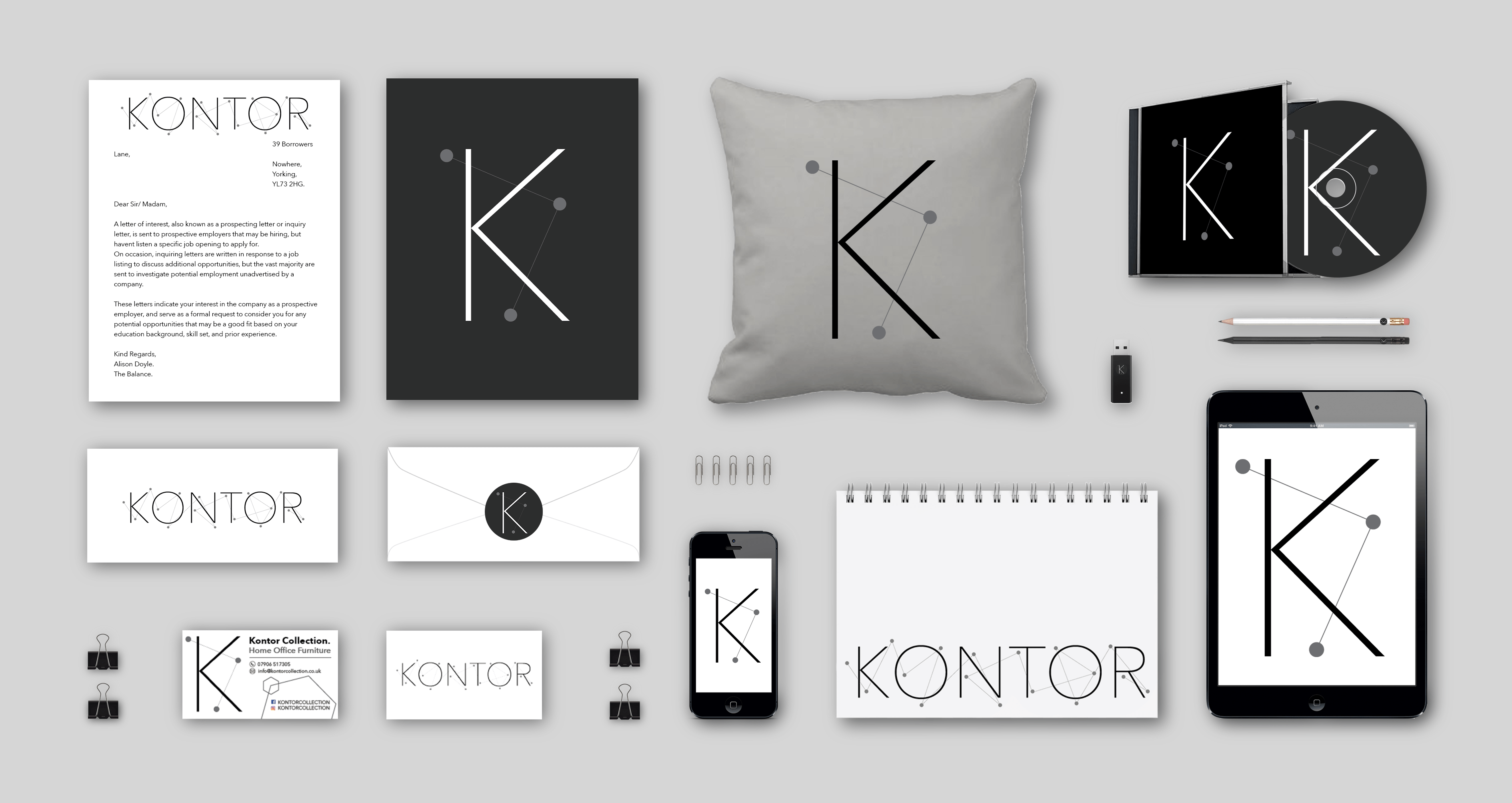
A branding portfolio is a document/ image that advertises and raises awareness of a brand across several different formats. I branding portfolio is unique as it doesn’t brand or advertise the products, however, uses features such as the logo and items similar to give people a sense of the activity and professionalism in a business.
I wanted to create a branding portfolio for Kontor as I believe branding is a vast and vital part in marketing. Branding is the face of the business with things like logos, business cards and the general customer service given, therefore, done correctly, a business can enhance their credibility and convey a more professional service.
I have looked at existing branding and marketing portfolio in my photographic marketing post, therefore gaining influence and inspiration to gage an idea as what is aesthetically pleasing, and relevant to the Kontor collection.
Below is the final image of my branding portfolio:
As well as my original logo design, I have created multiple versions that are compatible with different forms.
The above photo is an ident I created for smaller products to add variety which is a unique adaptation from the original photo:
Furthermore, I have created another version of the ident with a black background to be placed on darker objects:
To add to the branding portfolio, I further decided to create a stamp version, which could be used on enveloped and other items:
All of these logos are different versions of the original which maintain important key features. Furthermore, it enable people to engage and familiarise with the brand, enhancing the credibility of the Kontor collection and creating an aesthetically pleasing and professional outlook.
As part of the branding portfolio, I created a business card for the Kontor collection. Business cards are an effective marketing tool which raises awareness of the collection and further increases the businesses credibility. Business cards are like an introduction, therefore I have designed one that is simple, modern, contemporary and aesthetically pleasing to represent and maintain the Kontor collection’s brand image and identity.
In order to create the shadows on the images in the Branding Portfolio, I watched several tutorials in order to create a professional look, and to ensure the various products didn’t look like they were stuck to the page. The most useful one I found was the one below:

