Print Advertisements

Advertisement is vital in todays society. The United Kingdom ranks fourth among the world’s largest advertising markets (Statista, 2017), giving the Kontor collection a successful and vast opportunity to reach its target audience. Print advertisements still have many benefits in todays industry: they last ,longer, they are able to build an image, and are able to consider target market such as the local community (Suttle, 2017). Moreover, the Kontor collection would be able to exercise a form of synergy with brands advertised in the magazine or newspaper reflecting the target audience of the text (BFI, 2017).

There are several advantages that still existing in print advertising:

  • Tangibility (the physical piece of print can last in a consumers house for months or years, not disappearing into digital space),
  • Credibility (print gives a sense of legitimacy and therefore consumer sense little to no danger in print advertisements),
  • Branding (print advertisements solidify brand identity and can be consistent in the brand aesthetics, such as fonts, colour and images that establish brand recognition),
  • Target Marketing (with print advertisements, you are able to specifically place in whatever magazine or other publication which effectively reach and target the correct audience),
  • More Engaging (consumers are more engaged when reading printed material),
  • Less Print Ads (the decline of print publications can be used to a businesses marketing advantage. The publications are less crowded which allows more room for print advertisements to shine and may even be cheaper than previously before),
  • QR Codes (placing QR codes on printed pieces is an excellent way to bridge the gap between print and web. If someone scans the QR code on their smartphone, it will take them to a specified page offering more information about the product) (Newtek, 2012).

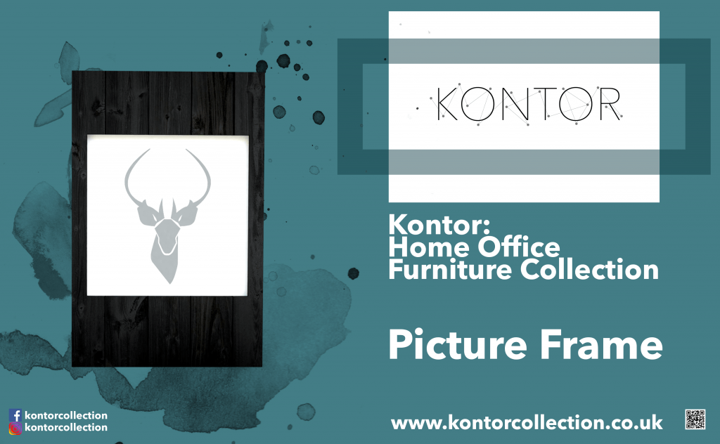
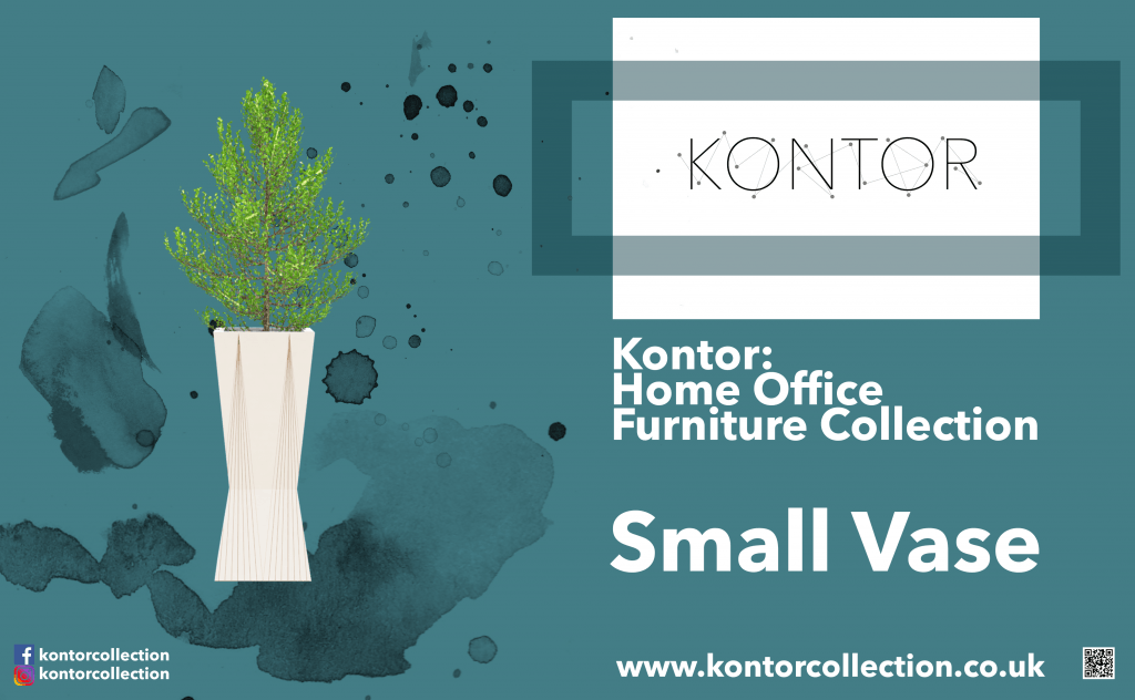
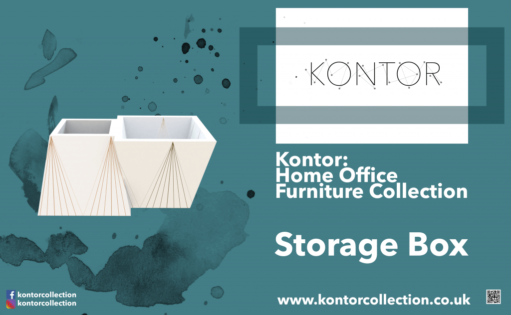
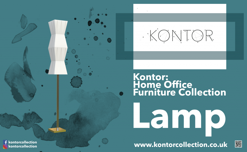
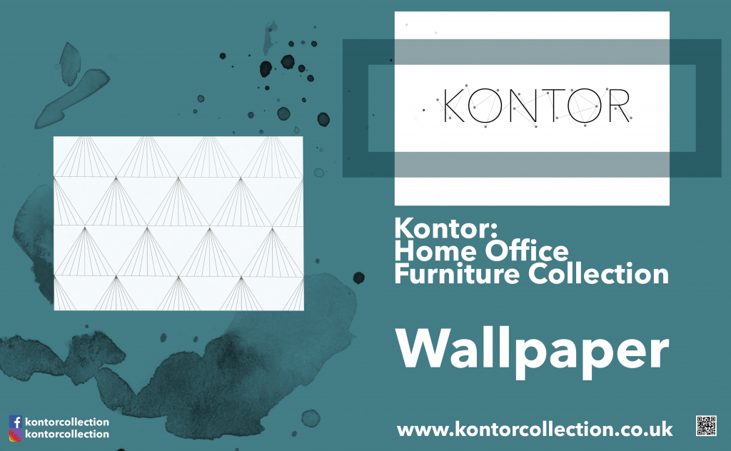
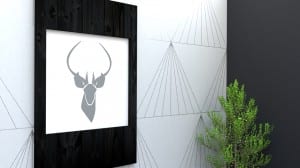
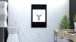
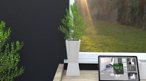
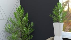
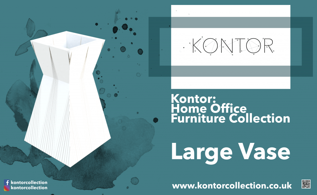
Because of all of these factors, I thought it would be highly beneficial to create print advertisements for each individual product in the Kontor collection. It means that consumers are able to see the products individually and therefore be able to compare products in aim to purchase. Furthermore, adding a QR code in the advertisements means that the divide between print and digital narrows and further embraces modern forms of media. I created the advertisements seen below on Adobe Photoshop using the renders from Blender:

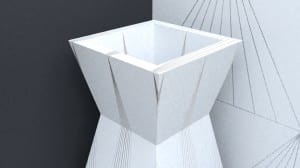
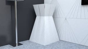
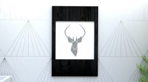
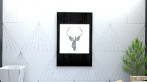
Large Vase Print Advertisement Picture Frame Print Advertisement Small Vase Print Advertisement Storage Box Print Advertisement Lamp Print Advertisement Wallpaper Print Advertisement

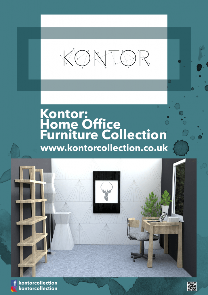
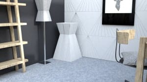
As well as producing individual product advertisements, I created a whole office advertisement. This way, the audience are able to see the whole collection in situ, as well as seeing how each product look aesthetically pleasing together. Seeing all the products together hone in the Kontor brand identity and further add to the brand image to create a professional looking furniture collection.

Whole Office Print Advertisement

I have kept similar important features such as the QR code to bridge the gap between print and digital; I have been consistent with the font, colours and imagery to maintain the Kontor brand image; I have kept the social media names in order for people to find more information out, as well as the website link, so consumers know where they can buy the products from.

Bibliography:

BFI (2017) Why is printed advertising still important to magazines, newspapers and other forms of print media? BFI. Available from http://www.bfi.org.uk/sites/bfi.org.uk/files/downloads/bfi-advertising-why-is-printed-advertising-still-important-rob-miller-2015.pdf [accessed 10 December 2017].

Newtek (2012) Print is Dead? Not so Fast. Forbes. Available from https://www.forbes.com/sites/thesba/2012/06/28/print-is-dead-not-so-fast/#d0836fa49414 [accessed 10 December 2017].

Statista (2017) UK: Advertising Industry – Statistics & Facts. Statista. Available from http://www.statista.com/topics/1747/advertising-in-the-united-kingdom/ [accessed 10 December 2017].

Suttle, R. (2017) The Importance Printing to Advertising. Chron. Available from http://smallbusiness.chron.com/importance-printing-advertising-33928.html [accessed 10 December 2017].

 

Promotional Video

The promotional video is a form of marketing which will advertise the collection of products over various platforms such as social media, the Kontor website, and on television.

A multi-channel marketing approach is vital as it is a persuasion method to entice consumers to purchase the home office furniture collection. Video’s are a highly beneficial form of marketing as it is a business channel that persuades and engages customers as it is the method that is the most memorable (GoAnimate, 2012).

87% of online marketers use video content, this method proves successful as 1/3 of online activity is spent watching video’s (Lister, 2017). Moreover, I believe video marketing is a successful tool, and have implemented this for Kontor. 

I wanted to follow the style of video shown in my ‘photo shoot’ post, which talks about the the story board and camera movements which I have followed for the making of this video.

For the music however, I decided to look at royalty free music in order to maintain the professional feel of the product and further maintain Kontor’s brand image and identity.

I looked at various pieces of music on sound cloud, however was unsuccessful as to gain free music, a lot had audio watermarks, therefore not professional and not free. I looked further from creative commons but was unsuccessful as the music I found did not fit the style of the video and brand.

Finally found a few songs on a website called Epidemic Sound, and further found a few songs to compare:

  1. ‘Up To You’ by Windshield
  2. ‘Those Who Arrived’ by Daniel Gunnarsson
  3. ‘I Will Be Ok’ by Daniel Aldenmark

Song I chose was the 4th one, fitted the video sequence the best, also had an ‘uplifting’ theme which is appropriate to attract potential consumers.

I used Adobe After effects in order to create a logo animation which would make up the start of the video, introducing people to the brand straight away for them to remember the brand throughout the video, and further it appears at the end to hone in what the brand is and where consumers are able to find it. Please see below the animation I created:

To add to the animation, I felt it was vital to show the products of the Kontor collection in situ. Therefore, I created camera movements in the Blender file, consisting of 4 cameras and 5 different shots following the camera script, to show the variety of products in ‘the scene’. When I started rendering this, I was rending at 32 samples, 2 bounces (max, min, diffuse, glossy, and transmissive), had reflective and refractive caustics on, ambient occlusion, and rendered at 50%. I then realised that this was the not best rendering settings to obtain a maximum, professional and aesthetically pleasing animation. So I canceled the render and changed my settings. I features I changes was turning off reflective and refractive caustics, and increased the samples to 512. Turning off the caustics mean that the rendering would speed up, however, increasing the samples would take longer, but produce a higher quality look. I set this rendering at 7pm, and came back to it at 10am the next day to see that it had only rendered 126 frames out of 415. Therefore, it took 16 hours to render 126 frames; therefore, 7.9 frames were rendered in one hour. This timing was incorrect for 415 to be rendered out, therefore once again I canceled the render and changed the settings. I realised that denoising had been turned off, therefore, `i turned that back on in order to maximise the quality of ‘the scene’. Denoising is a unique and smart tool which reduces the number of ‘fireflies’ in the scene. Furthermore, I reduces the samples back down to 32 as I read some articles saying you are still able to get a good quality animation from this number. As well as the usual settings, I reduces ‘compression’ to 0, which mean that Blender wasn’t worked extra hard to compress the file. When I rendered this animation out, it took approximately 9.5 hours, using the CPU rather than the GPU.

Please see below for the final rendered animation, along with the logo animation, and additional information surrounding what the collection is:

Final video:

Bibliography:

Epidemic Sound (2017) Uplifting Royalty Free Music. Epidemic Sound. Available at https://player.epidemicsound.com/#/browse/?&moods=Moods.Glamorous&moods=Moods.Peaceful&fatherGenres=Acoustic&moods=Moods.Laid%20Back&active=moods&activeFilter=energy [accessed 8 December 2017].

GoAnimate (2012) 5 Reasons Promo Videos Can Be So Persuasive. GoAnimate. Available form https://resources.goanimate.com/5-reasons-promo-videos-can-be-so-persuasive [accessed 10 December 2017].
Lister, M. (2017) 37 Staggering Video Marketing Statistics for 2017. The WordStream Blog. Available from http://www.wordstream.com/blog/ws/2017/03/08/video-marketing-statistics [accessed 10 December 2017].
Rendering 2.0

The last renders of ‘the scene’ were fine, however, missing something that enables the photo to look more photo-realistic and professional. Therefore, I decided to continue experimenting with lighting to better my project.
I looked at portal lighting in more detail and decided to remove the ceiling an ceiling lights. I then went on to replace the ceiling with an area lamp, scaling it up to the size of the ceiling, and changing it to a portal light. The outcome of this was vastly positive and beneficial as it gave ‘the scene’ a more crisp look, meaning that the products looked better quality and gave the overall scene a more professional and realistic look.

Please see below for a before and after shot:

Screenshot (15)Home Office 100% quality CEILING LIGHT PORTAL - 01

I rendered each image again to ensure the final product is of maximum quality for the best look.

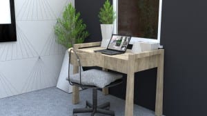
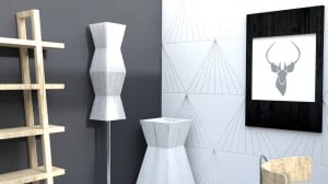
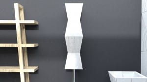
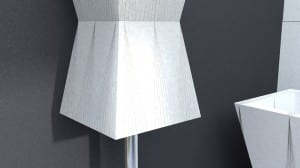
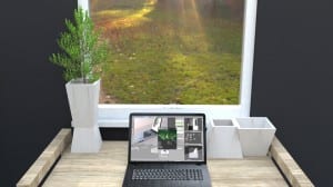
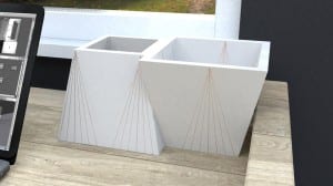
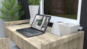
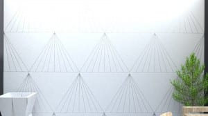
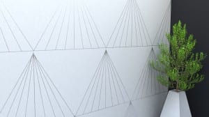
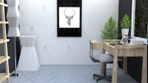
After feedback from my tutor, I realised that I needed to change a few models in order to enhance the photo-realistic and life-like look of the products. A method to do this is by bevelling the models. The straight edges of the models now are aesthetically pleasing, however, offer a non-realistic aspect when you look at real life products due to safety and wear and tear. Therefore, I bevelled the models at the correct size in order to create a better scene. Please see the photos below which are the final renders:

3.1 4.1 5.1 6.1 7.1 8.1 9.1 10.1 11.1 12.1 13.1 14.1 15.1 16.1 17.1 18.1 19.1 20.1 21.1 22.1 23.1 24.1

Furthermore, to better rendering times, I decreased the sample size to 32, this means that the outcome is still professional, however, optimises the render speed.

The beveled edges the make the models look more realistic and therefore may attract people attention to look into the product, and therefore further gain interest and potential sales.

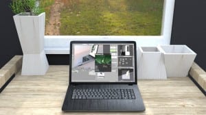
Moreover, I have changed the texture of the laptop and the material given in the download looks rough and non-photorealistic. I change the material to a black metal with a shine effect mimicking the light.

Home-Office-100%-quality-STORAGE-BOX-CEILING-LIGHT-PORTAL---03 21.1

Branding Portfolio

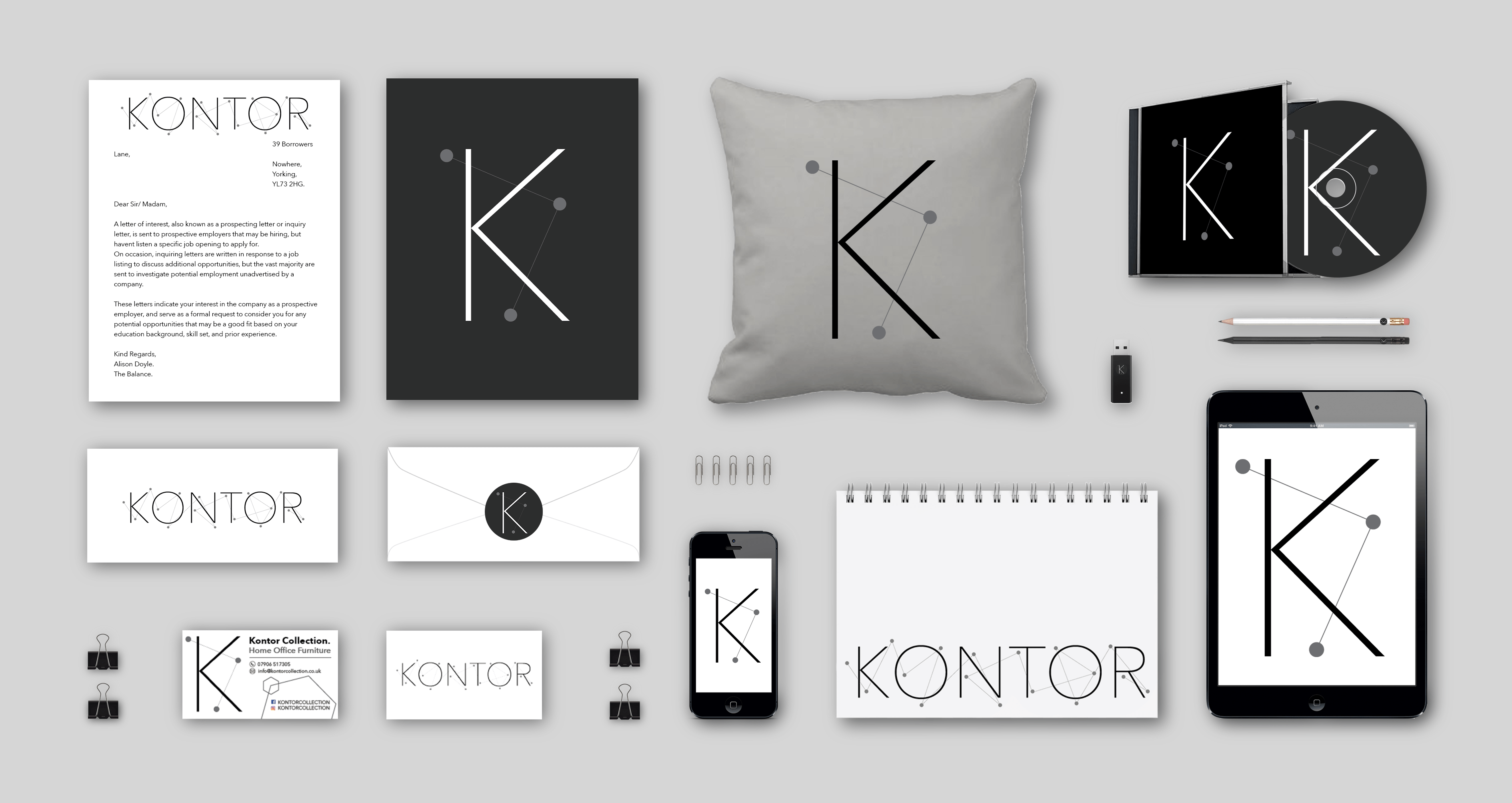
A branding portfolio is a document/ image that advertises and raises awareness of a brand across several different formats. I branding portfolio is unique as it doesn’t brand or advertise the products, however, uses features such as the logo and items similar to give people a sense of the activity and professionalism in a business.

I wanted to create a branding portfolio for Kontor as I believe branding is a vast and vital part in marketing. Branding is the face of the business with things like logos, business cards and the general customer service given, therefore, done correctly, a business can enhance their credibility and convey a more professional service.

I have looked at existing branding and marketing portfolio in my photographic marketing post, therefore gaining influence and inspiration to gage an idea as what is aesthetically pleasing, and relevant to the Kontor collection.

Below is the final image of my branding portfolio:

Branding Portfolio

As well as my original logo design, I have created multiple versions that are compatible with different forms.

Kontor Logo Final Design Ident

The above photo is an ident I created for smaller products to add variety which is a unique adaptation from the original photo:

Kontor Logo Design 3

Furthermore, I have created another version of the ident with a black background to be placed on darker objects:

Kontor Logo Final Design Ident (black)

To add to the branding portfolio, I further decided to create a stamp version, which could be used on enveloped and other items:

Kontor Logo Final Design Ident (black envelope)

All of these logos are different versions of the original which maintain important key features. Furthermore, it enable people to engage and familiarise with the brand, enhancing the credibility of the Kontor collection and creating an aesthetically pleasing and professional outlook.

As part of the branding portfolio, I created a business card for the Kontor collection. Business cards are an effective marketing tool which raises awareness of the collection and further increases the businesses credibility. Business cards are like an introduction, therefore I have designed one that is simple, modern, contemporary and aesthetically pleasing to represent and maintain the Kontor collection’s brand image and identity.

Business Card Front

Business Card Back


In order to create the shadows on the images in the Branding Portfolio, I watched several tutorials in order to create a professional look, and to ensure the various products didn’t look like they were stuck to the page. The most useful one I found was the one below:

Camera Work

For part of this project, I will be creating a short promotional video, with shots around ‘the scene’ to advertise each product in situ. Please refer to my ‘photo shoot’ post, where I illustrate the storyboard, and further discuss existing examples and camera placement.

To get basic knowledge about how the camera works in blender, I watched this tutorial:

https://www.youtube.com/watch?v=mWWX53PxwnQ

This tutorial discuss how you can change the camera properties and lens to create different looks. For example, you can decrease the camera lens focal to ‘8’, giving the lens a fish eye effect, depending on what your project is about. Furthermore, you can increase the camera lens focal to convey a more flat effect if preferred. Furthermore, by using the ‘shift’ tool, you are able to make simple movements with the camera, without being drastic and therefore making the shot more professional. The ‘clipping’ tool is quite interesting as it has a function of limiting what is seen. The clipping tool can cut out parts of the back ground so that the rendering and camera shooting can focus on the foreground.

This video was helpful in terms of learning how the camera works, however, I need to understand how you can make the camera move. Therefore, I found the tutorial below useful as the camera movements Enigma Toots delivers, are similar to how I desire my video to be:

https://www.youtube.com/watch?v=2_9gwI8sTMY

A limitation of this video is that it doesn’t show you how to add multiple cameras, and perhaps add key frames in order to get several camera videos from one scene. Furthermore, Enigma Toots does not tell you how to make a short films per say, more how to enable motion in the camera. Moreover, I need to further find out how to use several cameras in blender, and how to render these out to create one flowing movement.

The video above has been the most helpful so far. It has demonstrated how to use multiple cameras ans switch from one to the other to make a more interesting and complex animation. Sci Fi Animator demonstrates how you can simply add multiple cameras, focused on one object, and then move to different angles in order to create a more professional look. To do this, you need to place your cameras in the desired location, then go down to your time line in another screen. Click on the camera you want to start with, both in the ‘outliner’ toolbar and in the ‘properties’ toolbar under ‘render’. Then go into your timeline editor and add a marker. This tells blender what frame you want you camera to start in. Furthermore, to add another camera, you move to a different frame, and then repeat the process of clicking on the camera in all toolboxes, and adding a marker: will will end the last camera.

In my scene I have a total of 4 cameras, however using 5 different angles in total. This means I use the first camera twice, as the first scene and as the ending scene.

To add to the tutorial, Sci Fi Animator illustrates how you can add in key frames for movement as well. For my short animation which will act as part of Kontor’s promotional video, I only want to use simple movements. Therefore only using the ‘location’ key frame to move the camera about in different frames was highly appropriate as this gave a simple yet professional look. The desired look I was going for is conveyed in my ‘photo shoot’ post, where I look at existing products and illustrate themes.

Once all the cameras were set up, I places location movement key frames in the correct places to give subtle and slow movements. I further played around with the timings and key frames to process a better looking and aesthetically pleasing feel to the animation.

Once I was happy with the animation, I clicked on ‘render animation’ with all the appropriate render settings and waited to see how long the animation would tale to render.