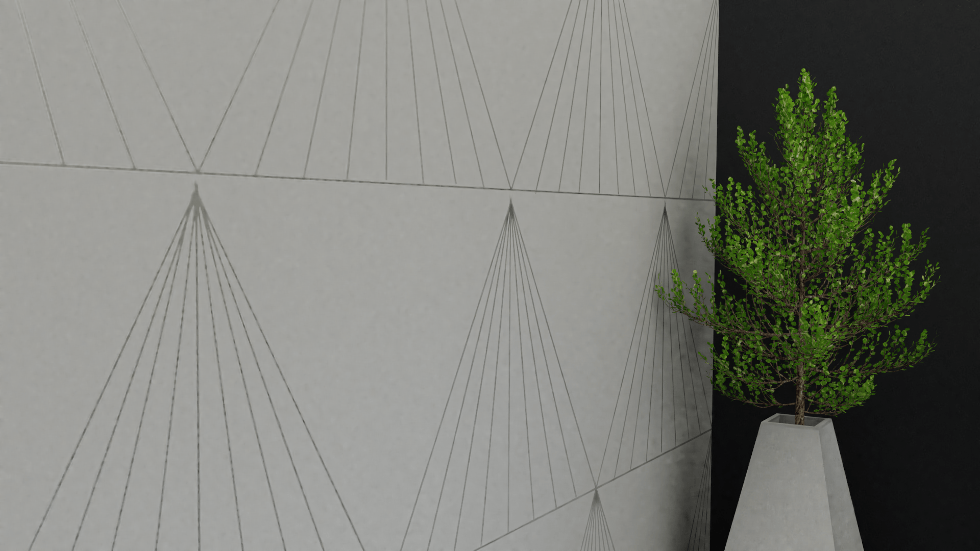
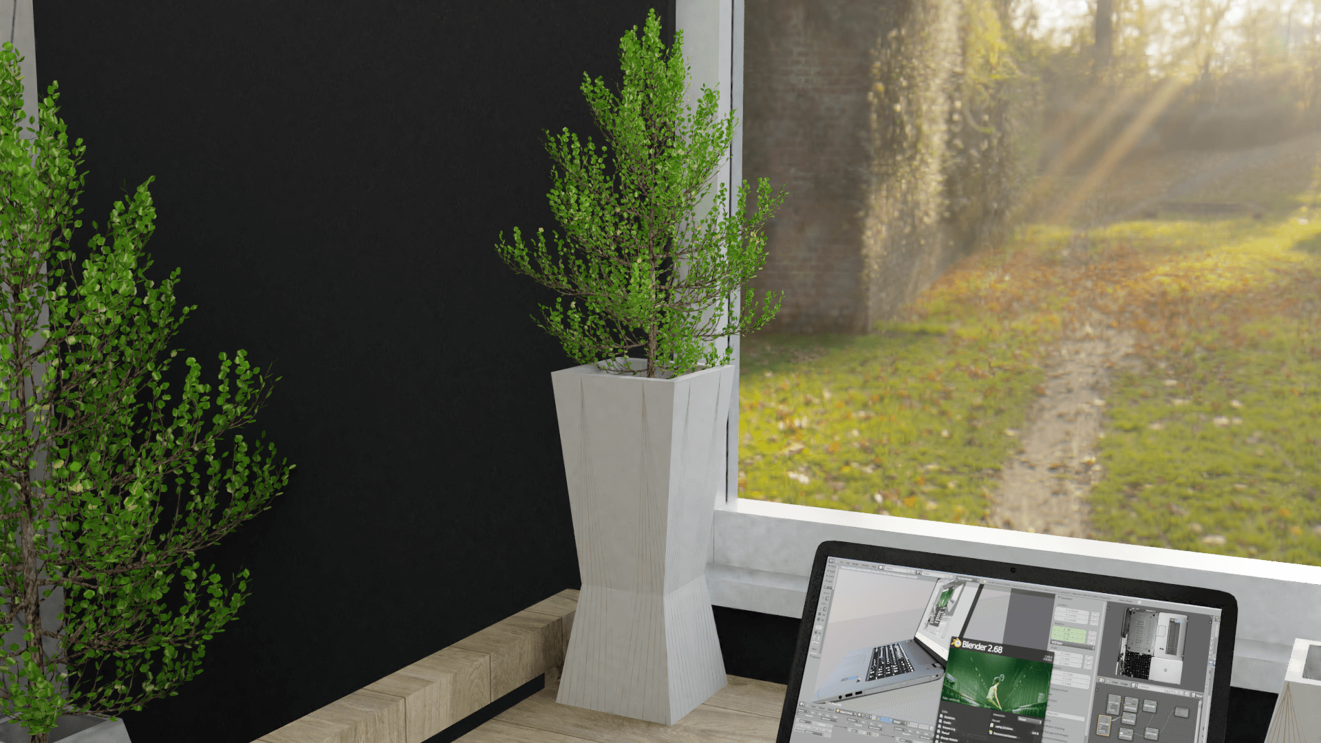
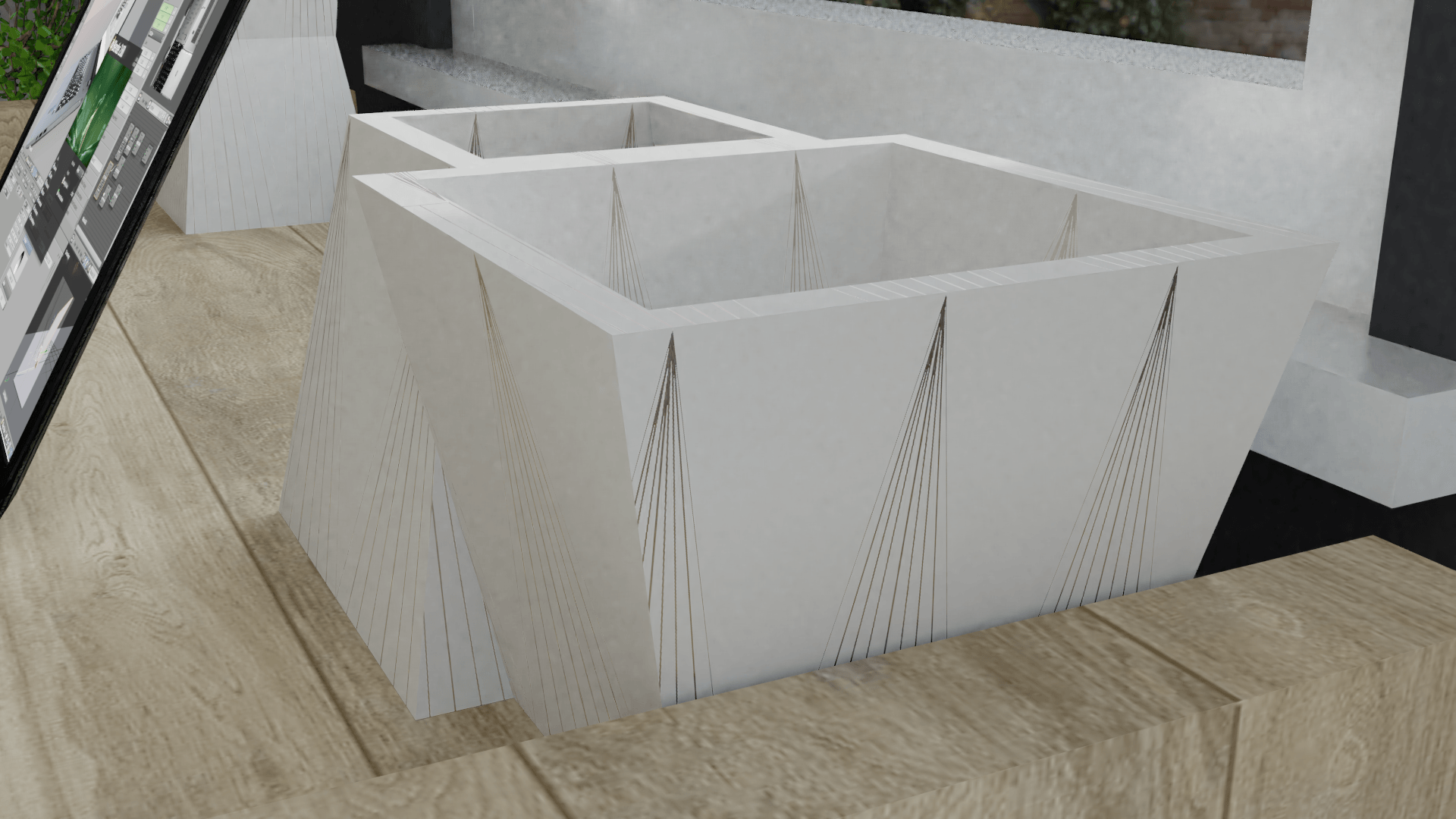
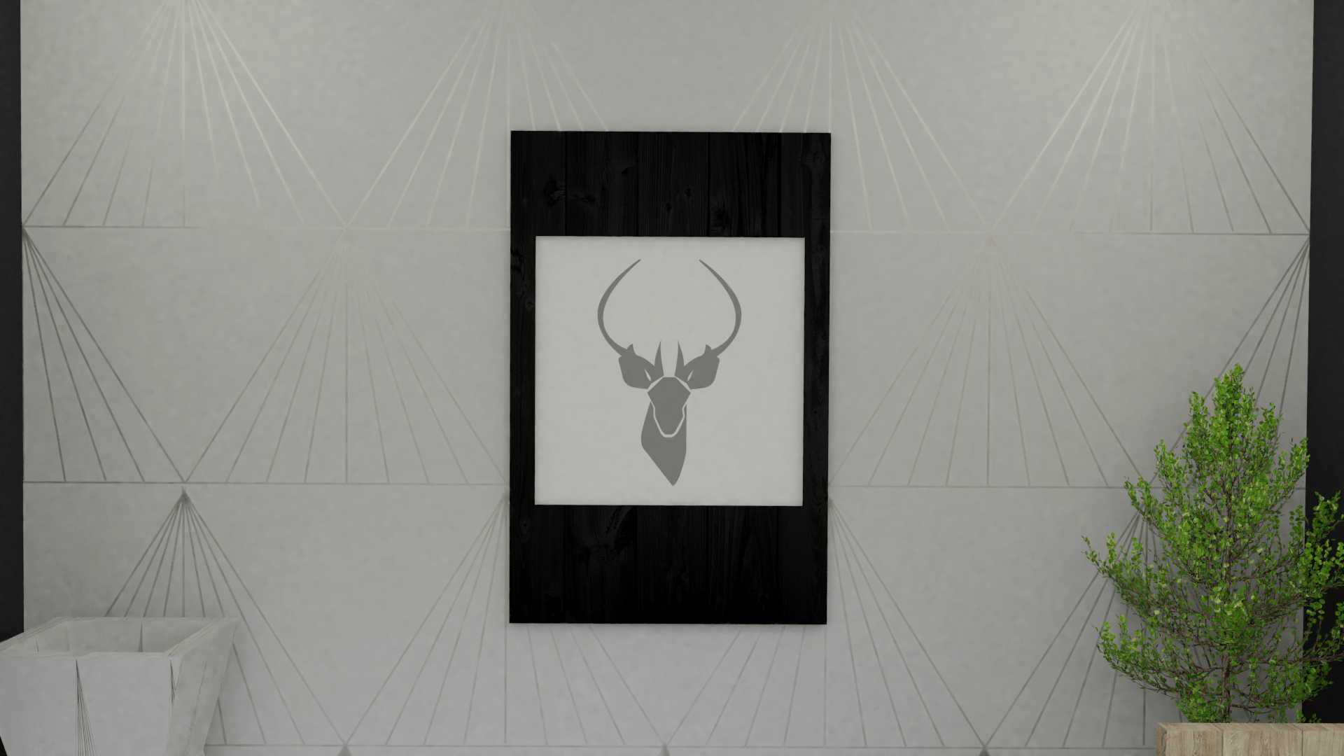
When looking at the two side wallpapers in ‘the scene’, as I have not created the texture, it looks low quality. Furthermore, the colour of the texture image blends in with the products too much, therefore, not enabling the products to stand out in their render.
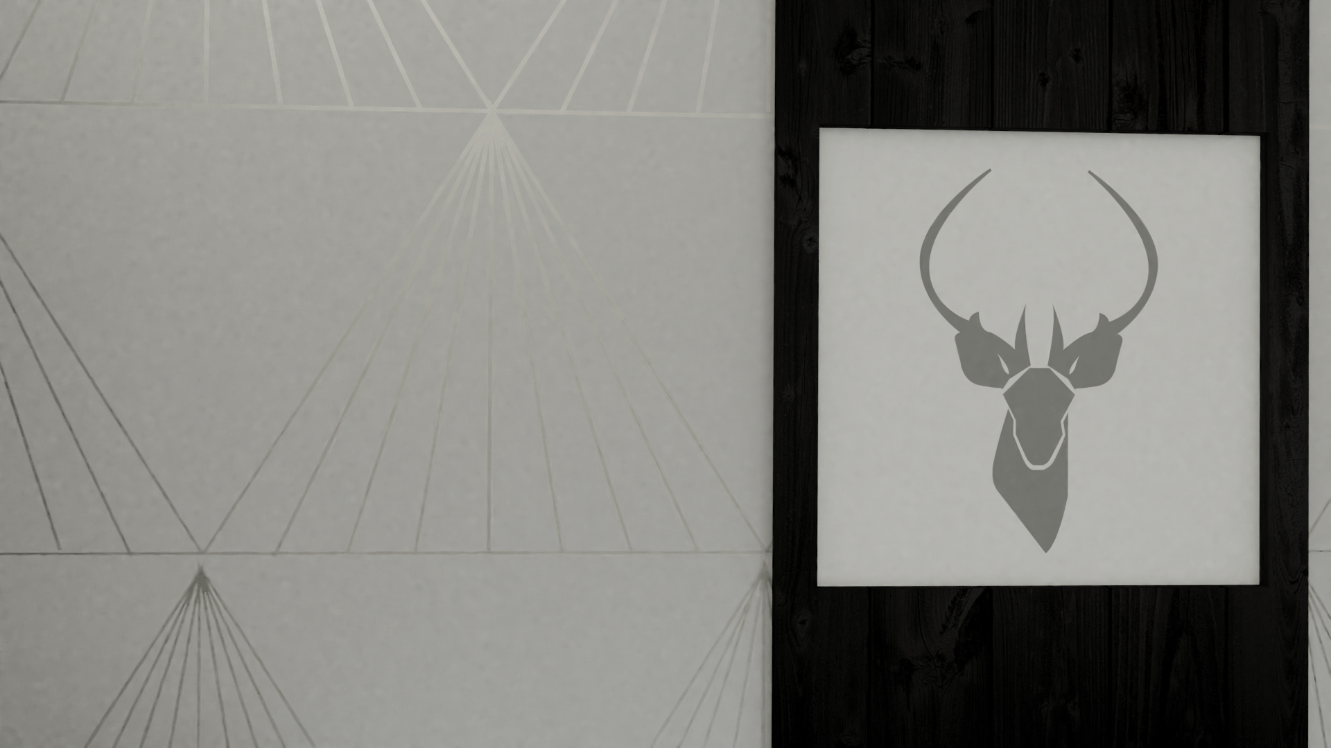
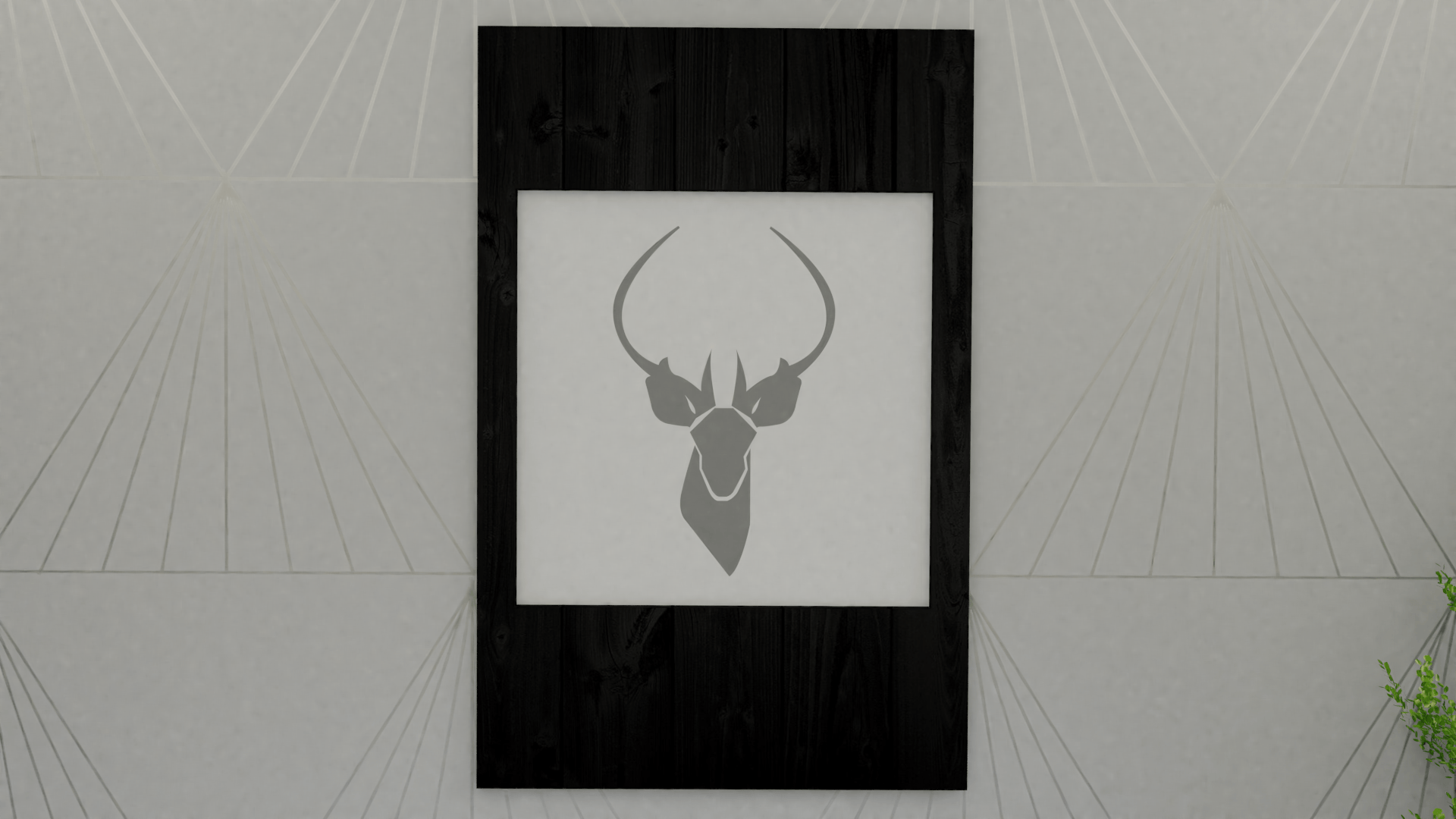
Please see images of the wall texture below:

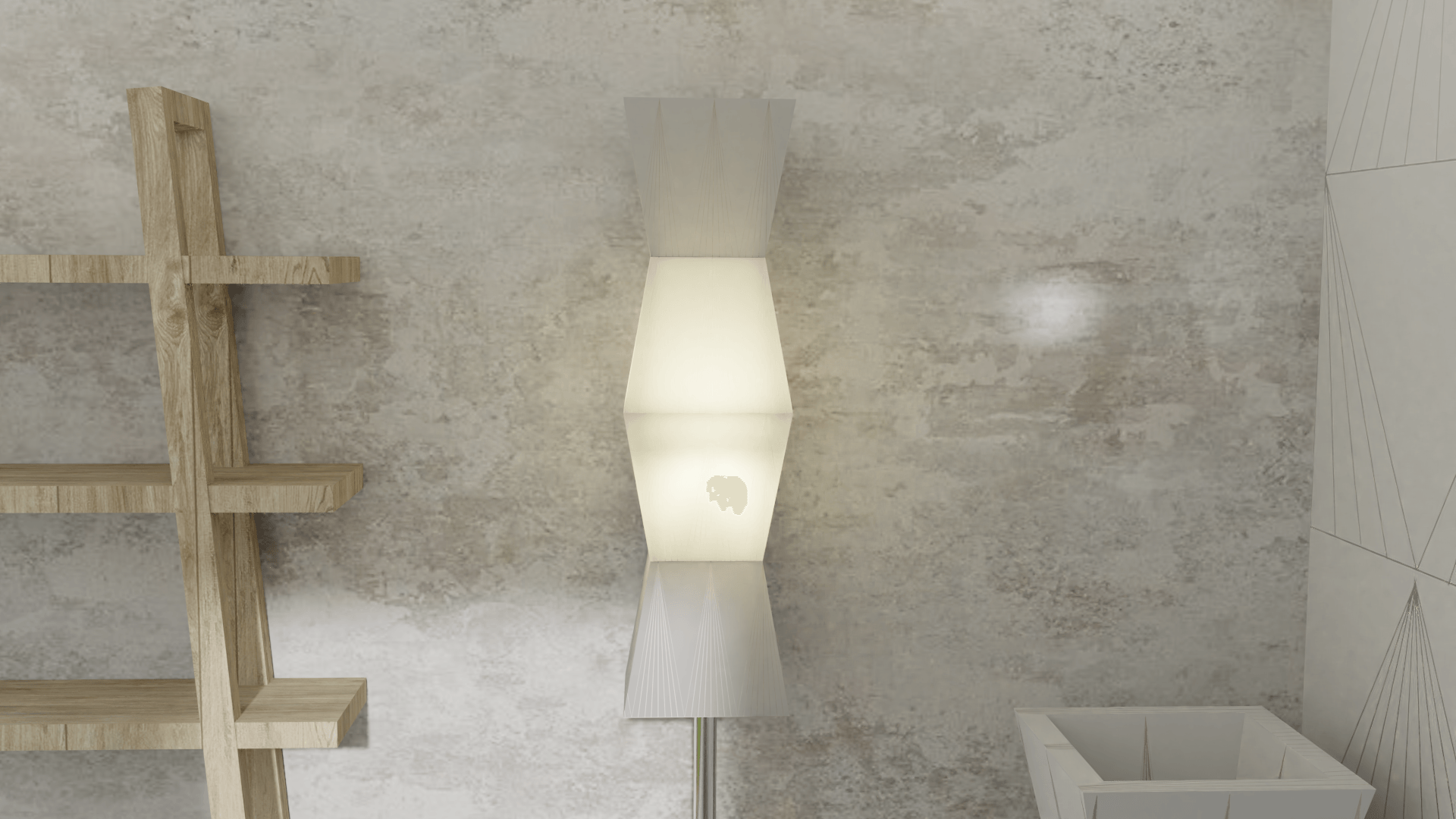
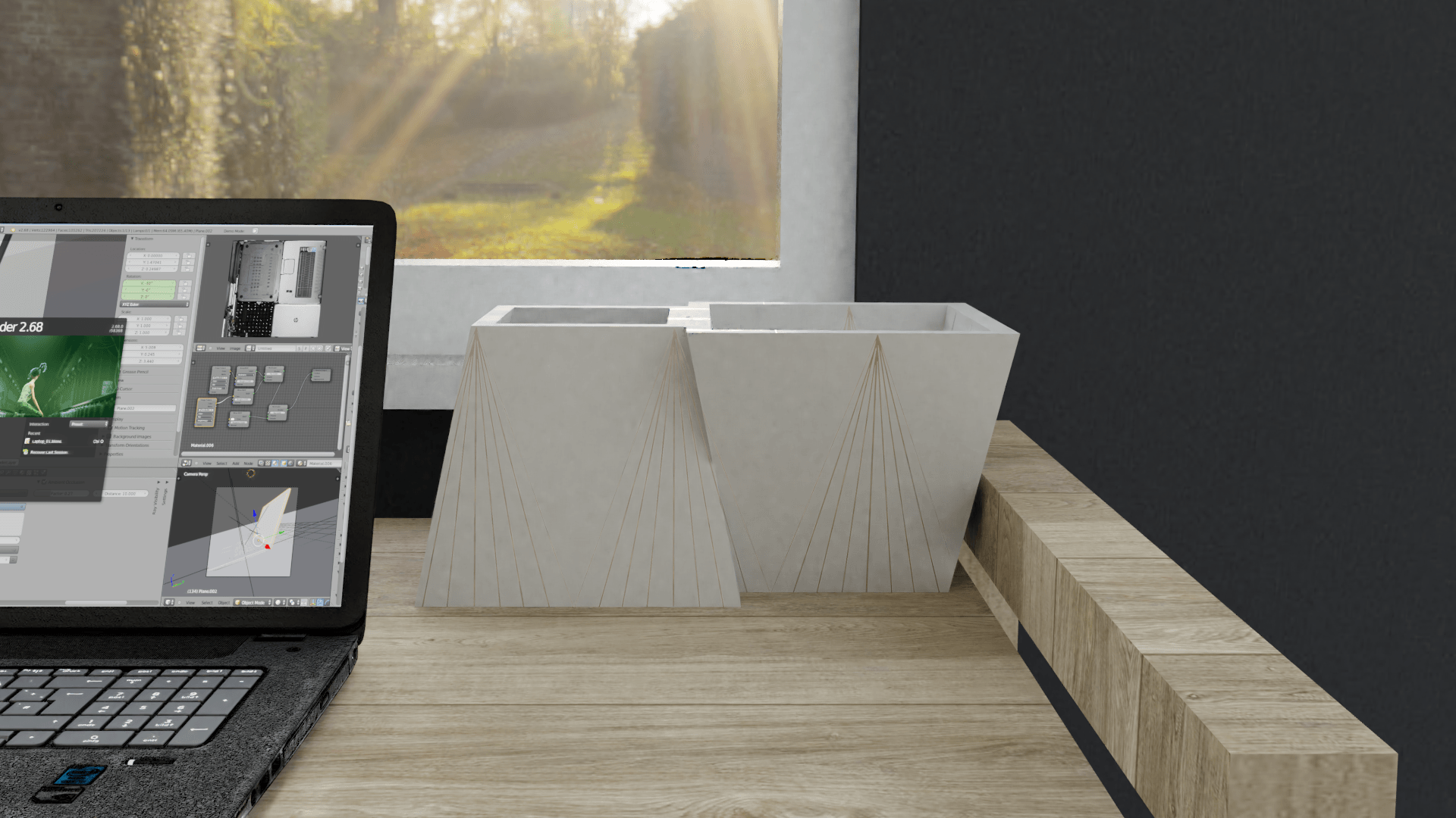
Although it sets a nice and light scene, there is a bit too much beige-like colours in ‘the scene’. Therefore, I decided to experiment with another texture to see the different, and to see what texture looked better.
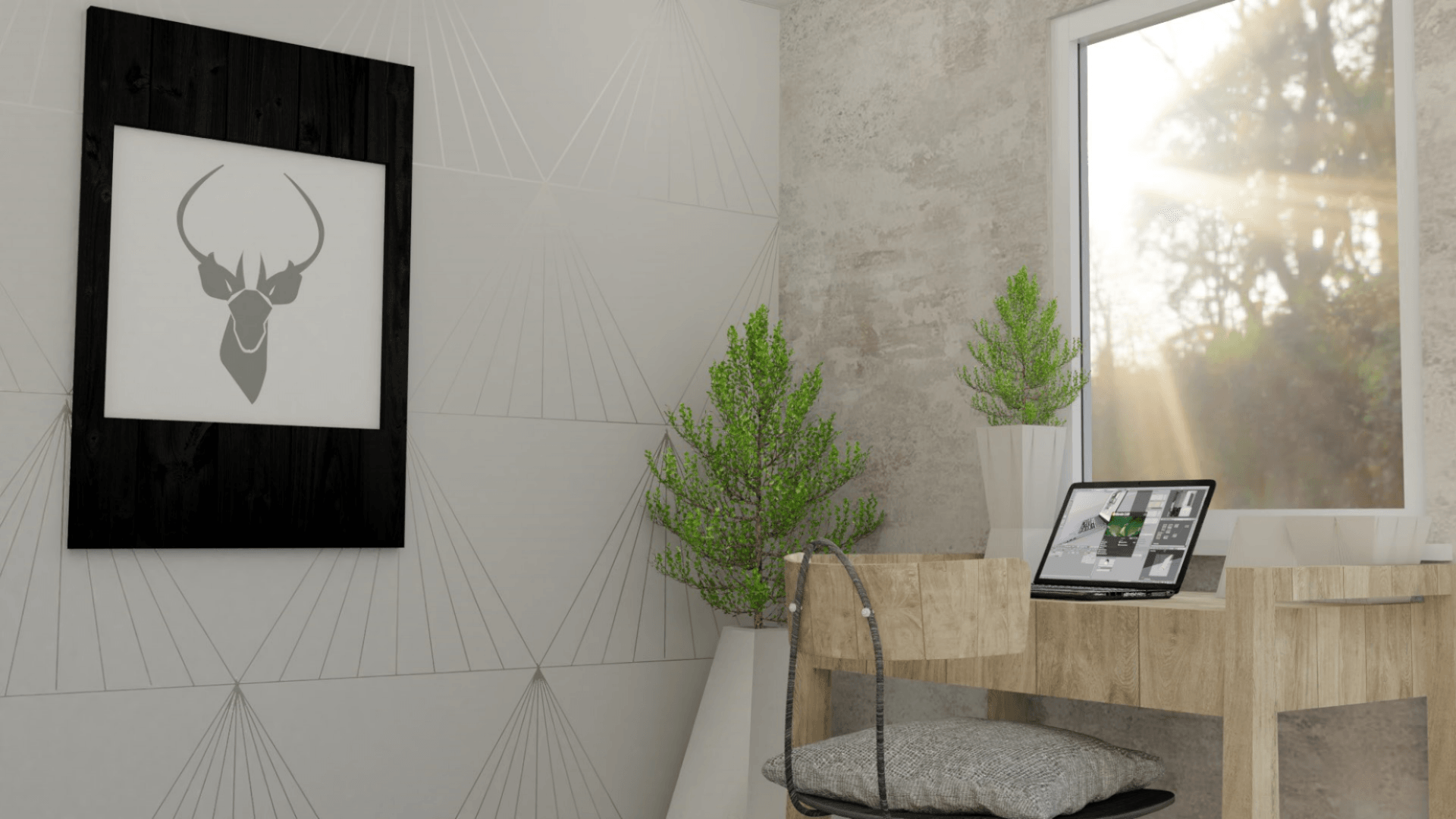
Below I have experimented with a dark grey wall texture. This makes the room look darker, however, makes the products in the Kontor collection stand out to the audiences eye:
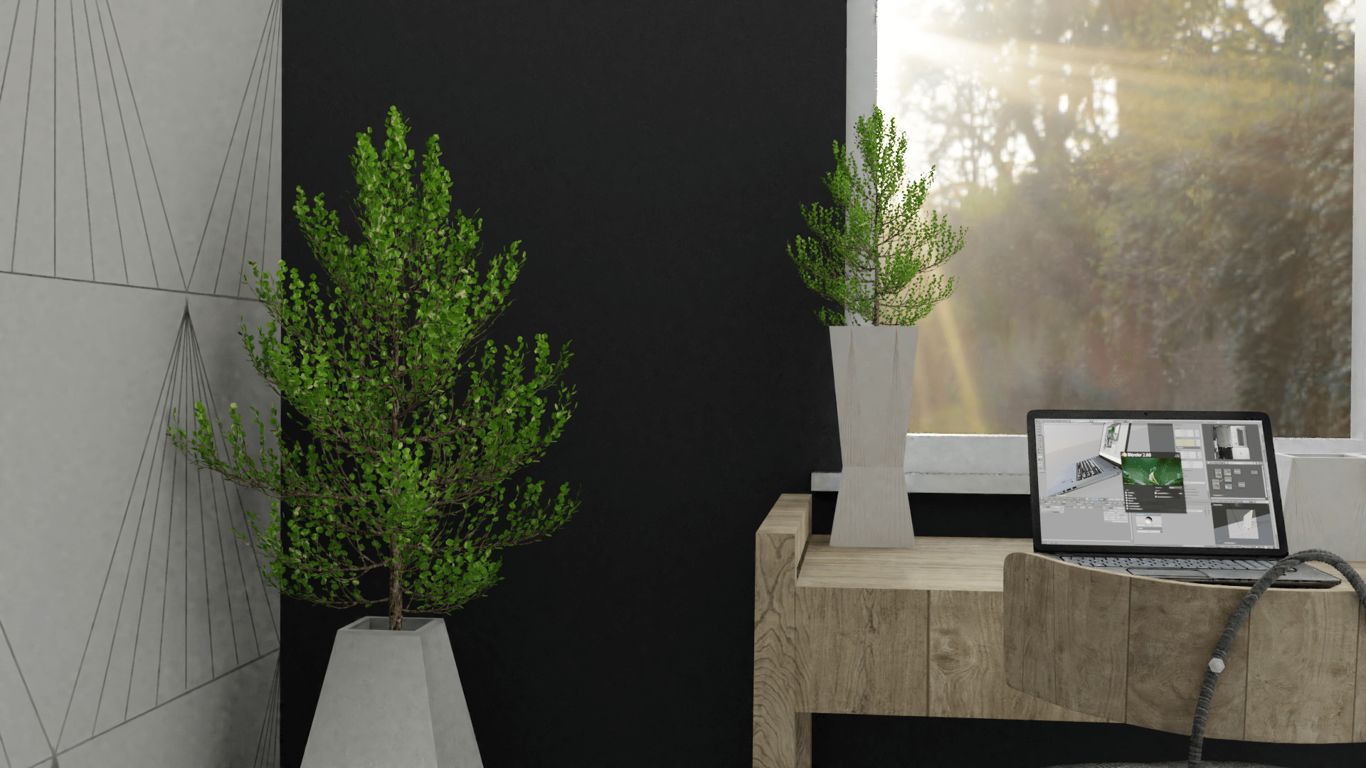
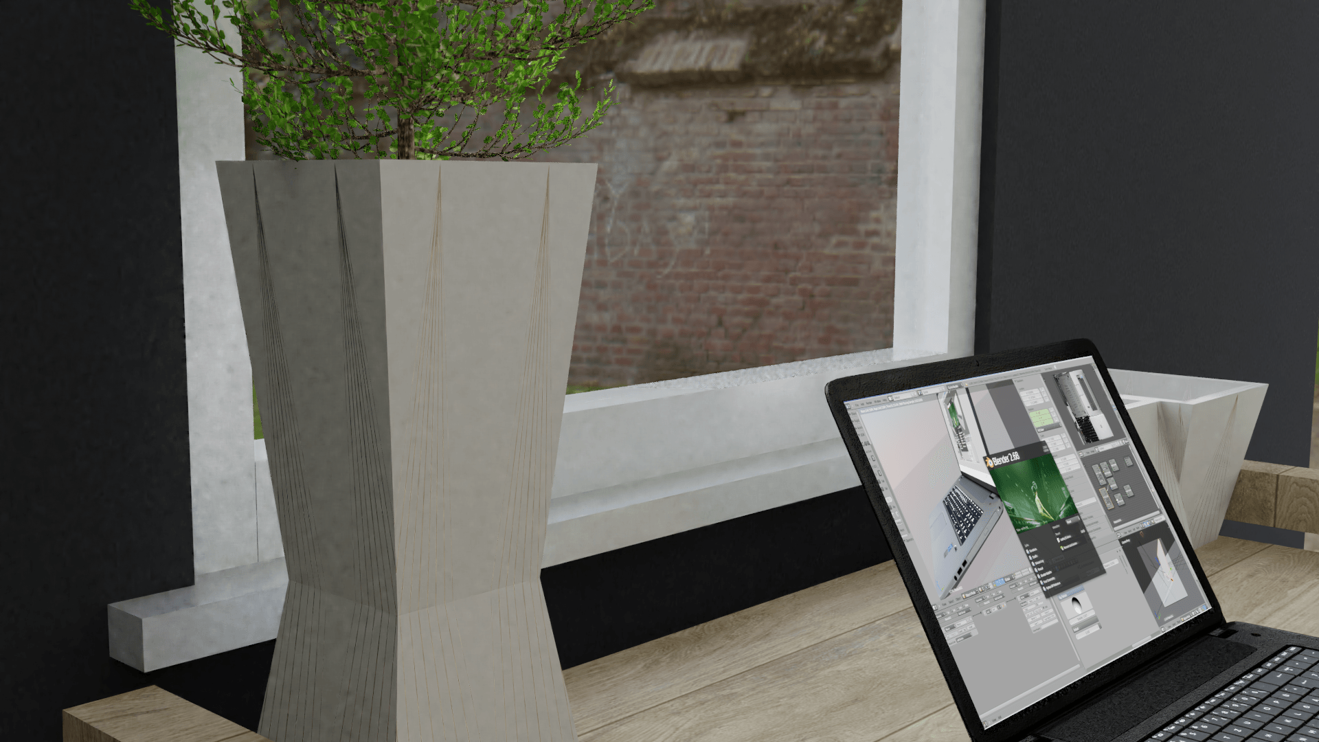
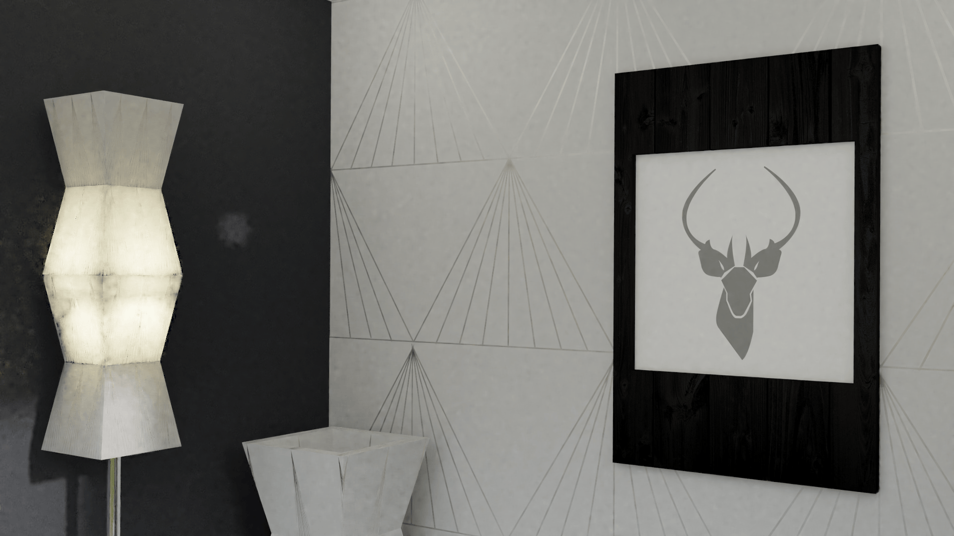
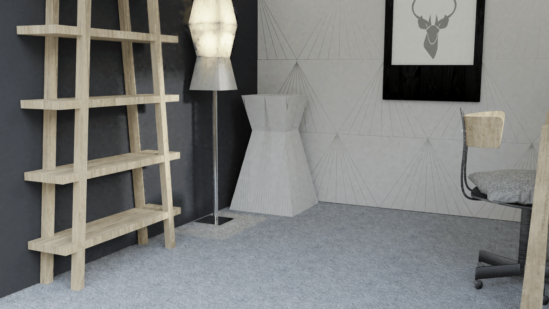
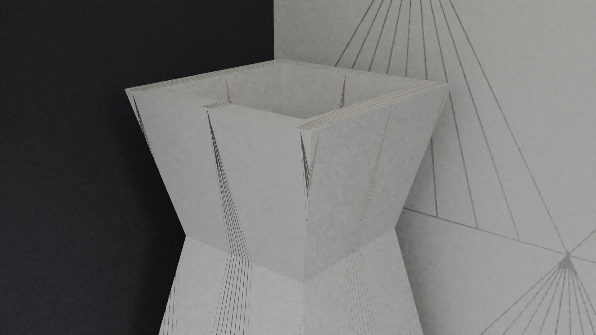
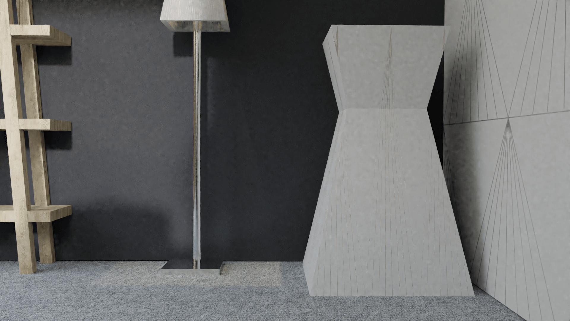
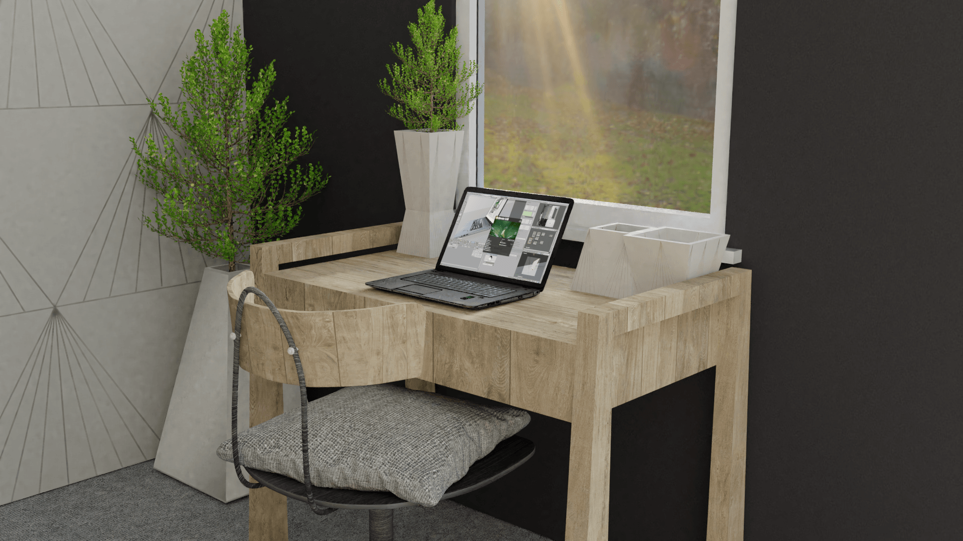
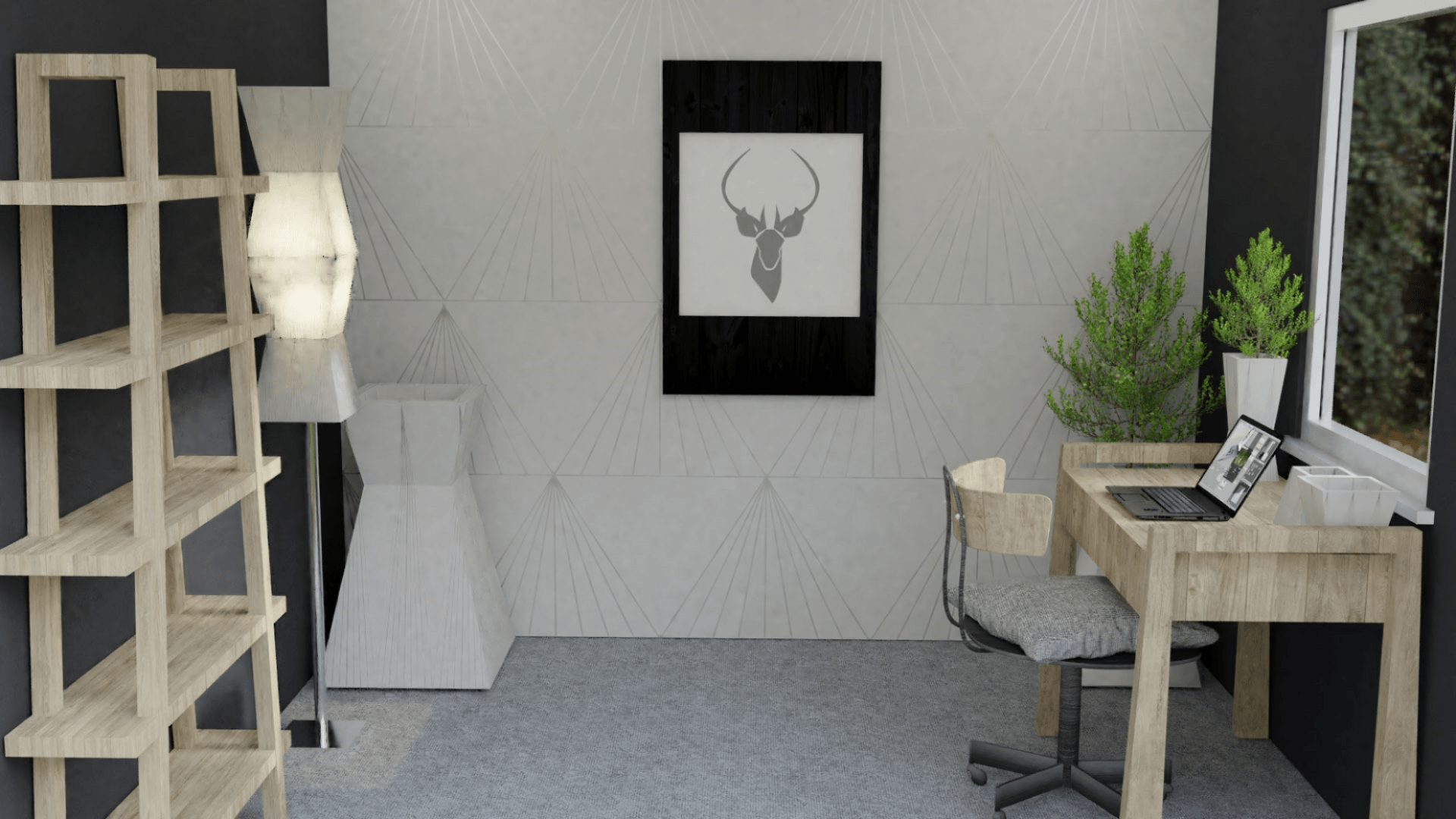
The grey wallpaper definitely looks more aesthetically pleasing and offers a more professional outlook on the products in ‘the scene’. The only issues with some of these images are that there are a bit of ‘noise/ fireflies’. Furthermore, the scene looks darker are the walls are now a dark grey rather than a light colour.
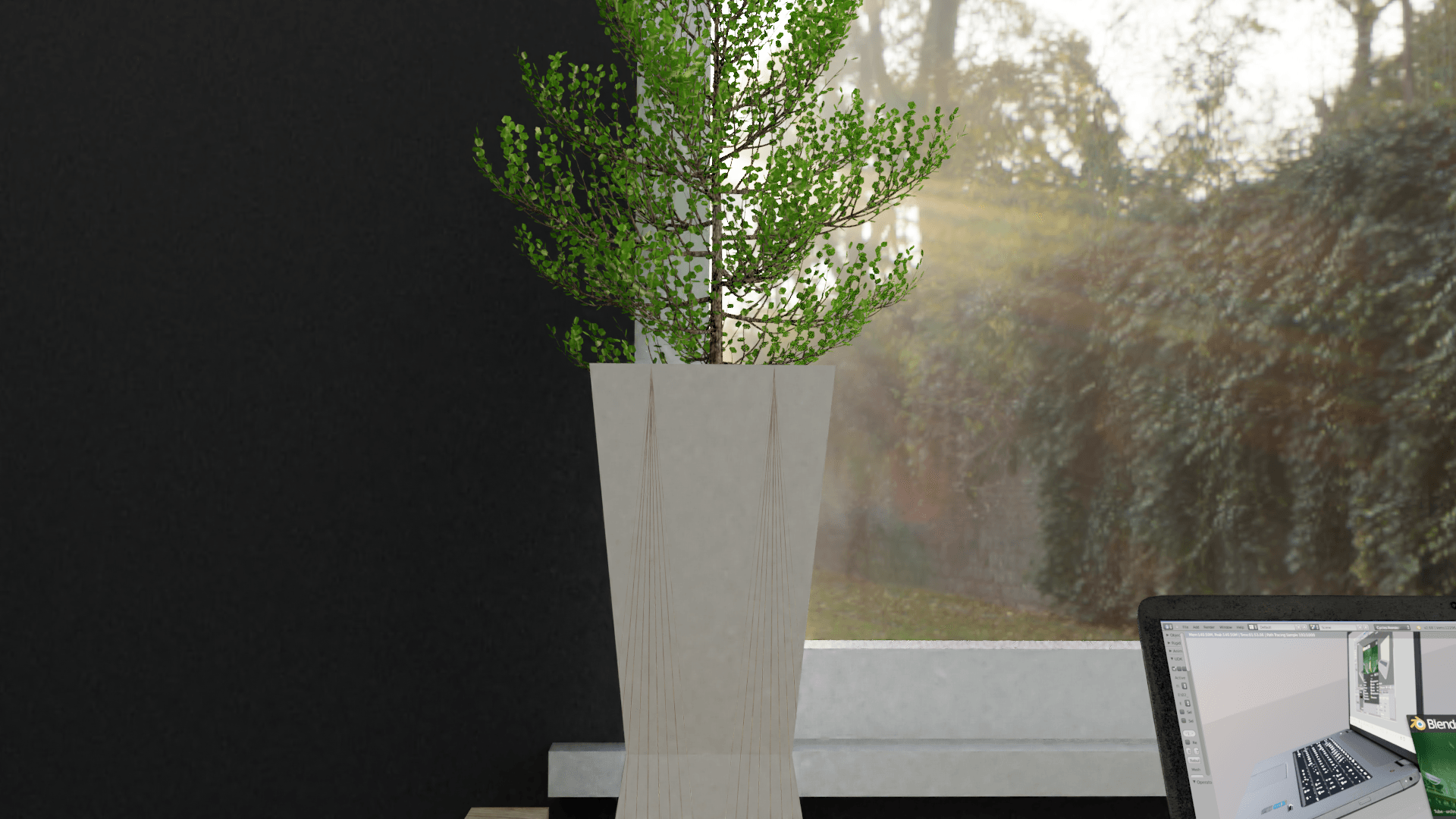
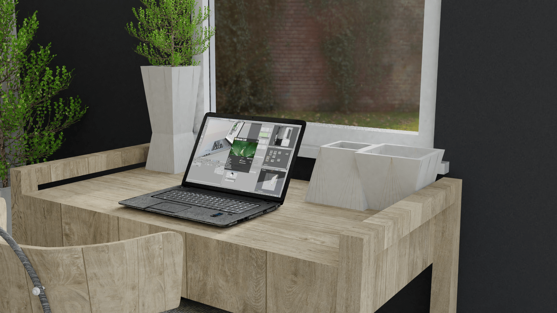
I looked into this further to improve my work and came across a strategy whereby I remove the ceiling and the ceiling lights, then replace everything with an area lamp, scale the size up, and use portal lighting. This gave my scene a more crisp, brighter and better quality image.