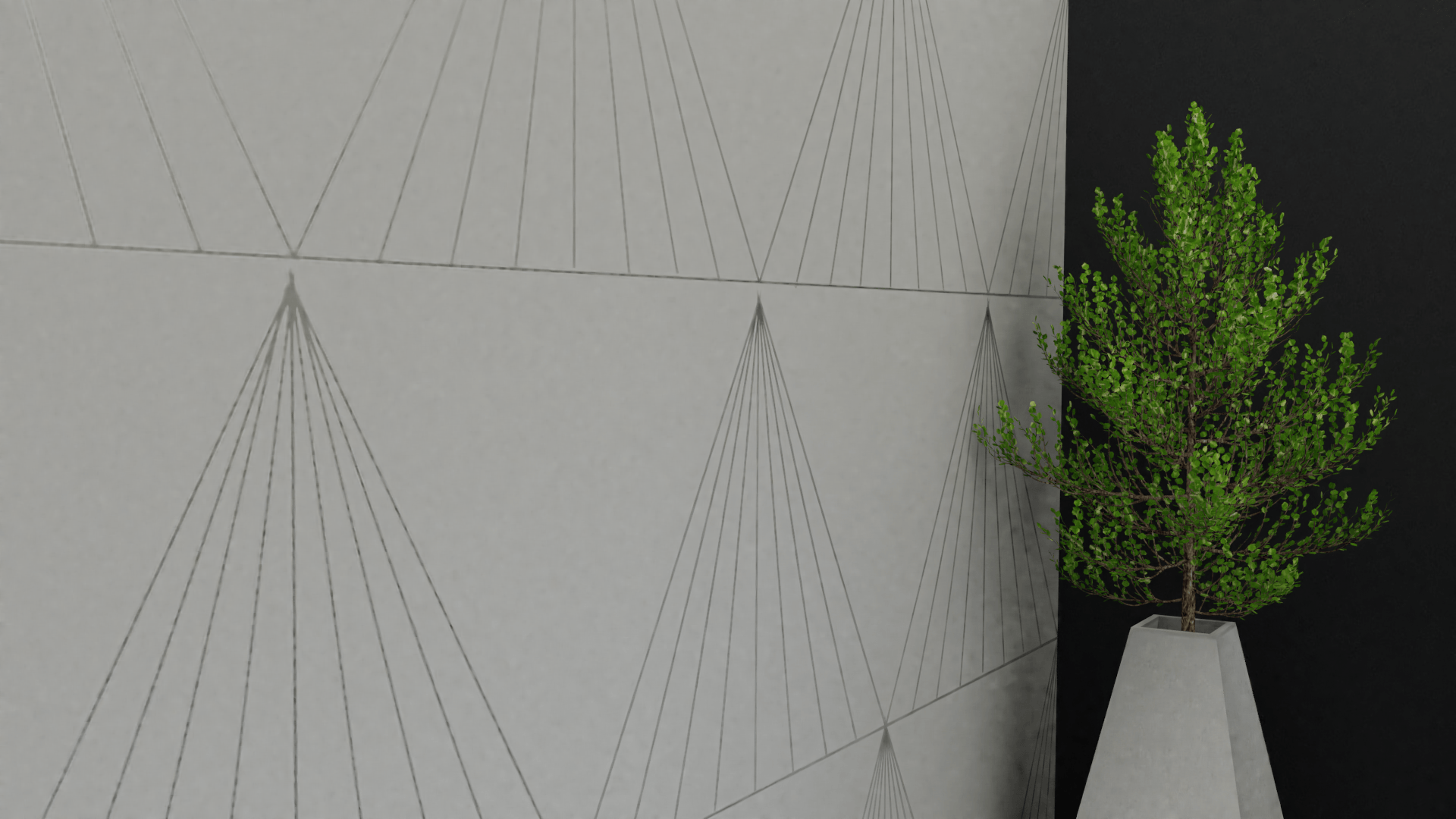
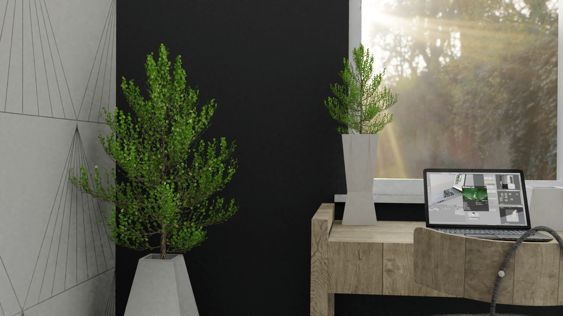
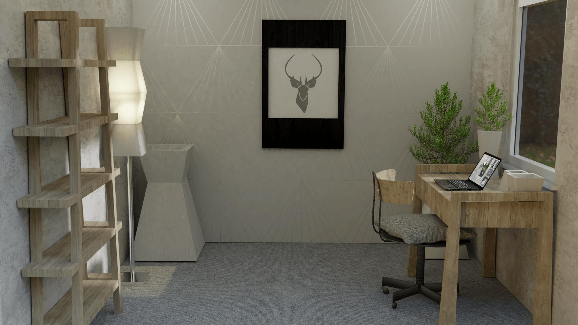
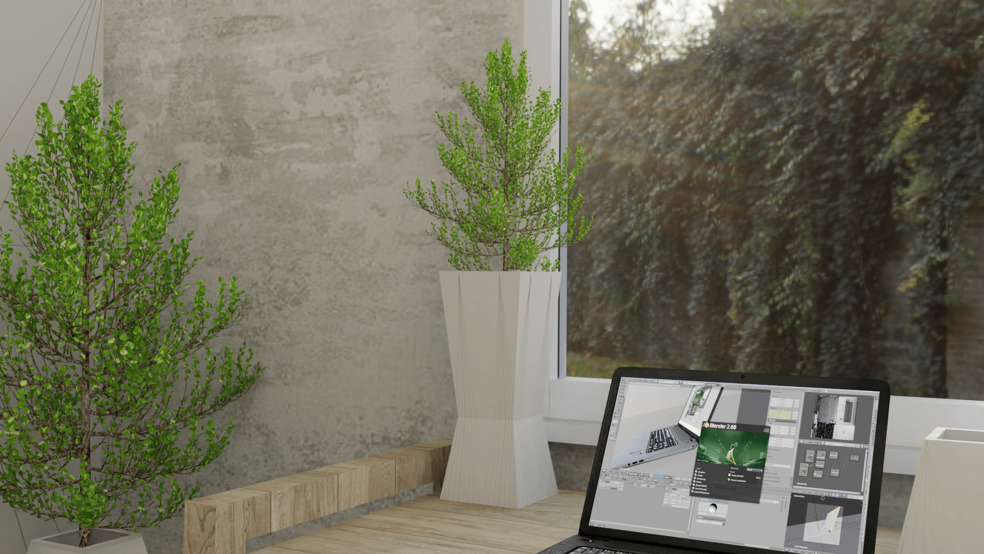
When looking at the two side wallpapers in ‘the scene’, as I have not created the texture, it looks low quality. Furthermore, the colour of the texture image blends in with the products too much, therefore, not enabling the products to stand out in their render.
Please see images of the wall texture below:
Although it sets a nice and light scene, there is a bit too much beige-like colours in ‘the scene’. Therefore, I decided to experiment with another texture to see the different, and to see what texture looked better.
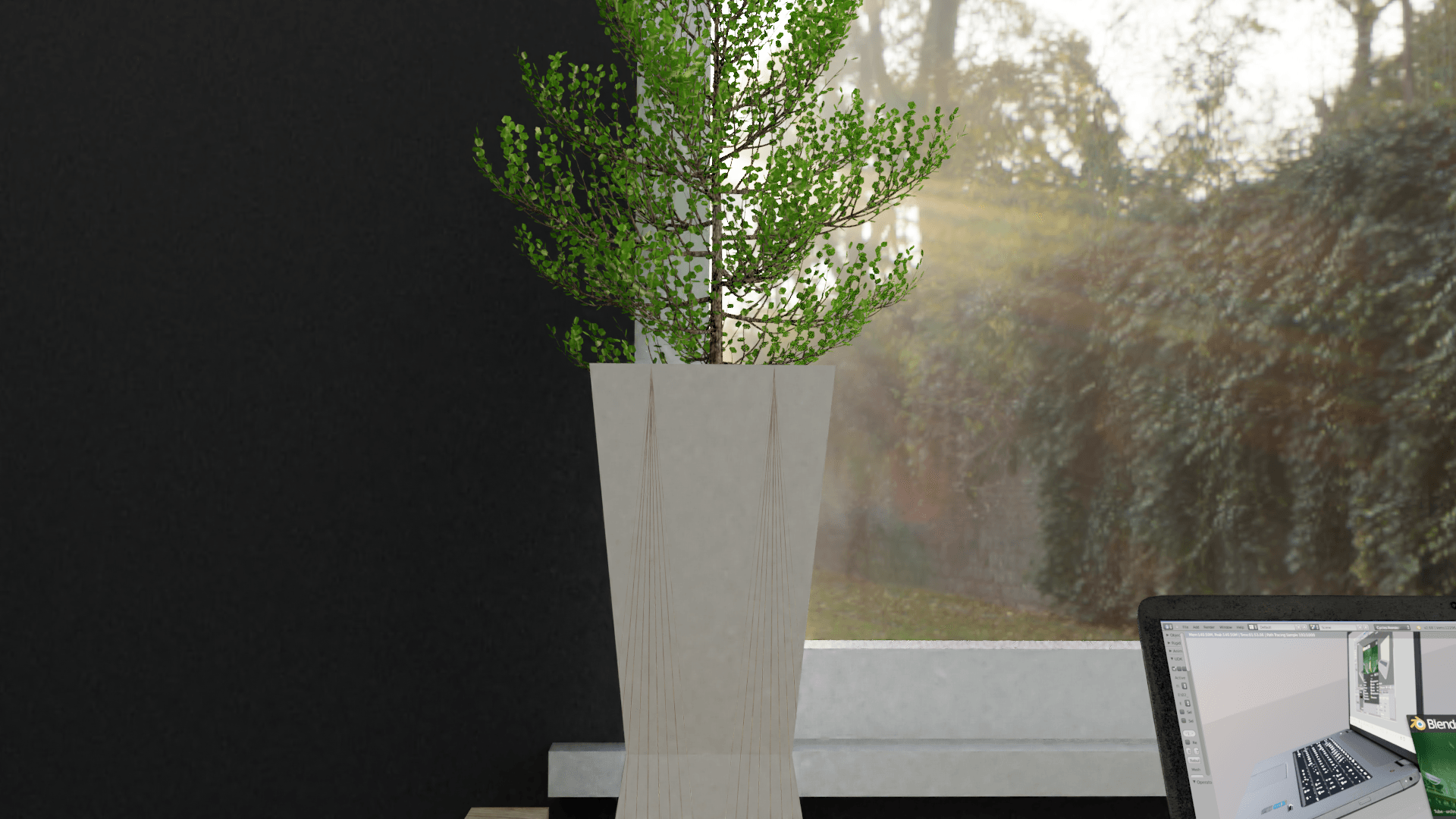
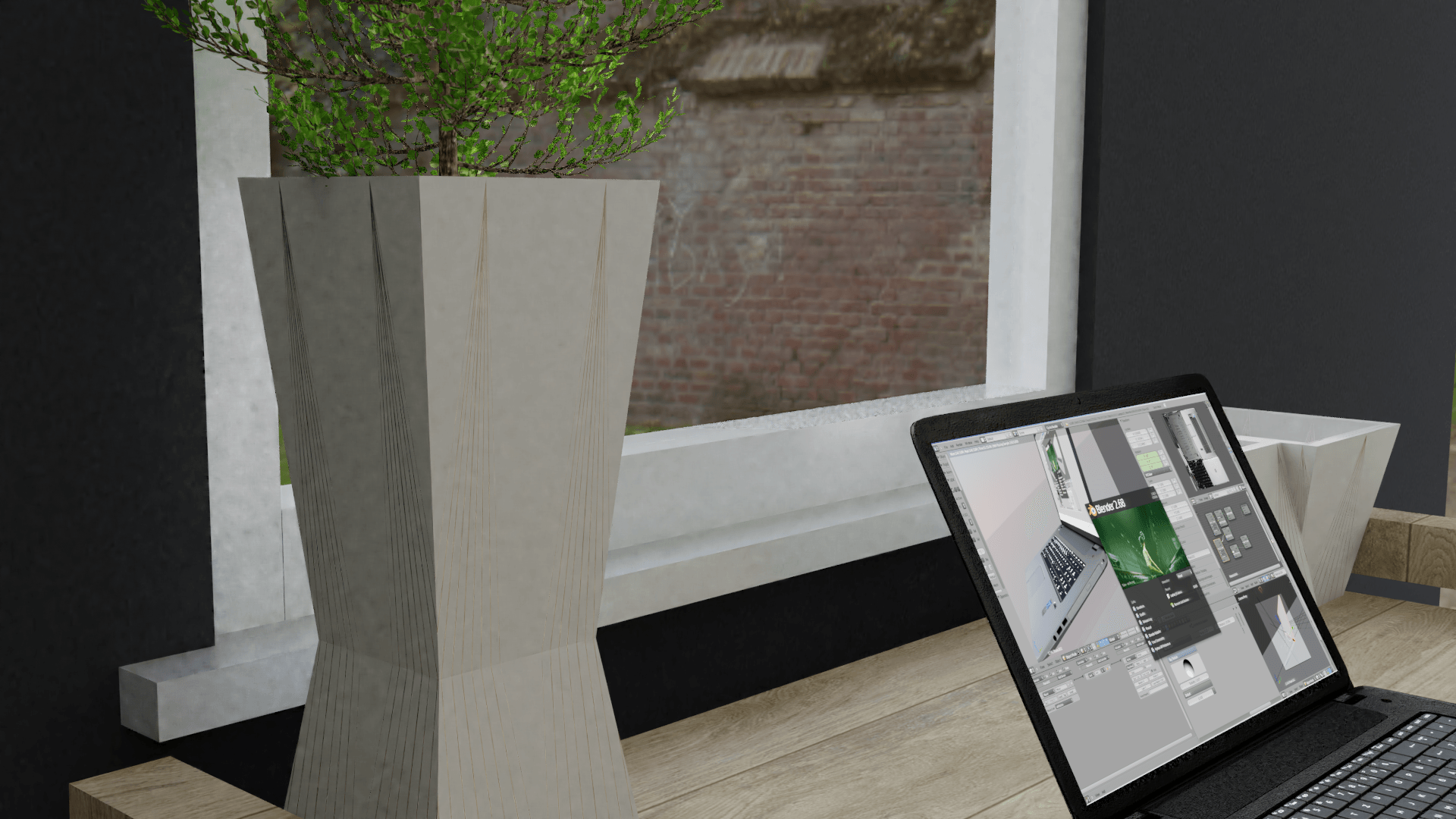
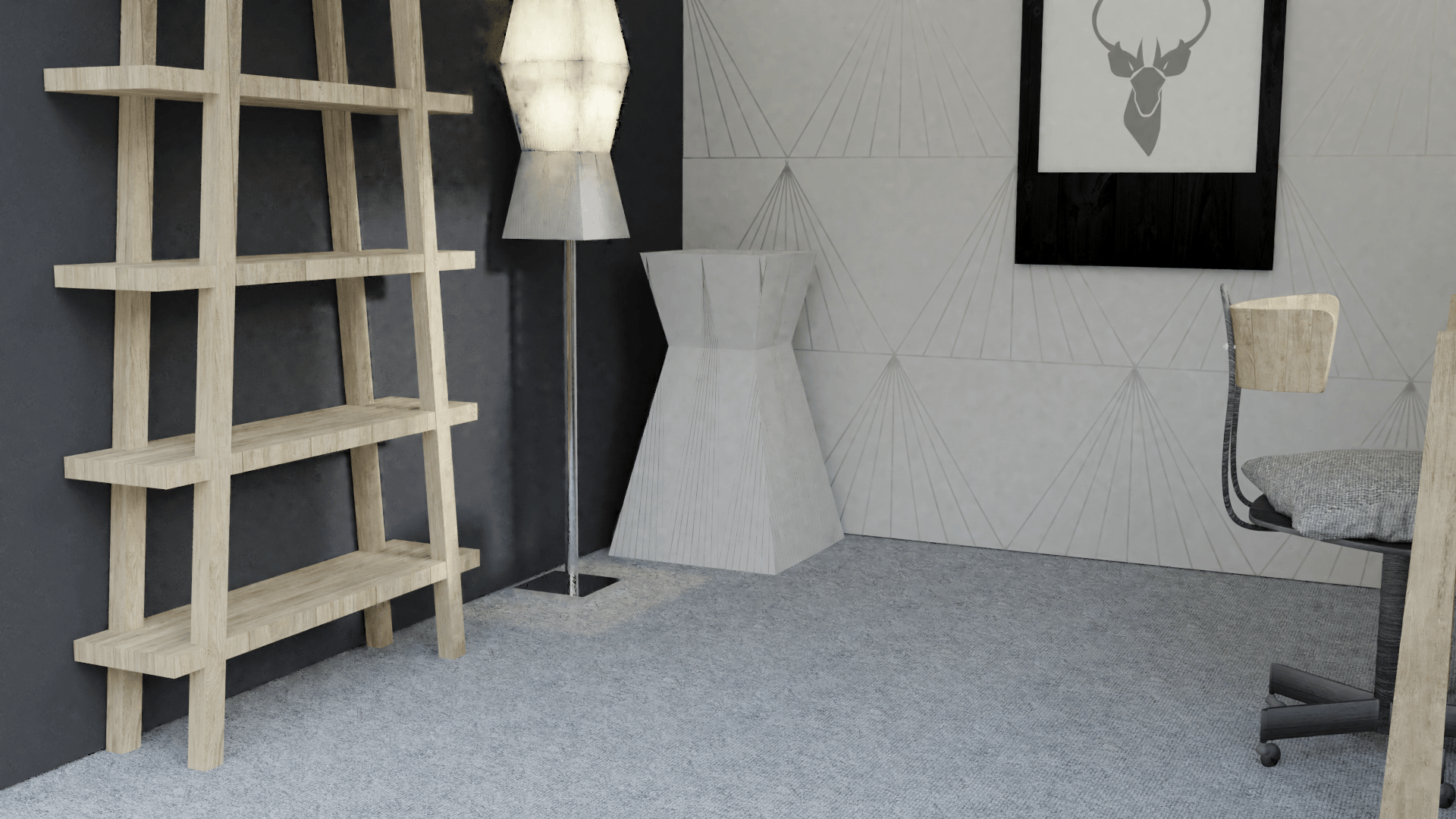
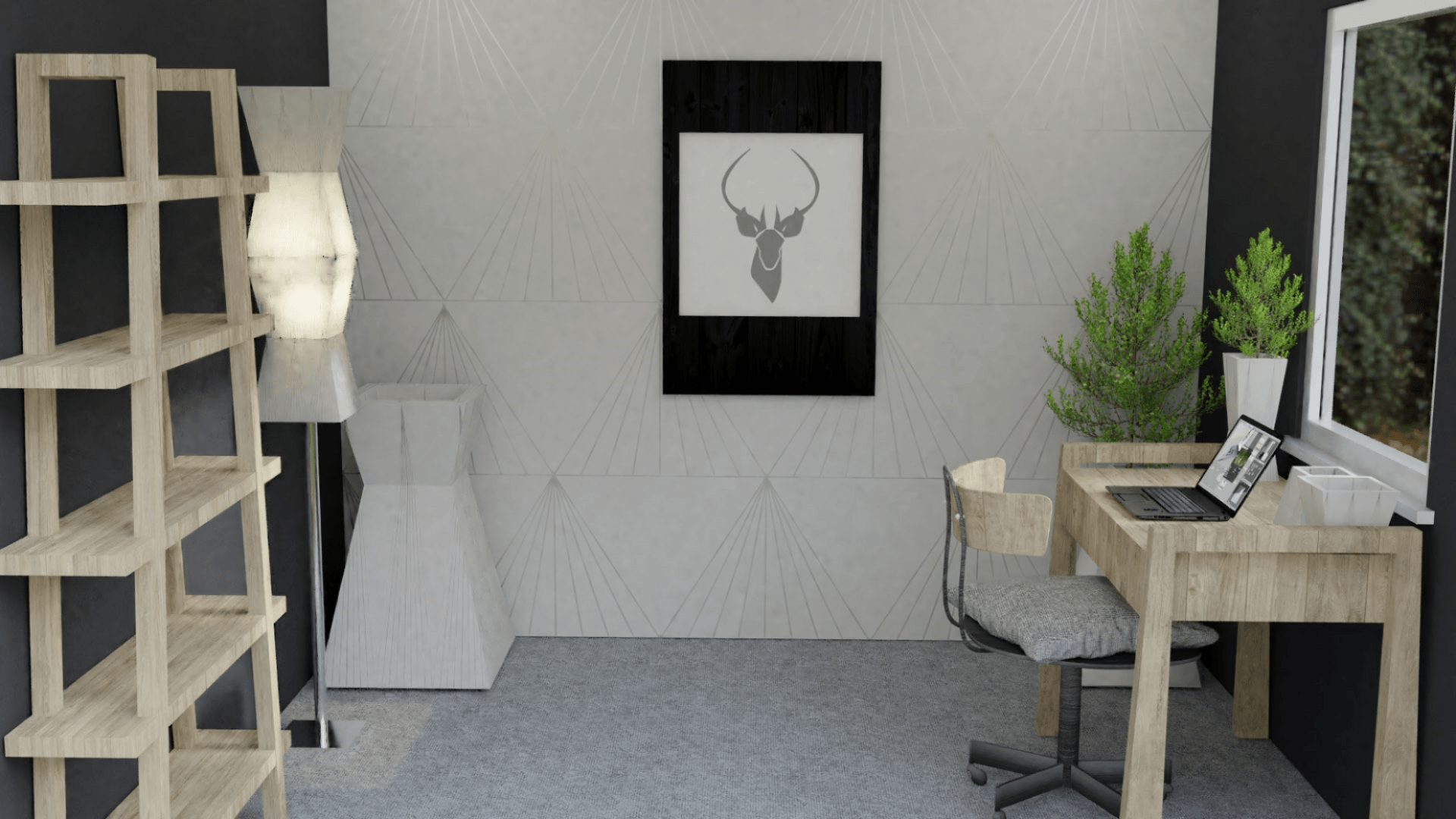
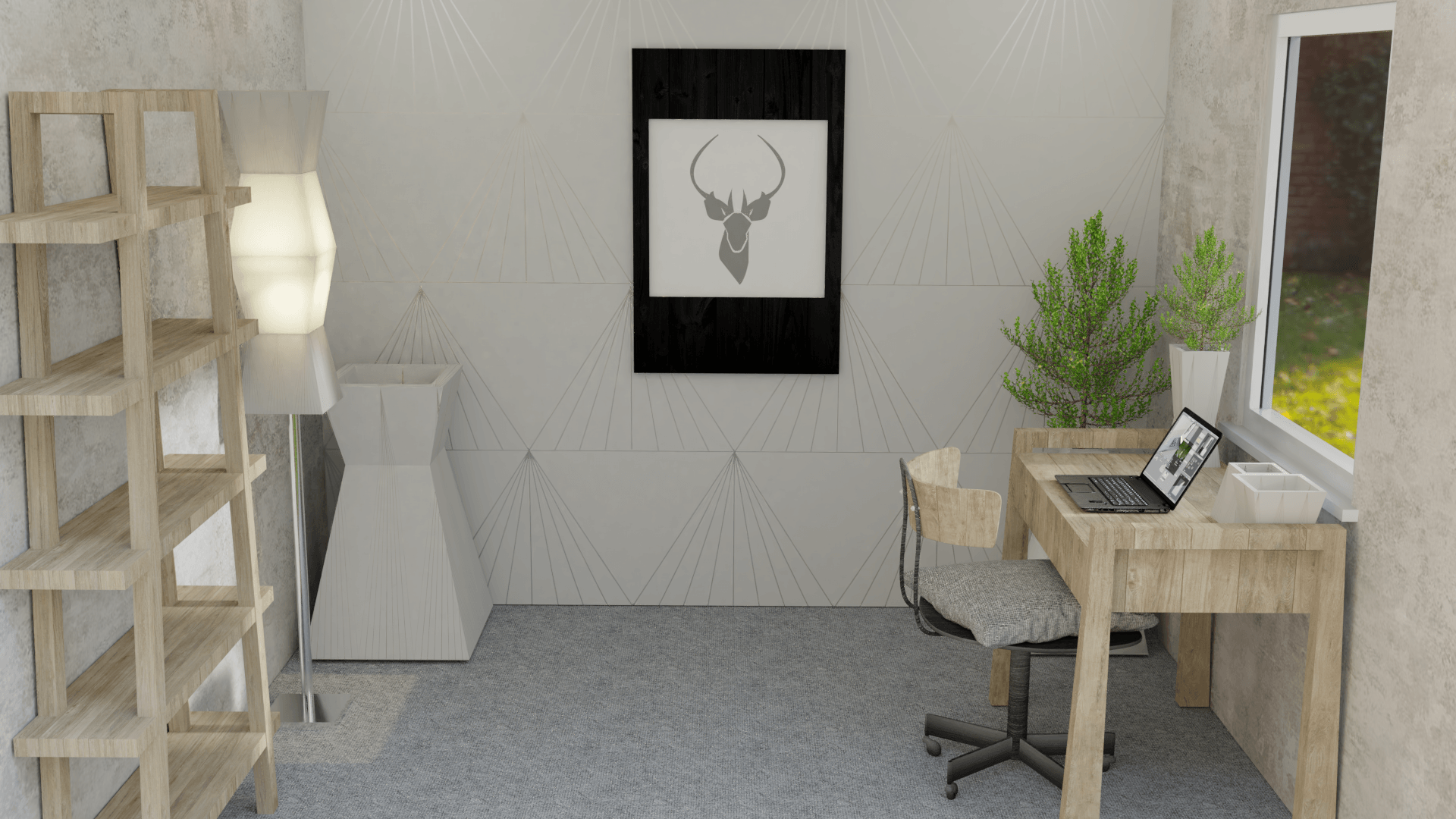
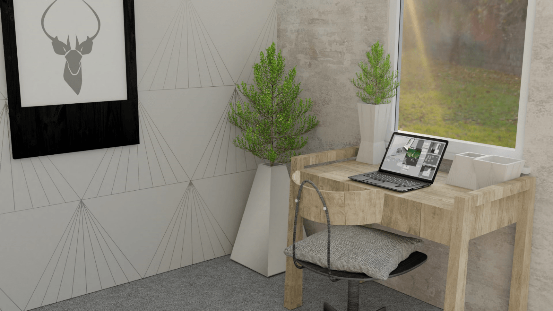
Below I have experimented with a dark grey wall texture. This makes the room look darker, however, makes the products in the Kontor collection stand out to the audiences eye:
The grey wallpaper definitely looks more aesthetically pleasing and offers a more professional outlook on the products in ‘the scene’. The only issues with some of these images are that there are a bit of ‘noise/ fireflies’. Furthermore, the scene looks darker are the walls are now a dark grey rather than a light colour.
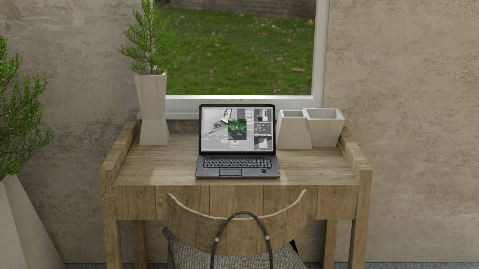
I looked into this further to improve my work and came across a strategy whereby I remove the ceiling and the ceiling lights, then replace everything with an area lamp, scale the size up, and use portal lighting. This gave my scene a more crisp, brighter and better quality image.
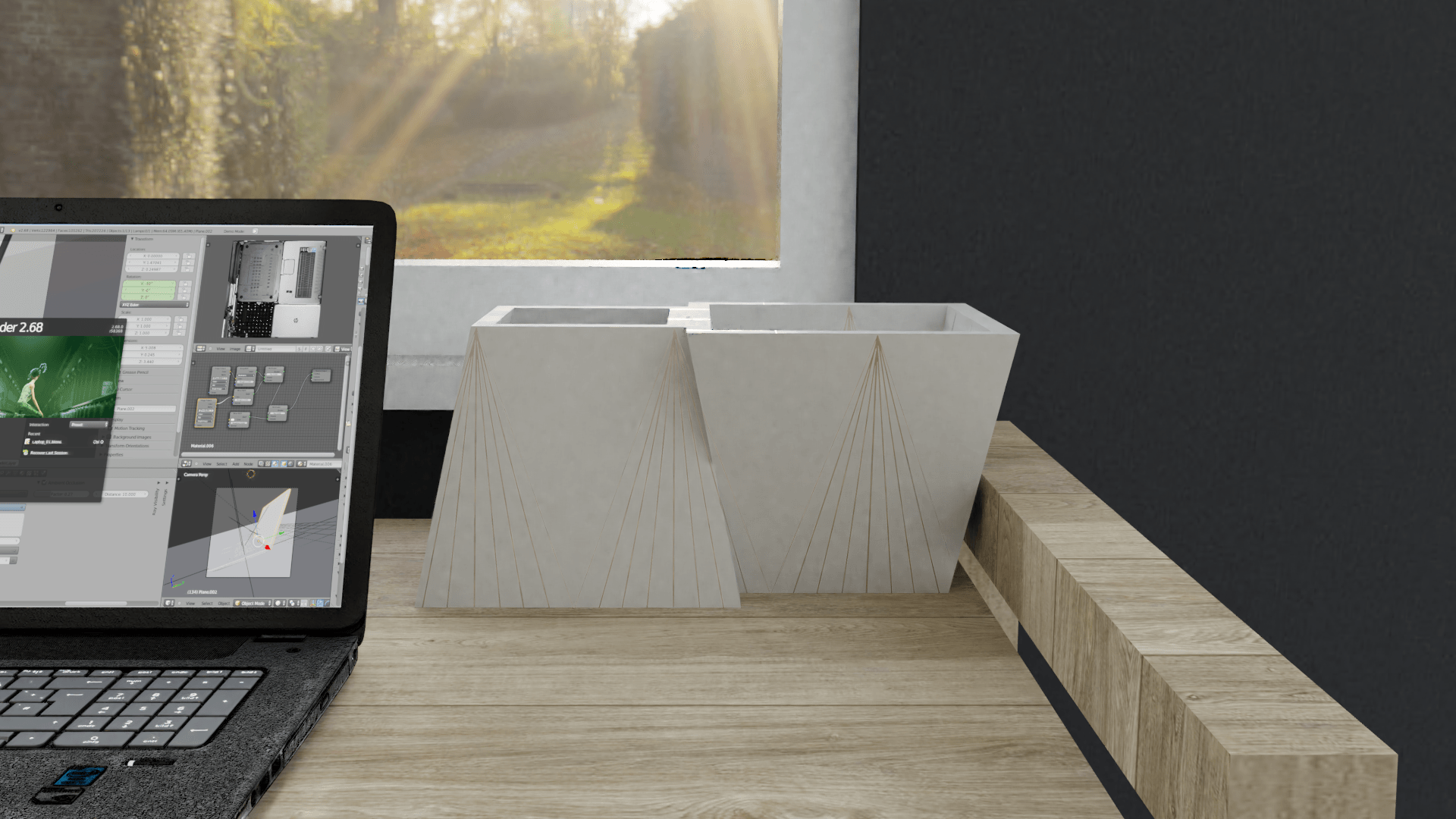
In order to get visual and good quality images from my ‘scene’, I need to render images out. Rendering is a process where you generate photo-realistic images from a 3D model/s from various computer programs – in my case blender. The result of the displayed product is called rendering (Birn, 2013).
As there are a lot of images that I need to render, I have been researching how to optimize my rendering in order for the process to speed up, yet get a professional quality image. Below are some tutorials that I have watched in order to gain this knowledge:
The information that I gathered from watching these videos include how to change certain preferences in order to speed up and optimize renter time. These changes are as follows:
Change to use the GPU Compute in the render setting toolbar on the right hand side of blender,
Go into user preferences > system > then change to ‘CUDA’ and chose the graphics card in your computer,
Reduce the amount of samples,
Reduce the amount of light bounces to around ‘2’,
Add a portal light by: add > lamp > area > then change the preferences to portal light and finally scale the portal light to the size of the window to mimic the lighting which will only be used in rendering.
Change the tile size to 512 rather than 16.
By using these settings, the rendering time should decrease dramatically.
However, by using the new computers in the university, I do not need to use the GPU as the computer has a very powerful and effective CPU, therefore the settings change once again:
Set back to CPU rendering,
Set the tile size to 16,
Decrease the samples for render down to 32,
Switch on denoise,
Make sure all light paths are down to ‘2’,
Keep portals the same for each window.
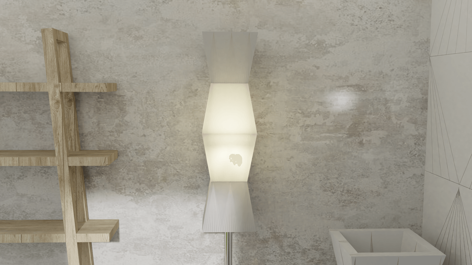
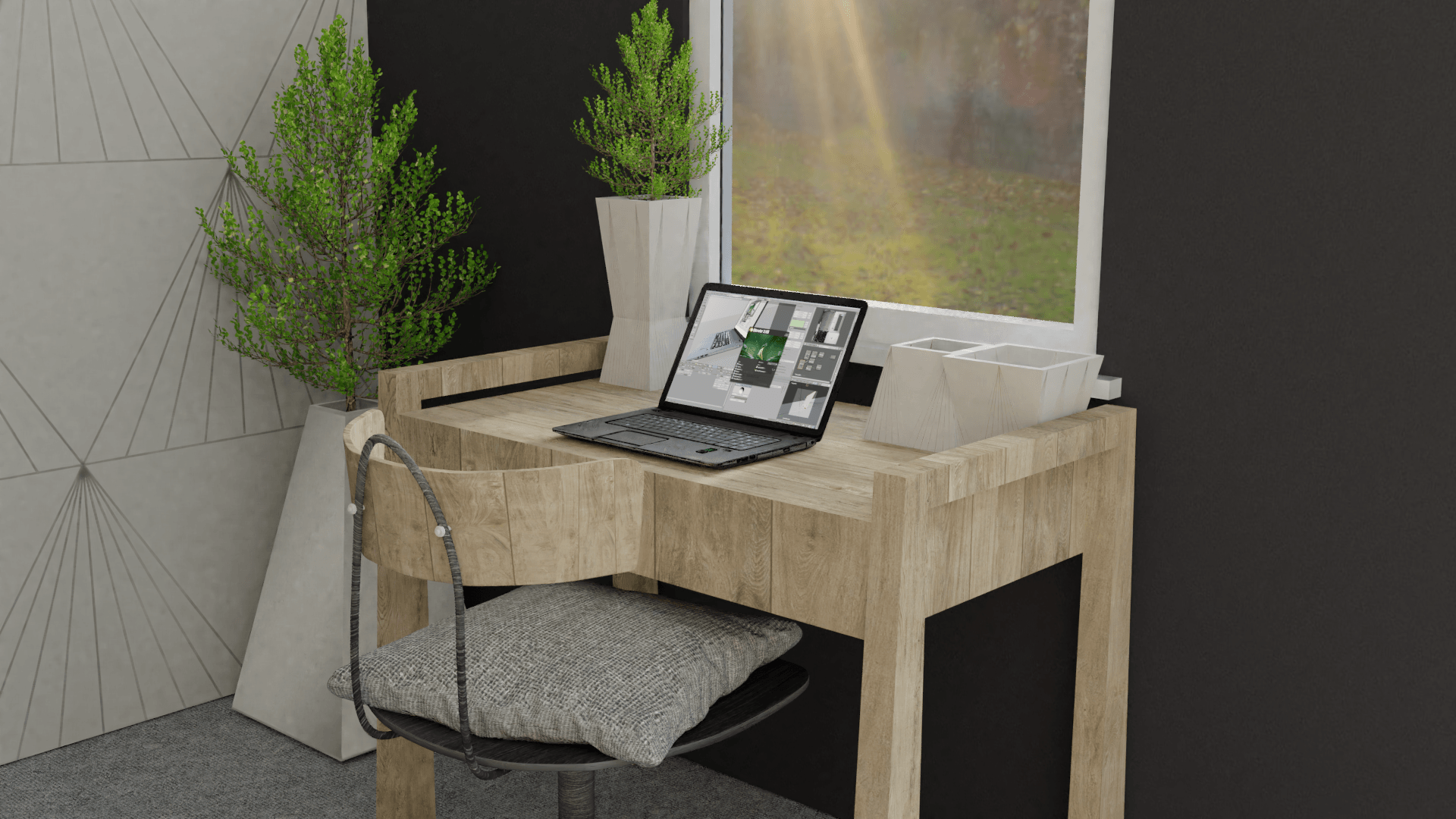
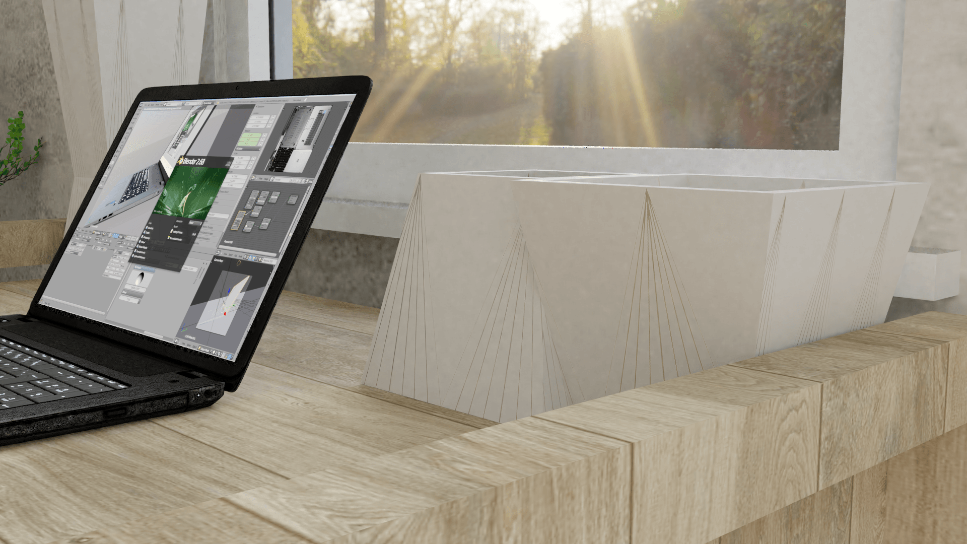
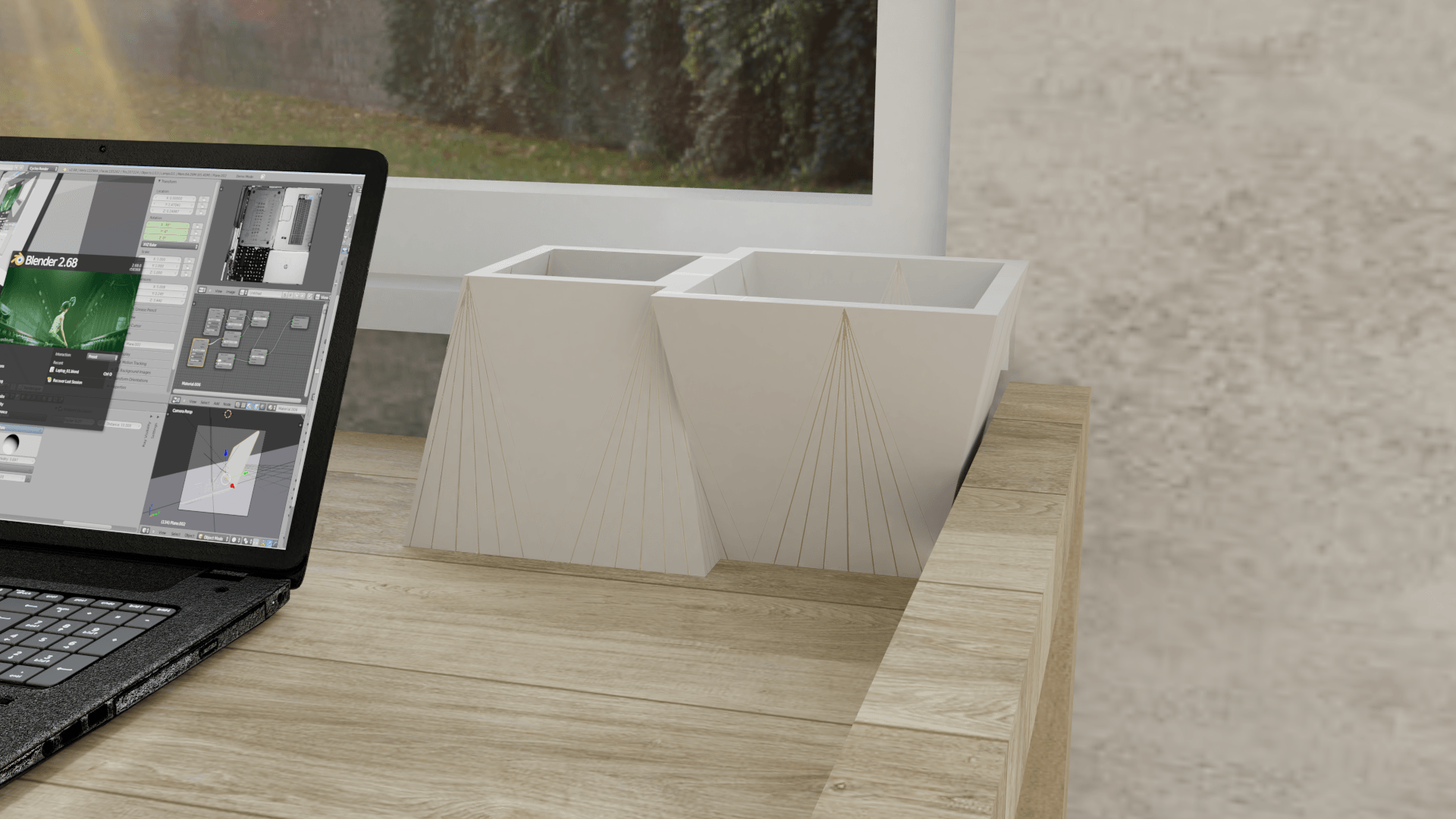
I feature I found important while playing around with the settings in blender, is ‘ambient occlusion’. This feature works with the lighting and make my renders look considerable better. Please see below for the before and after:
As you can see, the second render with the AO (ambient occlusion) looks crisp and lighter. Furthermore, there are considerably less ‘noise/ fireflies’ in the scene, which makes it look more professional and photo-realistic.
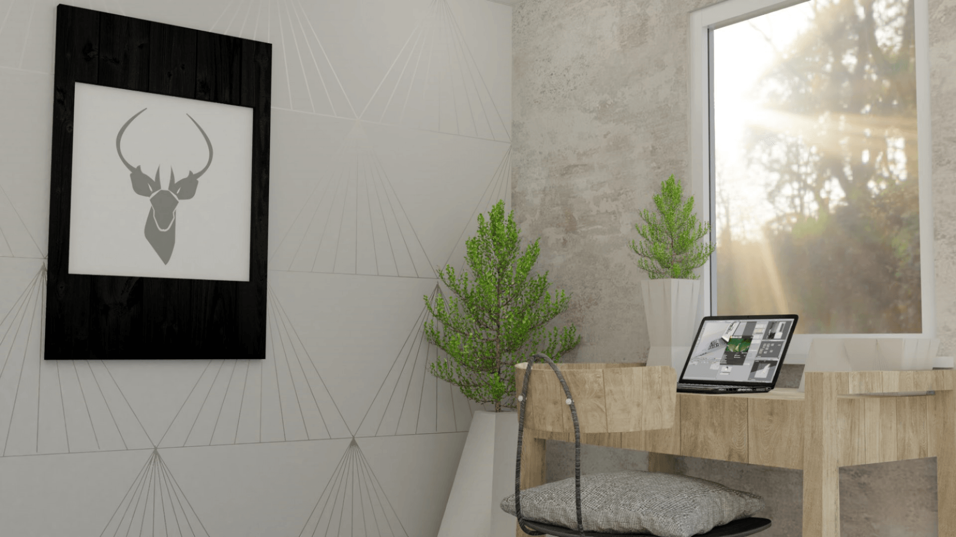
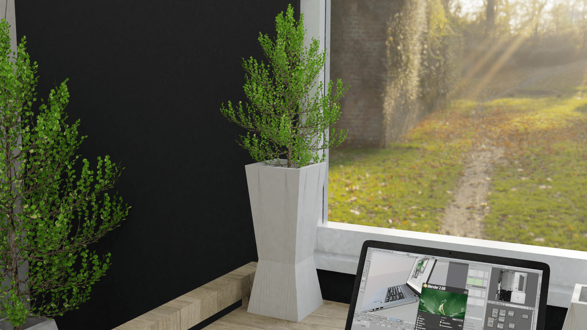
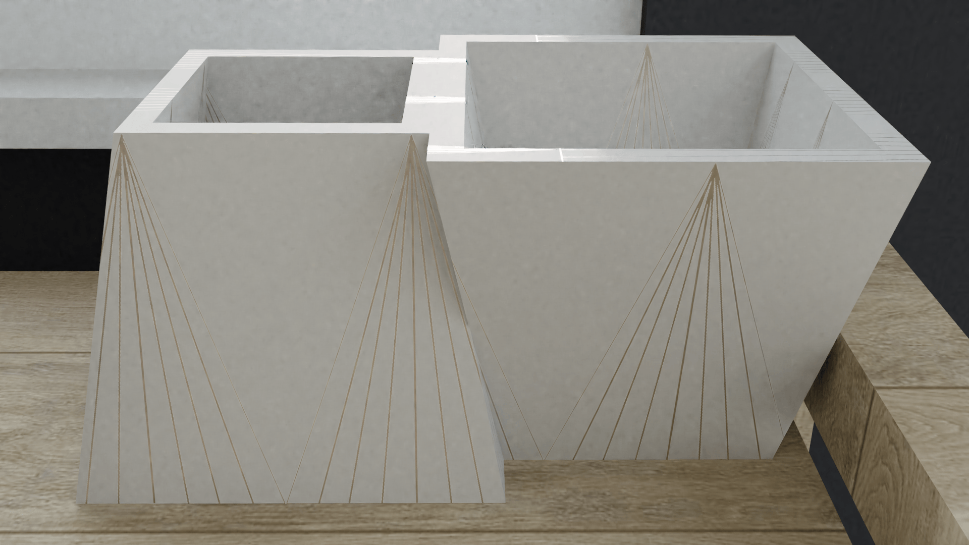
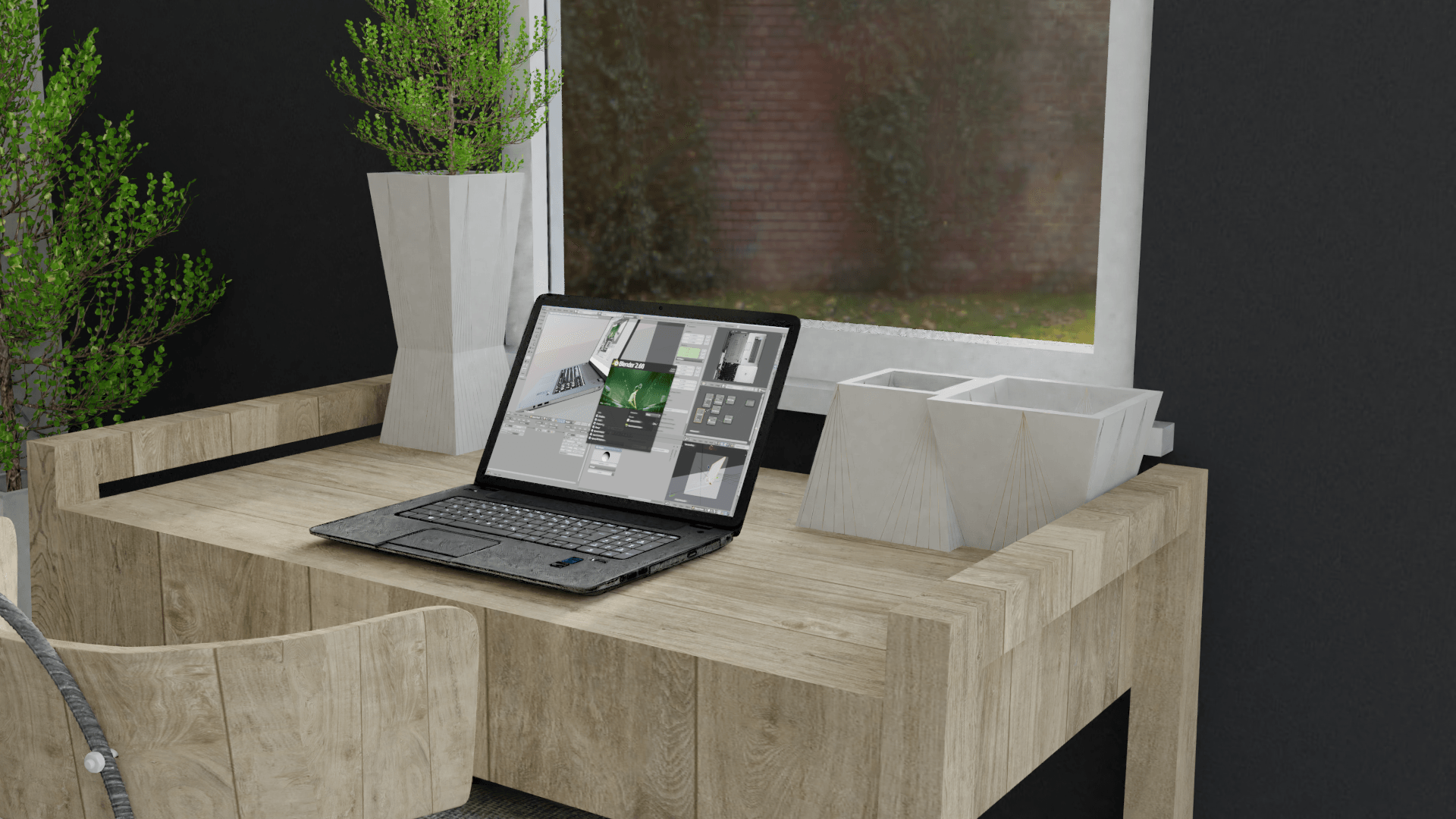
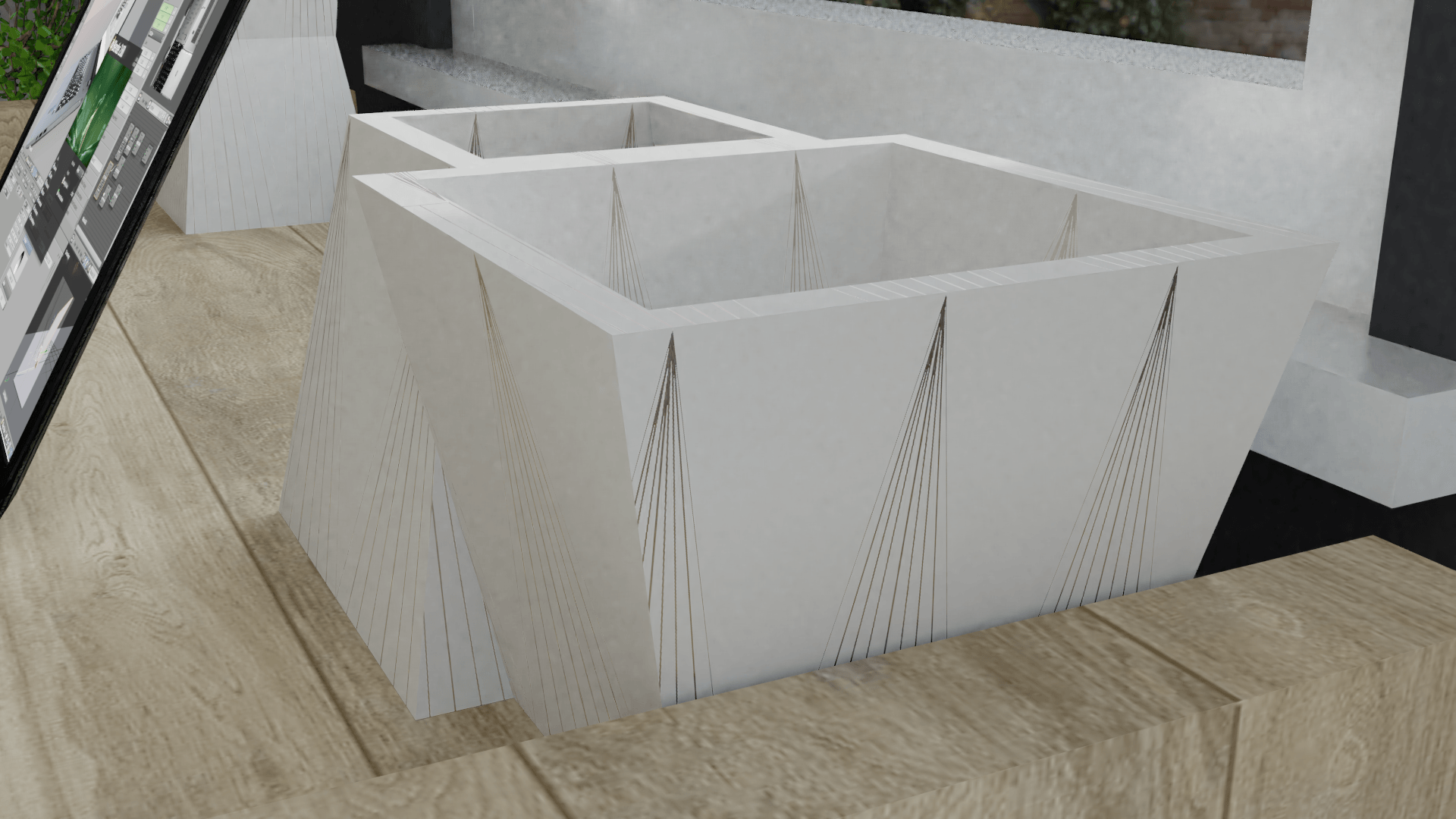
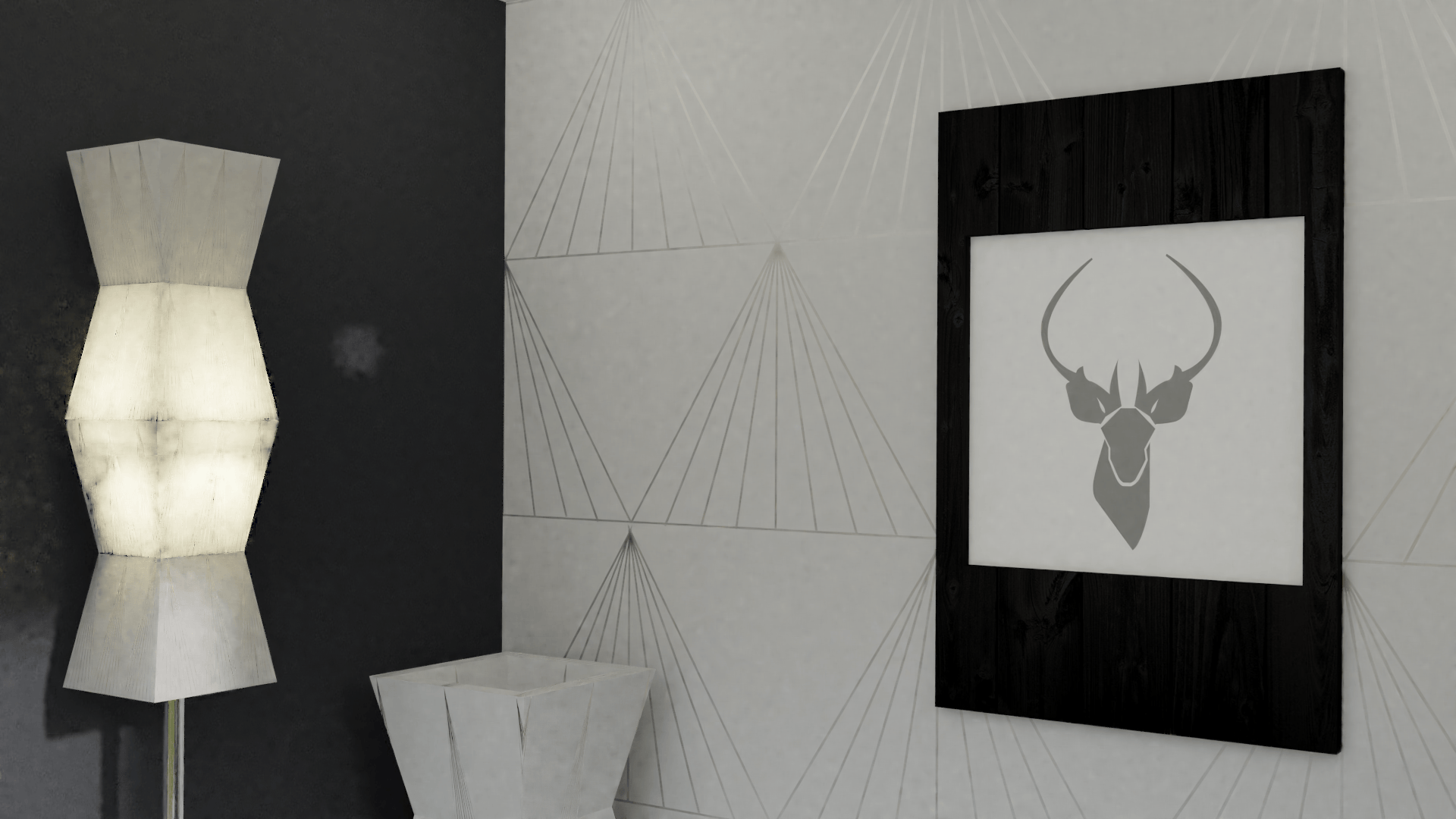
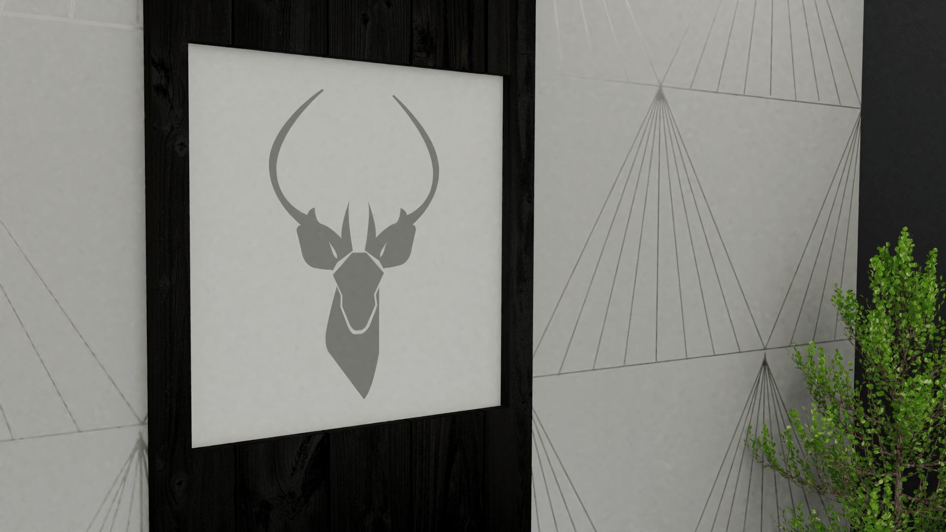
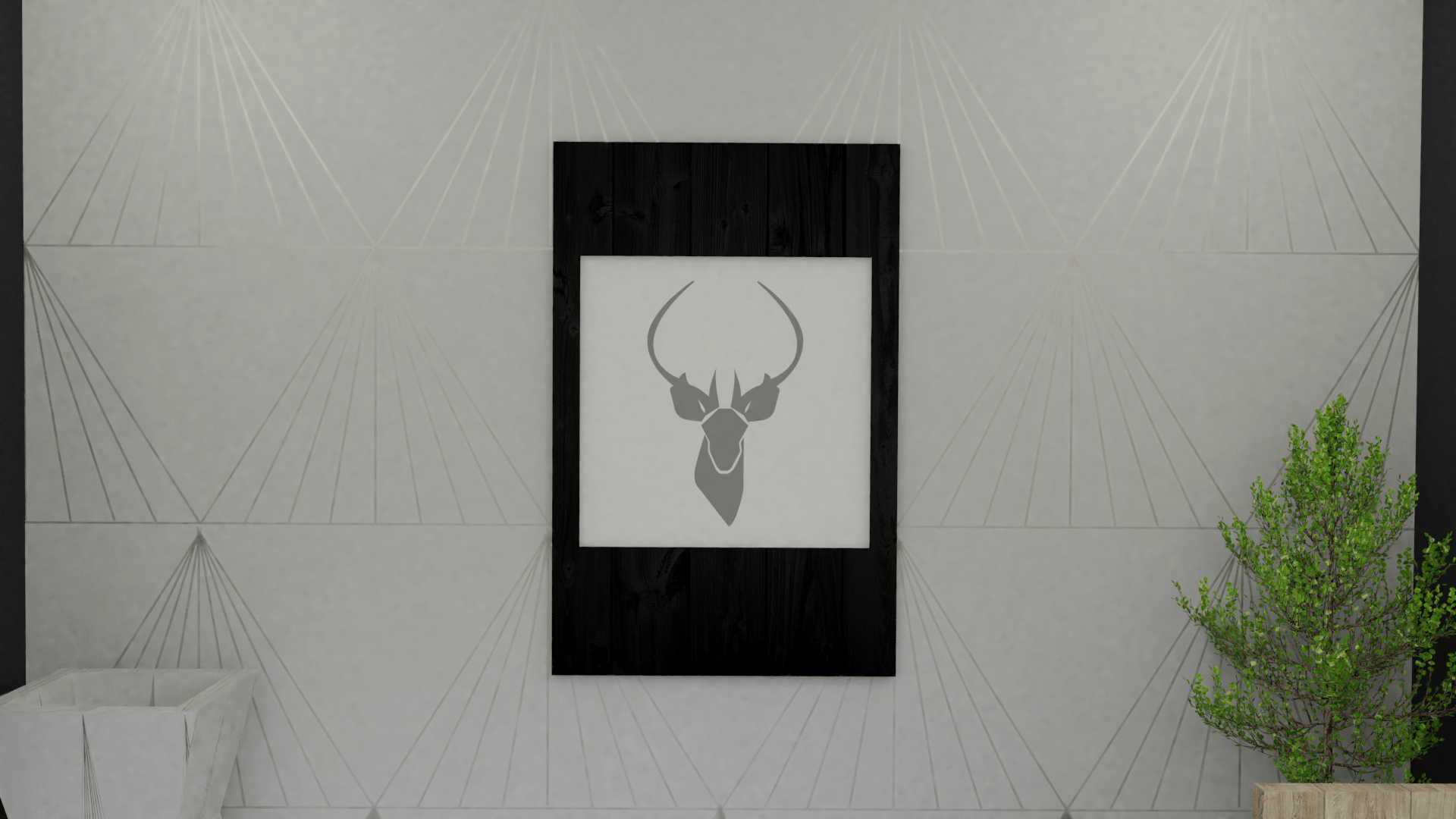
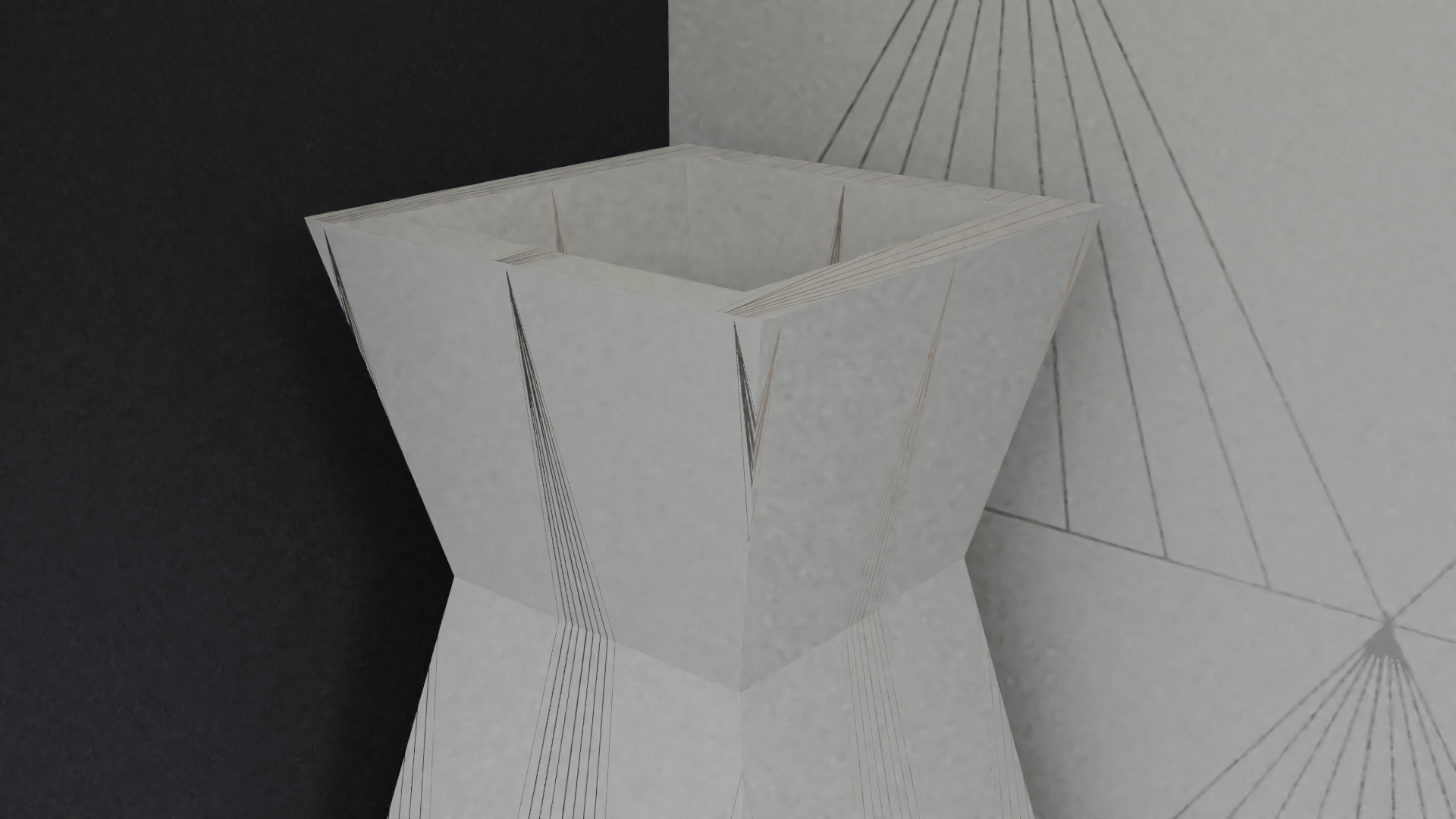
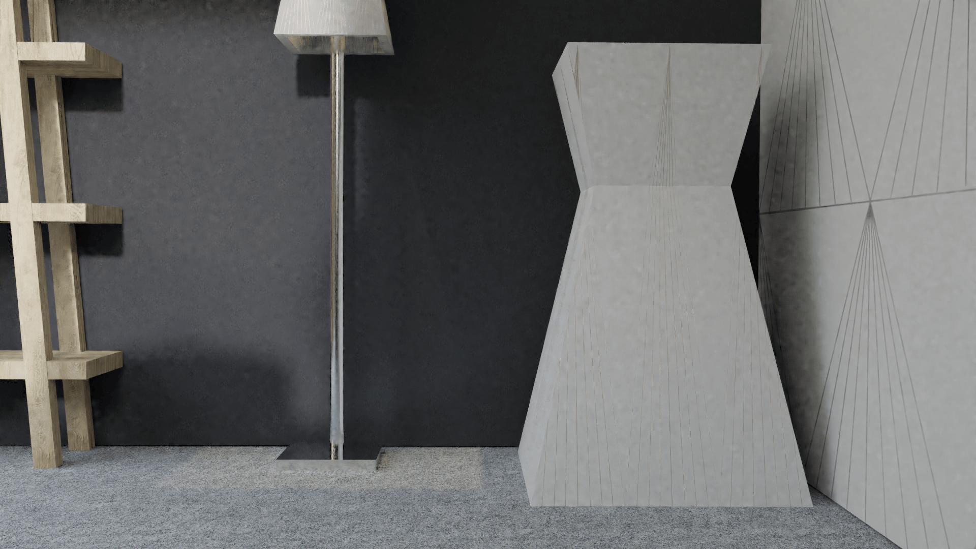
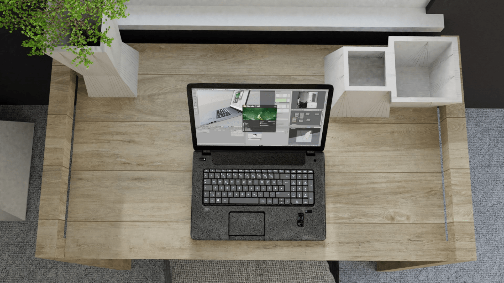
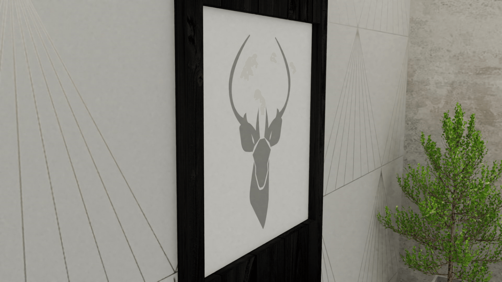
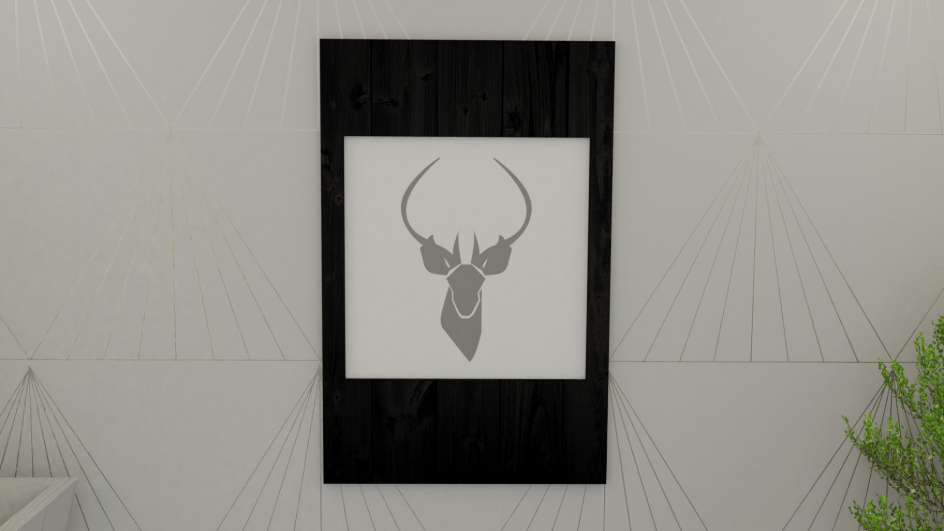
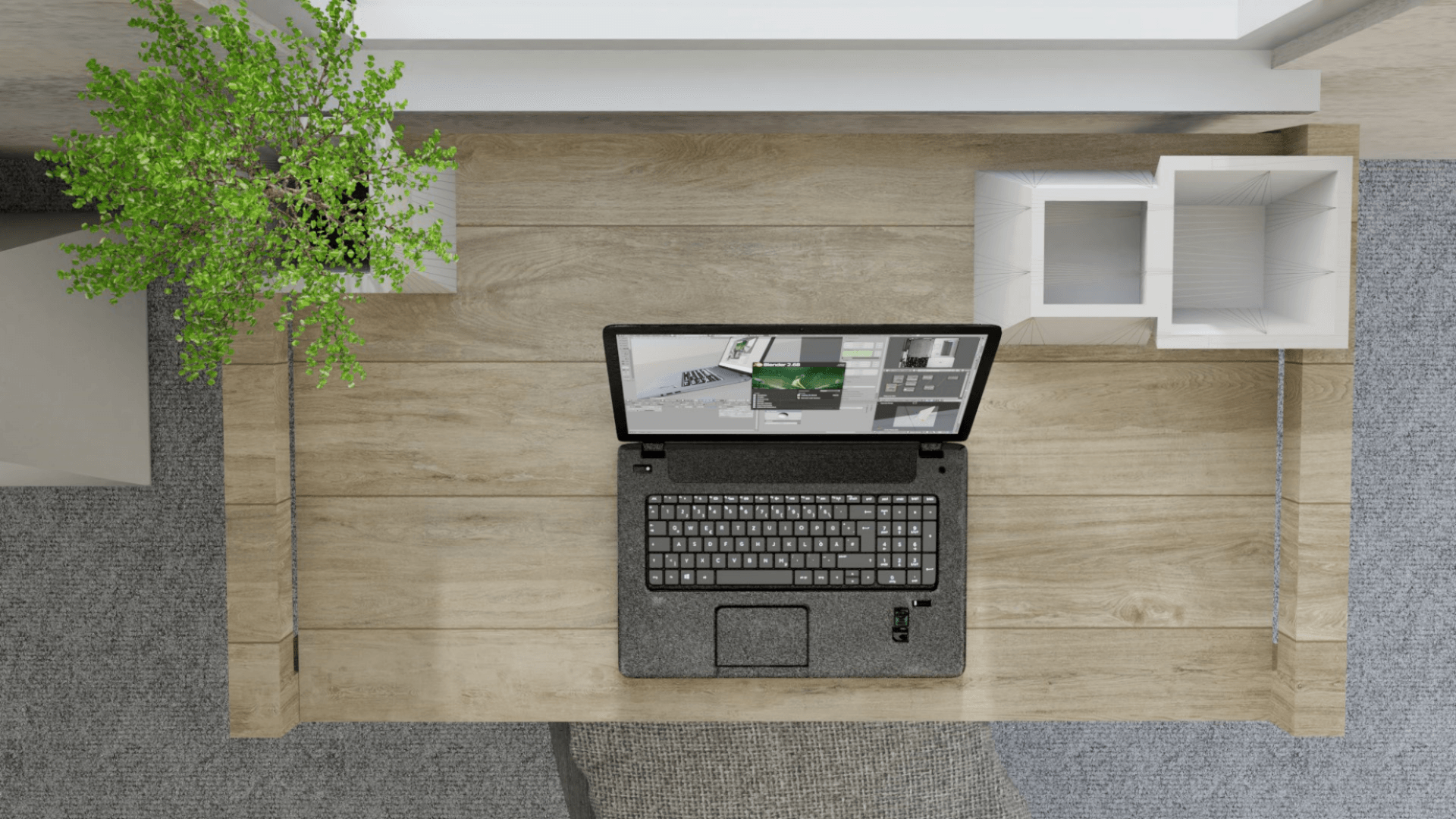
To create a professional collection look, I have rendered out individual images for each product in the Kontor collection. Please see below for these images:
Bibliography:
Birn, J. (2014) Digital Lighting and Rendering, 3rd edition. USA: Jeremy Birn.
Remington Graphics (2017) Speed Up Renders in Blender (Cycles)!
. Available from https://www.youtube.com/watch?v=dFdaoxcnvCc [accessed 5 December 2017].
Blender Guru (2017) 18 Ways to Speed Up Blender Cycles Rendering
. Available from https://www.youtube.com/watch?v=8gSyEpt4-60 [accessed 5 December 2017].
Blender Guru (2015) Using Portals to Accelerate your Render Times
. Available from https://www.youtube.com/watch?v=oveSskhIEAc&feature=share [accessed 5 December 2017].
When the Kontor collection is complete, I wish to market it aesthetically and photographically in terms of the various platforms and features it will be on.
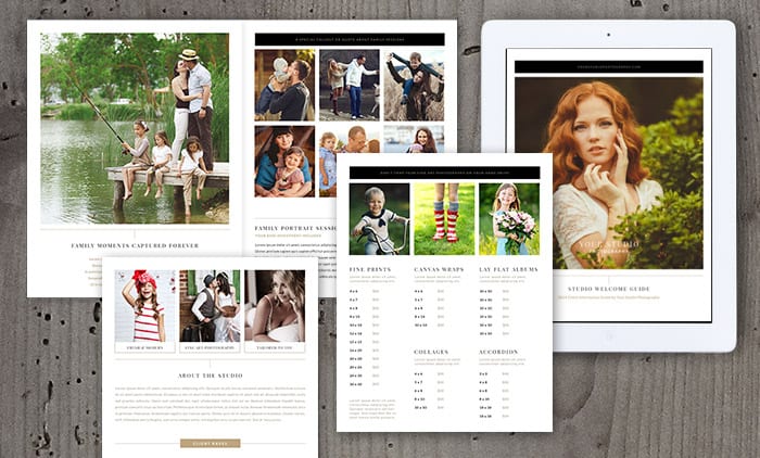
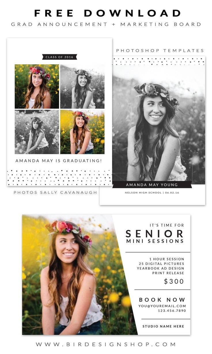
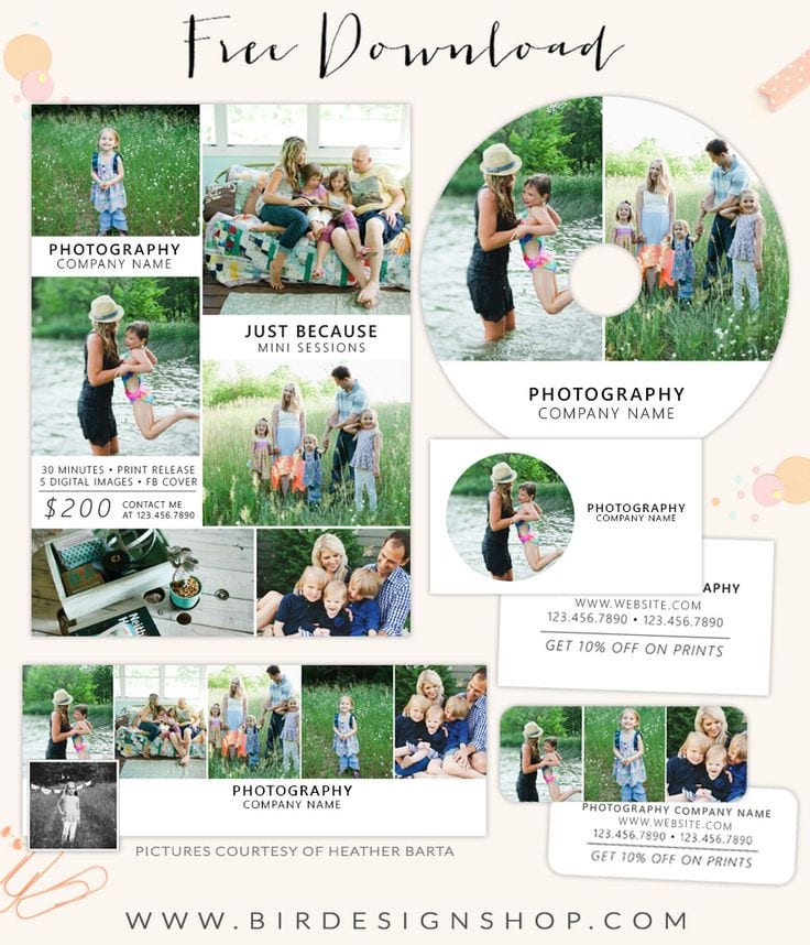
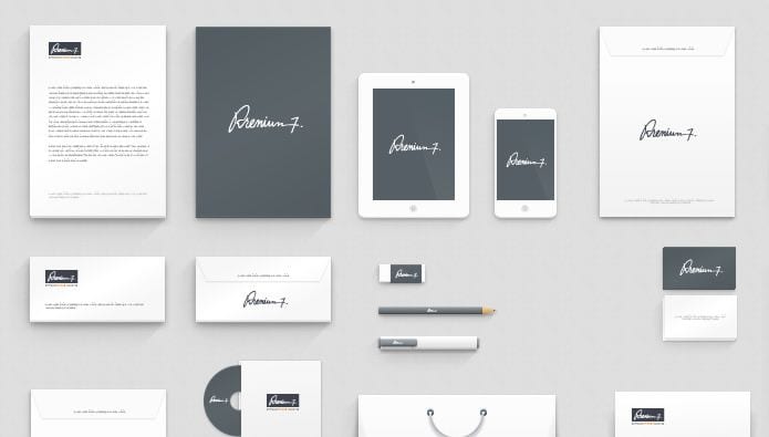
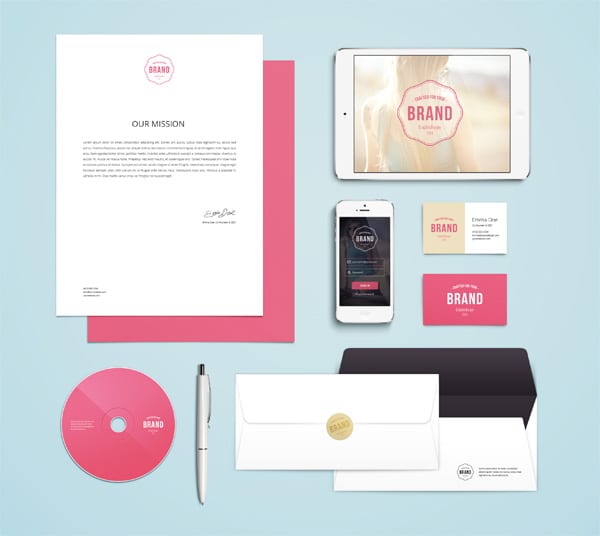
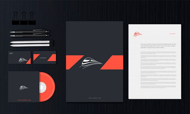
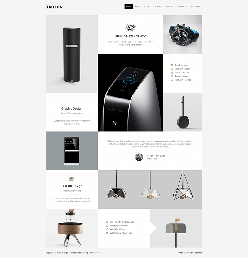
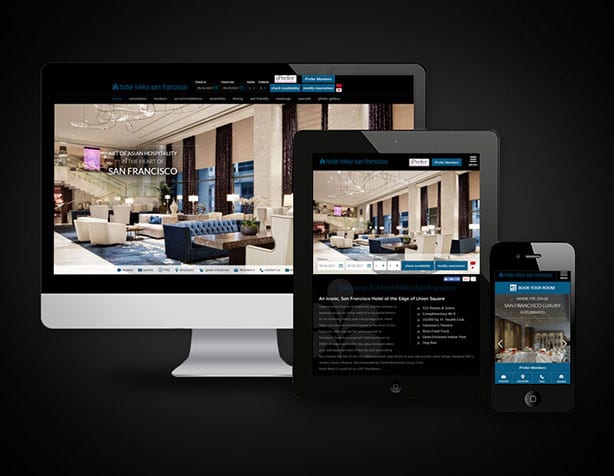
Here are some examples of branding design templates/ creative portfolios:
As you can see, they all differ creatively and aesthetically. The branding design templates are useful as they offer continuity and enhances the brand name and image. Furthermore, they show consumers the variety of media the company cater for, therefore illustrating a more professional an accessible business. The creative portfolios offer similar attributes, however deliver less media in a more creative and unique way. The creative portfolios are not necessarily about each individual product the business offers, however, use aesthetically pleasing modern design techniques to catch the audience’s eye.
The branding design template above is the main inspiration and influence as to how I will present the Kontor brand to enhance recognition so the audience/ consumers will familiarise and therefore gain a wider interest in the products for the home office. It offers a classy yet professional outlook on the brand and advertises in an aesthetic design manor. The use of grids and spacing conveys the attractiveness of the brand and therefore enhances the professionalism and quality of the product of service. All the forms above (letters, business cards, pencils, phone, CD, tablet and notepad) are items that you would find in a home office, therefore it is plausible to use these products when creating my own branding design template. As well as populating the consumers with a strong brand image, is it also relating to the products Kontor offers.
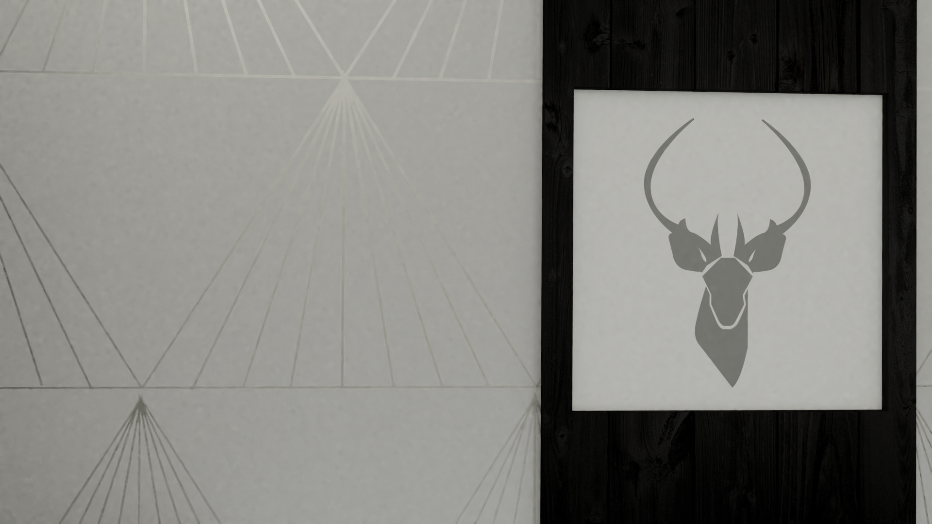
Logos are a visual cornerstone of a companies brand. It is the businesses identity which is visually expressed towards the audience (Bubba, 2017). The logo is the ‘face’ of the company, and through colours, lots, images and graphics they provide essential information about a company that allows customers to identify with the company’s core brand (Gilikin, 2017).
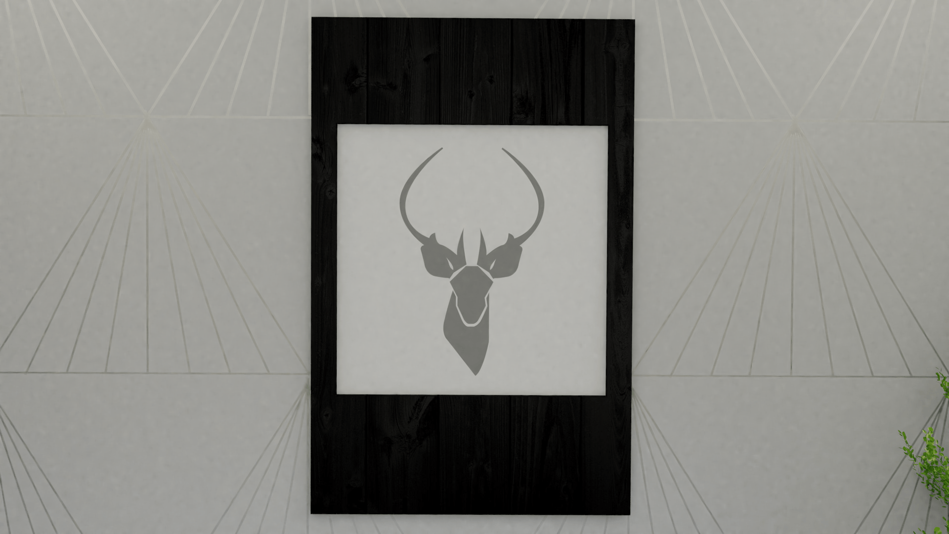
A well designed logo is an essential part of any company’s overall marketing strategy, therefore I designed various logo’s with different design techniques to attract the customers eye:
Above are 6 logo designs I created with similarities and variations surrounding 2017 design trends.
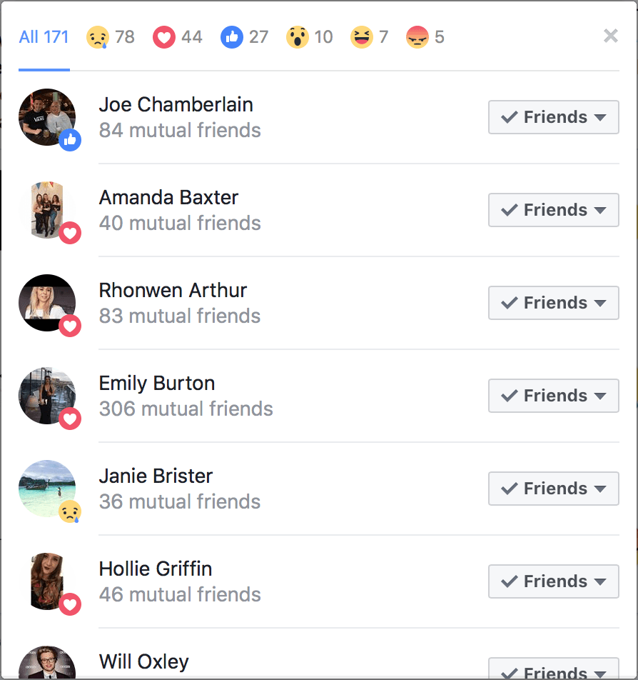
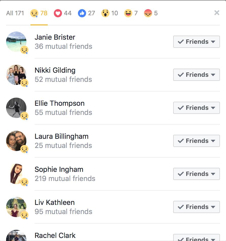
In order to decide which logo will be the final design. I took to Facebook and asked the population which design they preferred, along with a short description of what the brand is for (furniture collection).
Below is the PNG file I uploaded to Facebook, and used the ‘like buttons’ so people could distinguish which design they preferred:
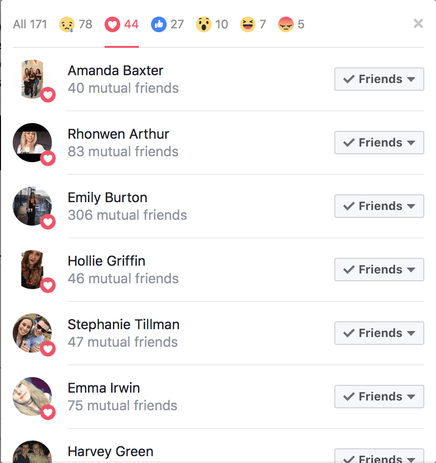
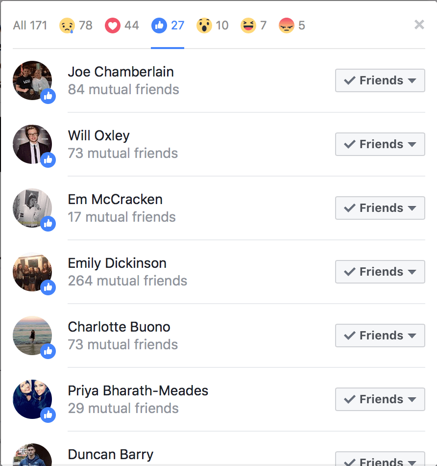
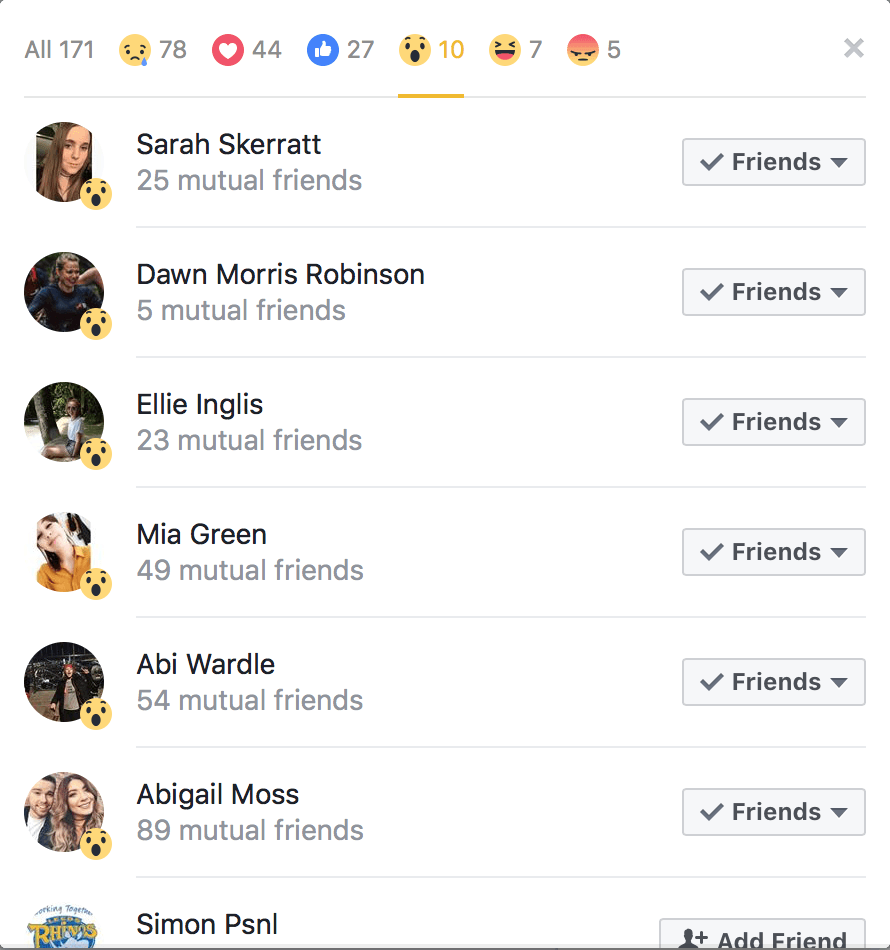
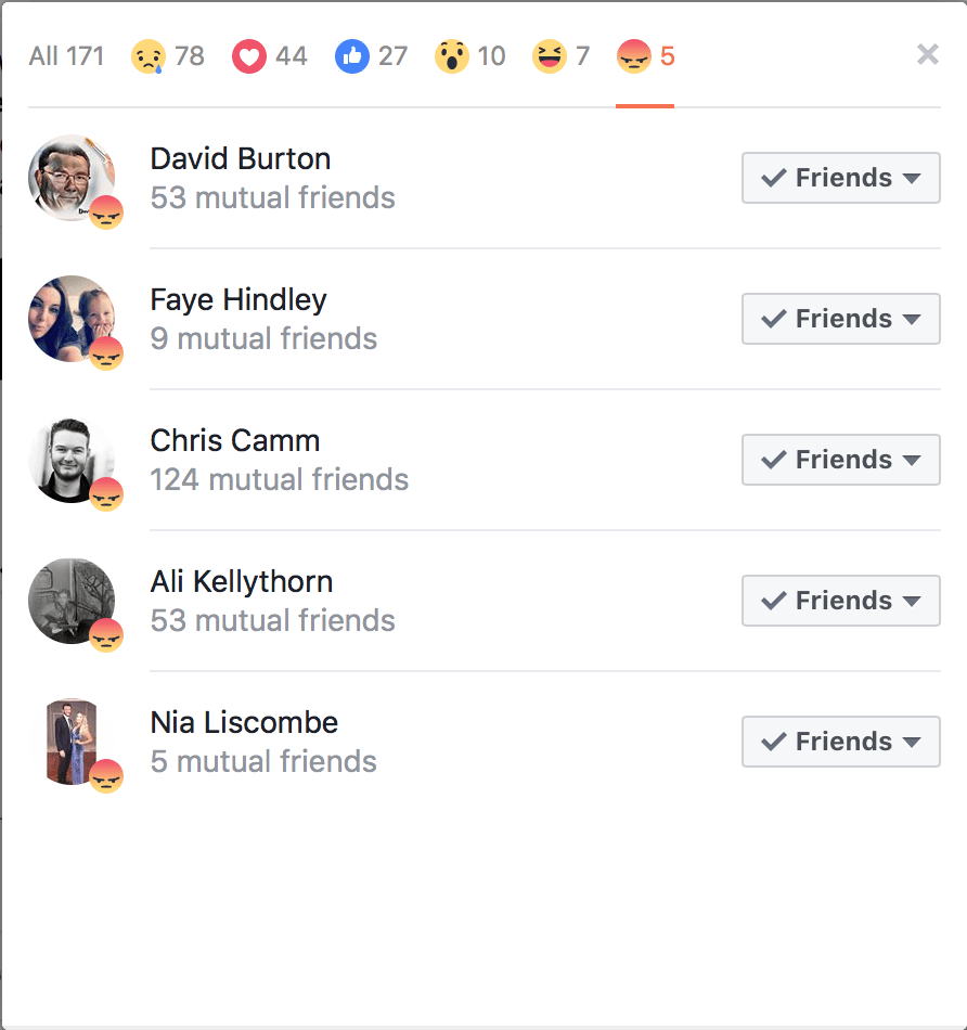
Below are the response and ‘likes’ that were the outcome of the post:
Bibliography
Bubba (2017) 25 Posts on Why a Good Logo is Essential to Your Business. Branding Beat. Available from https://www.qualitylogoproducts.com/blog/25-posts-on-why-a-good-logo-is-essential/ [accessed 27 November 2017].
Gilikin, J. (2017) Importance of Logos in Business. Chron. Available from http://smallbusiness.chron.com/importance-logos-business-577.html [accessed 27 November 2017].
Branding is a business feature that communicates with the audience. Branding is where the business, product or service has a unique name and image which stays in the consumers mind, and is delivered through advertising and other marketing methods. Branding establishes a significant and differentiated presence in that market and is used to attract and retain loyal customers (Business Dictionary, 2017).
Branding is important as it goes beyond just a memorable logo. Good branding increase the value of the company, provides employees with direction and motivation, and further makes acquiring new customers easier (Deluxe, 2015).
Below are several ways branding can impact a business:
Improves Recognition,
Creates Trust,
Supports Advertising,
Build Financial Value,
Inspires Employees,
Generates New Customers.
The branding for Kontor is a vital part of this project, and will define whether the products outcome will be professional. Therefore, below is a list of what I shall create in order to produce good branding:
Logo
Branding Guidelines
Communication
Design (colour, font, etc.)
Behaviour
Language
Culture
Mission and Vision
Design
Print Advertisement
Web Advertisement
Banner Ad
Web Page Layout
Promotional Video
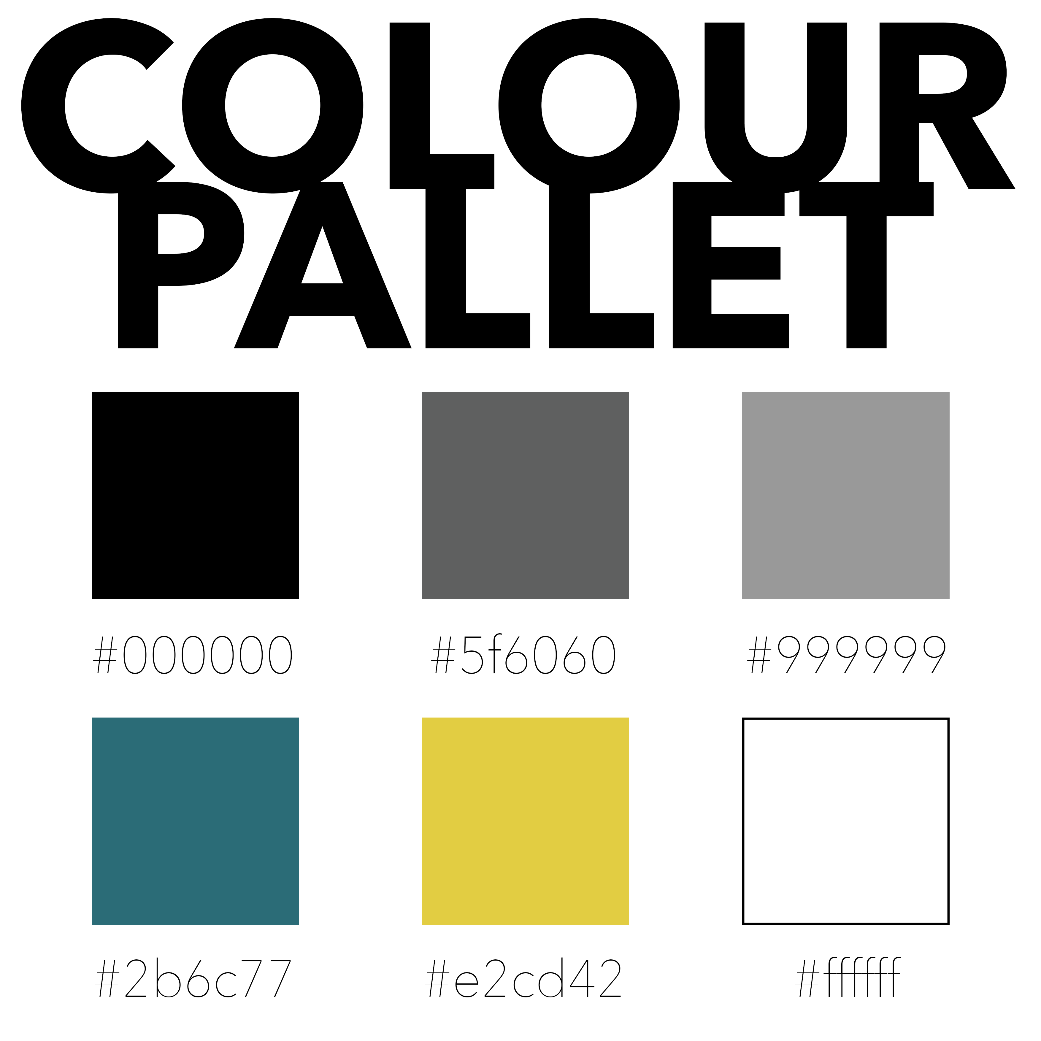
Below is a colour pallet designed in order to maintain the Kontor brand image and identity. These colours will be used in all marketing products such as: advertisements; letters; emails; promotional material and websites.
The use of the specific colour number tells people what specific colour they have to use when creating products. This means that the Kontor brand stays consistent and maintains its image in order for consumers to recognise them.
Kontor will be renowned for their good quality customer service. The behaviour when dealing with customers will be positive and polite, and furthermore help them with any query possibly. All these features come under marketing as the important factor Kontor is concerned with is developing strong relationships with customers and enhancing the Kontor image.
Bibliography
Business Dictionary (2017) Definition of Branding. BD Dictionary. Available from http://www.businessdictionary.com/definition/branding.html [accessed 27 November 2017].
Deluxe (2017) 6 Reasons Why a Strong Brand is Important for Your Small Business. Small Business Resource Center. Available from https://www.deluxe.com/blog/six-reasons-why-strong-brand-important-small-business/ [accessed 27 November 2017].
Strategy (2017) Why is Branding Important? Marketing and Technology Solutions. Available from https://strategynewmedia.com/why-is-branding-important/ [accessed 27 November 2017].