Style Research

According to Bassett Furniture, there are several types of styles in which furniture is influenced by:

  • Antique
  • Traditional
  • Vintage
  • Rustic
  • Art Deco
  • Retro
  • Modern
  • Contemporary

Furthermore, House of Home offer a few different styles to add to popular furniture types on the market currently:

  • Classic Contemporary
  • Transitional
  • Modern
  • Traditional
  • Contemporary
  • Rustic
  • Cottage
  • Tuscan
  • Midcentury
  • Electric
  • Country
  • Industrial

Bassett (2017) A Guide to Furniture Styles & Types. Bassett Furniture. Available from https://www.bassettfurniture.com/content/furniture-styles-guide.asp [accessed 26 October 2017].

Moreover, House of Home offers several debates to explain the difference and similarities of various styles that may compliment one another:

  • Antique vs. Vintage
  • Traditional vs. Rustic
  • Art Deco vs. Retro
  • Shabby Chic vs. French Provincial
  • Modern vs. Contemporary

Contemporary furniture is an avenue I wish to explore further.

Contemporary style furniture can be really difficult to define, apart from saying it is furniture designed and made in recent times, and by that might mean anything from the late 20th century up until today! The level of creativity and the variety of materials available mean that contemporary furniture, which might also be referred to as modern furniture, is unlikely to be pigeon holed. Despite this, it is probably fair to say that contemporary or modern furniture often looks ‘clean’ – lines are simple, uncomplicated, and the overall appearance tends to be fresh. For this reason, contemporary and modern furniture can lend itself beautifully to other interior design periods; it tends not to overpower rooms and can look equally at home in retro surrounds as it might alongside art deco furnishings, for example.

A significant benefit of contemporary furniture, apart from its ability to blend with and complement an array of other periods, is its widespread appeal. If for example, you intend to furnish an investment property, then it would be advisable to err on the side of caution and seek out contemporary or modern furniture. It is a similar logic to that of painting the inside of an investment property white; it’s more of a blank canvas that has a stronger chance of appealing to a greater cross section of the population.

House of Home (2017) What are the Different Types of Furniture Styles? Carlinea Williamson. Available from https://www.houseofhome.com.au/blog/what-are-the-different-types-of-furniture-styles [accessed 26 October 2017].

Modern furniture is another avenue I wish to explore, as it offers design for products which I find aesthetically pleasing.

Modern furniture is furniture produced from the late 19th century on wards, under the influence of the Modernist movement. It is distinctive and highly prized- and very collectible.

When this furniture was first produced, it was a shock to furniture fans. It was a big departure from more traditional furniture forms – now Antique forms – that used heavy, dark wood and ornate carving.

The designers of the Classic Modernist movement used new materials- steel, molded plywood and even plastic to create furniture that was dramatically different. A chair suddenly mimicked the curves of the human body. A coffee table might now have one elegant curving central leg rather than the traditional four legs. A dining table might now be made from glass with a mirror-like chrome frame. A couch or sofa was suddenly angular, and covered in leather.

These radical changes heralded an entirely new period of design that still appears fresh and bold today. Today, the majority of Modern furniture pieces on the market are reproductions. These can be very close to the originals and can be hard to spot. The major difference here is price. You’ll easily figure out if what you’re being offered is genuine – if it sounds too good to be too, it probably is.

Despite that if you’re comfortable with a reproduction and the originals are out of your reach – and you’re comfortable with the ethics of purchasing a knock-off design- you can always fake it till you make it! Otherwise you might want to start with purchasing low-end originals, or smaller fixtures like a lamp or clock, while you save up for that original modernist piece.

House of Home (2017) What are the Different Types of Furniture Styles? Carlinea Williamson. Available from https://www.houseofhome.com.au/blog/what-are-the-different-types-of-furniture-styles [accessed 26 October 2017].


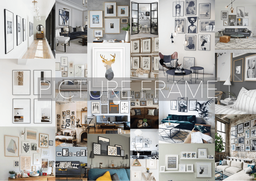
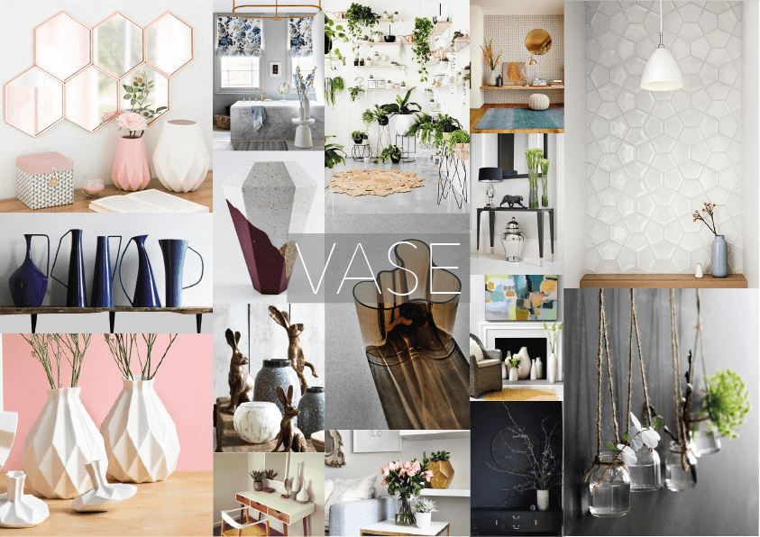
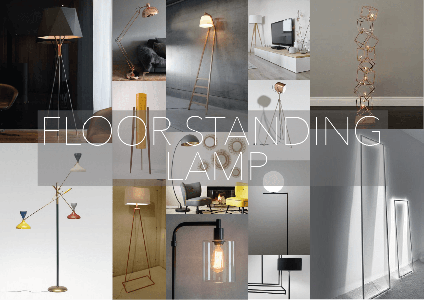
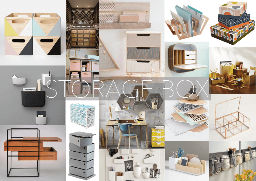
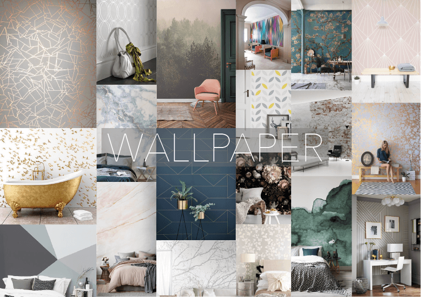
Below are some moodboards that I have created, to gain influence to develop some ideas and designs.

Wallpaper:

Wallpaper Moodboard

Picture Frame:

Picture Frame Moodboard

Vase:

Vase Moodboard

Floor Standing Lamp:

Floor Standing Lamp Moodboard

Storage Box:

Storage Box Moodboard

These mood boards that I created are using Pinterest images, whereby the search category for each image includes ‘modern’.

The styles features above are similar to which I would like to create, however, using a more unique design.

The answers from my survey say that the style featured in my mood boards are the preferred style by my target audience. Therefore, I gain influence from these in order to attract consumers.


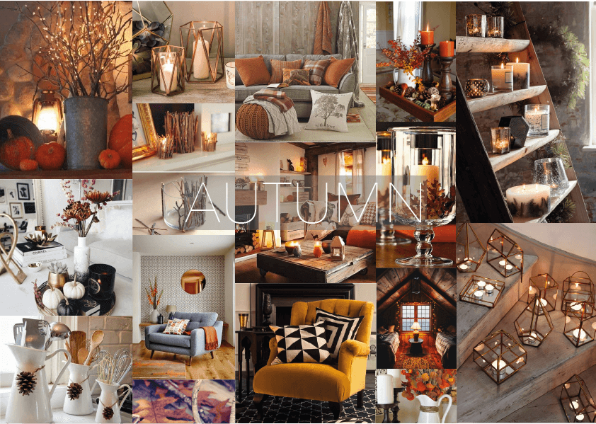
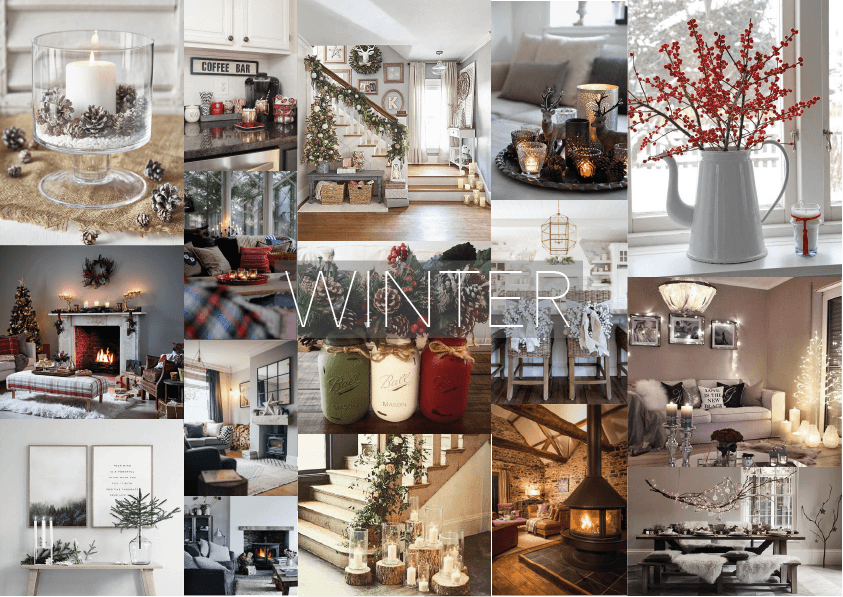
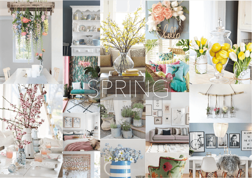
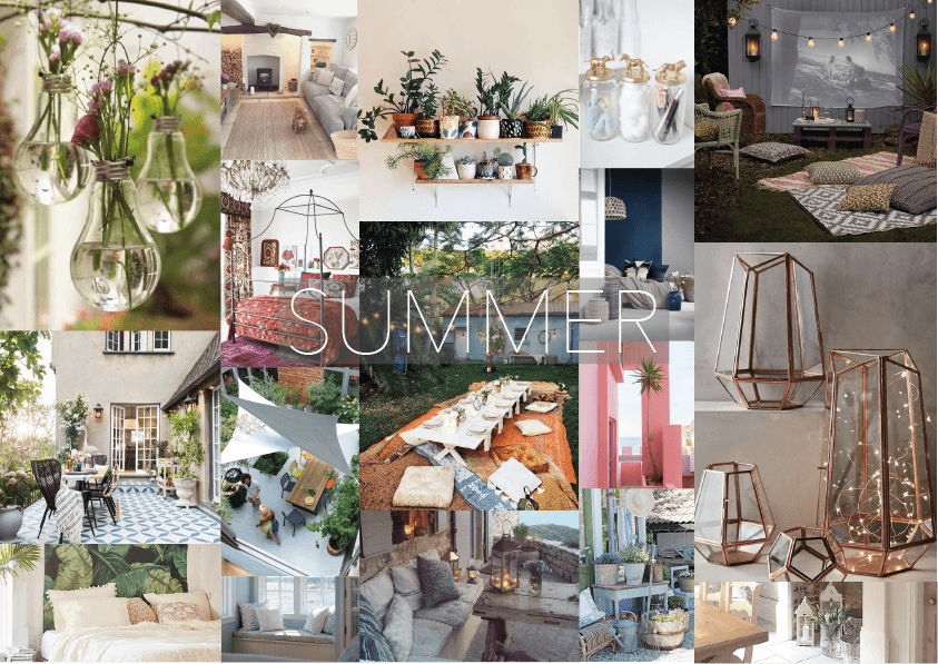
To further my research, I decided to look into seasonal design trends. Below are some mood boards I created regarding seasons:

Autumn:

Autumn Moodboard

Winter:

Winter Moodboard

Spring:

Spring Moodboard

Summer:

Summer Moodboard

Research into seasonal home decor has helped me gain insight as to how furniture collections can be presented, and how they can influence consumer decision making depending on the time of year. One thing to think about when designing my products is what time of year will they be advertised to be sold, and is using a seasonal element going to benefit the sales and consumer appreciation.

Existing Products – Secondary Research

As part of my research, I will be looking into existing products on the market. Information of this sort will enable to me gage various statistics of the product such as height, weight, width, length, price and even cord length.

To start off researching into existing products, I took a look at IKEA, a market leading affordable furniture store.

Floor Standing Light 
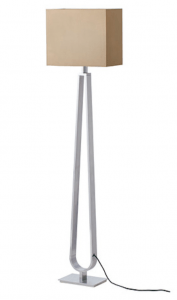
Screen Shot 2017-10-22 at 16.26.51 Screen Shot 2017-10-22 at 16.27.44


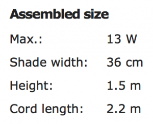
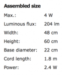
This floor lamp, called KLABB, has an A++ energy rating, and includes dimming features, creating a soft, cosy atmosphere. The lamp has a max weight of 7.13kg, a height of 1.5m, and a cord length of 2.2m. Cord length is something people forget to consider when designing new products, however, getting the right cord length is essential, as it needs to be long enough to reach the plug from its desired location, but not too long that there is excessive cord left on show.

This lamp features a simple rectangular box shape, with a more creative stand in an oval cut out shape. This product is simple, yet aesthetically pleasing; a product that would fit nicely in a modern home office.

Price of KLABB: £85
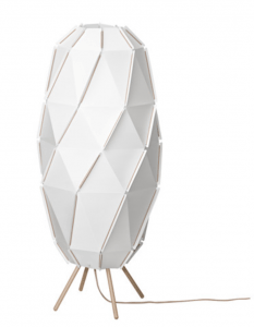
Screen Shot 2017-10-22 at 16.28.01 Screen Shot 2017-10-22 at 16.28.12


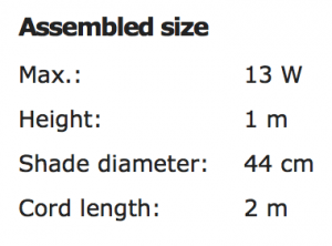
This SLÖPENNA lamp explore a more creative outlook on modern design. This lamp almost resembles The Gherkin London, therefore holds a British sense for modern homes. Again, this lamp as A++ energy rating, a feature I will include in the production of my light, enabling consumers to keep their energy bill down – being attractive, yet cost efficient in the long run.

The lamp weights 1.32kg, which is considerable lighter than the last one, which is the difference of the material used. This lamp offers similar design aspects to what I am planning for my lamp shade, with the fact that the main focal point will be on the lamp shade rather than the stand.

Price of SLÖPENNA: £25
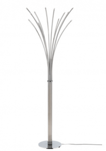
Screen Shot 2017-10-22 at 16.28.51 Screen Shot 2017-10-22 at 17.23.17


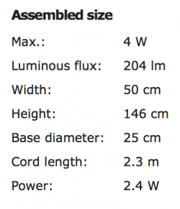
The HOVNÄS floor lamp from IKEA, is yet again creative and aesthetically pleasing to the eye. The materials used explain why the product is heavier than the last lamp, weighing 6.24k. Materials is an element I need to think about when developing my product, as this will distinguish the cost and quality of the product; the HOVNÄS lamp for example is made from steel and aluminium, and priced at £90. This is more expensive than the last, however, uses materials that cost more in the industry.

Price of HOVNÄS: £90
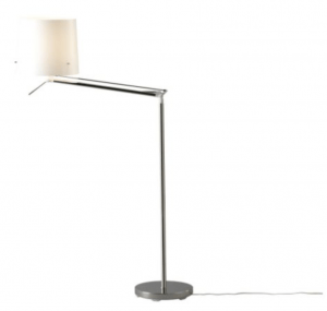
Screen Shot 2017-10-22 at 17.28.56 Screen Shot 2017-10-22 at 17.29.04


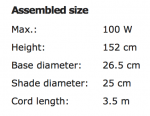
This is the SAMTID floor lamp, that is also advertised as a reading lamp. This lamp offers additional features to the last three, whereby you are able to tilt the lamp the way you like, due to an adjustable arm. Furthermore, the cord length of the SAMTID is 3.5m, the longest of all products analysed; this means the light is able to manoeuvre more efficiently and reach longer distances depending on where the consumers want it, especially if they’re reading. My light differs from this, as I plan for it to be a decorative static piece, therefore, I will not need a cord length this long as it would cause excessive wiring. The weight of this lamp is 4.95kg, which is in-between the other lamps, illustrating how it is make from concrete, plastic and steel.

Moreover, this lamp has the largest power output being 100W. This is significantly higher than the other lamps, probably because it’s purpose is for reading. However, power outage is another important feature I will need to advertise when creating my product.

Price of SAMTID: £35


Table Lamp 

Moving onto desk standing lamps, here are some I will discuss and analyse to gain information which will help me towards the development of my products.
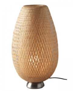
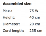
Screen Shot 2017-10-22 at 17.37.21 Screen Shot 2017-10-22 at 17.37.35


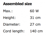
The BÖJA table lamp will be the first one I look at. These lamps offer different features to the floor standing lamps, such as height, cord size and power output. Again, this light has an energy rating of A++, and has a power output of 75W, stronger than some of the floor standing lamps. The materials consist of nickel-plated and bamboo, unique materials that give this product  price of £30, similar to some of the floor standing lamps. The 2.35m cord length is similar to that of the floor lamps, as consumer may need to manoeuvre around desks and other options, something I need to consider when deigning my product.

Price of BÖJA: £30
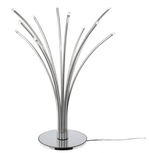
Screen Shot 2017-10-22 at 18.04.10 Screen Shot 2017-10-22 at 18.04.17


Here is the smaller version of the HOVNÄS collection at IKEA. It is prices at £59, one of the most expensive products in this field on the IKEA website. There is an additional built-in feature of a light dimmer on this product, therefore adding a better atmosphere to the consumers home. The cord length is not as long as the last lamp, however, still features a good length for consumers. The HOVNÄS desk lamp, like the floor standing lamp, doesn’t have any illustration added to the product, unlike mine; however, other features such as design and material will help when developing my product.

Price of HOVÄS: £59
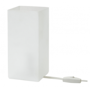
Screen Shot 2017-10-22 at 18.17.36 Screen Shot 2017-10-22 at 18.17.53


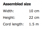
Above is the GRÖNÖ, frosted white glass table lamp. An energy rating of A++, and a light weight of 1.18kg illustrates this is a cost effective and simple lamp. The minimalistic style and minimal use of materials puts this lamp at £6, a tenth of the price of the previous lamp. The GRÖNÖ table lamp gives a soft mood light and has a smaller cable length of 1.5m. This is a budget and simple use lamp which may prove popular for consumers who are looking for something that will fit in rooms of a variety of colour and style. With the collection I aim to produce, I will develop the products to match together and create the atmosphere of the room, therefore the products will be the features; something different to this lamp, as this lamp is designed to fit in a variety of environments.

Price of GRÖNÖ: £6
Screen Shot 2017-10-22 at 18.23.38 Screen Shot 2017-10-22 at 18.23.44

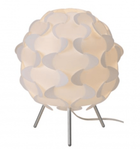
Above is the A++ energy rated FILLSTA white table lamp that features a very creative an abstract design. This lamp is 0.42kg in weight, the lightest lamp I’ve researched so far; made form plastic and aluminium – both lightweight materials. The lamp gives a ‘soft mood light’, an element I believe I should incorporate into my design and development, as well as the possibility of having a powerful, reading element with it being in a home office. This lamp would fit into a modern, minimalistic style room as it has such a creative flair; it wouldn’t look pleasing in a traditional setting. This will be similar to my product, as the products will make up the room, and follow a modern home office feel using minimalism to create an aesthetically pleasing feel.

Furthermore, the price of this product is cost effective and can be used for a middle range of the target audience, both for a budget lamp, and an extra added feature.

Price of FILLSTA: £12


Storage Boxes

Moving onto storage boxes for a desk, here are some products I will discuss and analyse to gain information which will help me towards the development of my products.
Screen Shot 2017-10-23 at 11.33.53 Screen Shot 2017-10-23 at 11.34.08

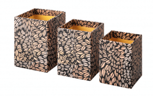
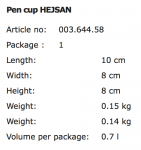
Above is the HEJSAN pen cup storage collection. This products offers a pack of 3 different sized storage containers to help organise products on a desk, such as pens, rulers, and other small products. The HEJSAN collection offer a creative, illustrative design that has been wrapped around a box. Having a design on a basic product is highly important for aesthetic purposes. Colour and patters speak to people as a method where a product can brighten up a dull room or add n extra feature. I wish to incorporate both colour, design, and minimalism in my work, to speak to a wider range of audience.

The Price of HEJSAN: £2 pack of 3
Screen Shot 2017-10-23 at 11.43.28 Screen Shot 2017-10-23 at 11.44.03

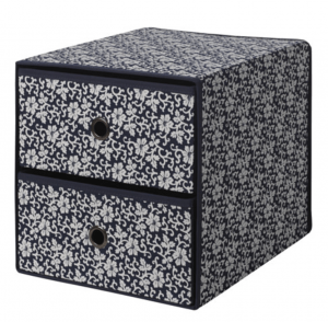
The FLARRA set is a mini chest with 2 drawers. This product offers different features to the last with its different design. The FLARRA drawers offer consumers the ability to close away their small desk products. This product could be said to look more appealing in terms of organisation of the desk, as you cannot see the contents once the drawers are shut. However, the graphic design of these draws are too fussy for my taste of style. The navy base colour means this product will have to fit in to a specific coloured room to look appropriate, therefore there are colour issues when buying the product. This storage box is bigger than the last, therefore allowing consumers to organise and tidy more items away while at their home office. The materials of polyester and polypropylene mean this product is still cost efficient at £8.

Price of FLARRA: £8
Screen Shot 2017-10-23 at 11.52.14 Screen Shot 2017-10-23 at 11.52.21

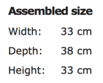
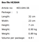
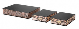
Here is the HEJSAN box file collection, priced at £6 for a pack of 3. The collection offer a black, classic look, in collaboration with bright, vibrant illustrations. This is a modern piece of furniture that is suitable for papers, photos and other small things. These box files are ideal to go onto a modern, desk, in a minimalistic designed room. The box is creative and unique, therefore a plain room would be suited, not to over complicate the feel. This product is lightweight at 0.90kg, therefore easily manoeuvrable. Furthermore, this product has three elements, meaning more storage for the price for the consumer.

Price of HEJSAN: £6 pack of 3
Screen Shot 2017-10-23 at 14.32.06 Screen Shot 2017-10-23 at 14.32.13

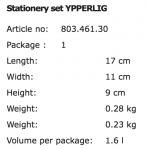
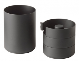
The YPPERLIG stationary set is a different form of storage than the previous examples; YPPERLIG offers features such as: storage for pens, rulers, mobile phones, USBs, can cut sticky tape, and can be used in damp areas if needed. This multiuser storage is made from aluminium, therefore durable, and comes at a price of £8. The simple yet professional black coating means the product can be used in a variety of environments, such as colourful rooms or modern, minimalistic coloured rooms. A limitation of this product, is that the size limits what you can store in the product, for example, you wouldn’t be able to store any pair files like the previous products.

Price of YPPERLIG: 8

To conclude on storage boxes, I believe it is important to offer a product that can store a variety of objects, from files to pens. Therefore, the size will be vital in development to ensure this can happen. Moreover, I believe that a minimalistic approach with an element of colour for the graphics will be important. I aim to develop the collection to be the main focal point of the room , therefore producing something that will fit in every room won’t be the case, as it will follow a modern and unique style.


Vases

Moving onto vases, here are some examples which I will discuss and analyse to gain information which will help me towards the development of my products.
Screen Shot 2017-10-23 at 14.53.51 Screen Shot 2017-10-23 at 14.53.59

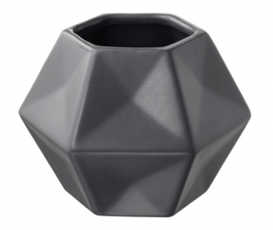
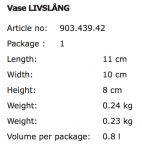
The LIVSLÅNG vase in grey offers a creative, unique, and professional look, perfect to decorate a home office. The colour creates a classic look with the addition that it’s made from stoneware. The key features state that its beautiful with or without flowers, to which I believe this vase would benefit from being a decorative piece of furniture. The geometric shapes creative a modern yet abstract style which would fit nicely into a modern room, of any colour. I like the shape of this product as I envision my product to hold similar qualities as I will be looking into geometric shapes and how you can apply that to products such as this one.

Price of LIVSLÅNG: £3
Screen Shot 2017-10-23 at 15.21.27 Screen Shot 2017-10-23 at 15.21.35

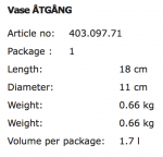
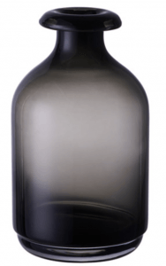
Here is the ÅTGÅNG vase; a ‘glass vase that is mouth blown by a skilled craftsperson’. This product approaches a different style to what we have seen in previous examples. The style, shape and colour of the vase would fit in a more traditional setting, as well as a ‘crafty’ environment. This piece of furniture would add depth to a room, with its forms of transparency that fade into back. If flowers were to go in this product, an interesting element is that you would be able to see the stems faintly; this creates a mysterious yet magical sense that again, would make a great feature to an office. The style is not something I wish to replicate in my work, however, it is good to see what examples are out there on the market and how each product differs.

Price of ÅTGÅNG: £5
Screen Shot 2017-10-23 at 15.27.16 Screen Shot 2017-10-23 at 15.27.24

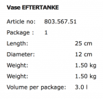
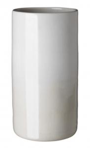
Above is the EFTERTANKE off-white vase. This handmade vase is made by ‘social entrepreneurs in Doi Tung, Thailand’. This vase poses a minimalistic style design with a subtle fade from beige to off-white in the form of a gradient. This product offers background information about the makers, therefore giving the vase a story, which speaks emotionally to the consumers. It is one of the more heavier vases, weighing 1.50kg, and made from glazed stoneware. The colours of this vase enable the product to fit in a variety of environments, which could include bright colours, or warm tones. This product has helped me appreciate the simple colours and design.

Price of EFTERTANKE: £12
Screen Shot 2017-10-24 at 15.56.29 Screen Shot 2017-10-24 at 15.56.37

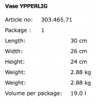
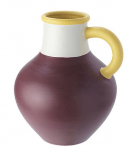
The YPPERLIG brown vase is a hand-painted product weighing the heaviest at 2.88kg, compared to other vases. The colours of this product are the main focal point, being brown, yellow, and off-white. Because of the bold colours, this vase would have to fit into a ‘plain’ coloured room to look aesthetically pleasing, as the colours may strike with the wall colour or other products in the room. The shape of this vase, including the handle, means the product is easily manoeuvrable, therefore efficient in placement. This piece of work would look good on its own, of with flowers in it, therefore the consumer has greater choice in decoration. To further my research, I will look into what colour are on trend, depending for what style I am going for, as I aim to produce a collection with minimalism as its core design, with bursts of colour to enhance the look.

Price of YPPERLIG: £18


Picture Frames

Moving onto picture frames, here are some examples which I will discuss and analyse to gain information which will help me towards the development of my products.
Screen Shot 2017-10-24 at 16.03.52 Screen Shot 2017-10-24 at 16.04.02

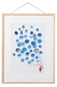
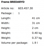
The BREDARYD frame offers a unique and creative image with a simple pine frame. A benefit of this product is that if the consumer wants some variation, they are able to easily change the motif or put textiles in the frame. This feature enables the consumer to keep the product for longer, and to adapt to a various of environments; for example, if the consumer wishes to re-decorate, they do not have to get rid of the product, they can simple change the textiles to the appropriate colour and theme. The style of this picture is more illustrative, rather than geometric, which is the style I wish to follow. The price of this product is relatively cost effective being £8, therefore is an affordable product for my target audience.

Price of BREDARYD: £8
Screen Shot 2017-10-26 at 14.08.35 Screen Shot 2017-10-26 at 14.08.42

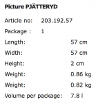
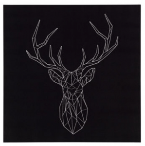
The PJÄTTERYD picture follows a similar, creative and geometric style and them which I want to adopt for my picture. The black and white colours follow a minimalistic approach and therefore would fit in a variety of environments with multiple colours or plain situations. The simple lines make up a shape of  deer, which is within popular trends at the moment. This picture

Price of PJÄTTERYD: £15

Screen Shot 2017-10-26 at 15.34.43 Screen Shot 2017-10-26 at 15.35.21

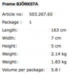
The BJÖRKSTA picture offers a jungle journey with an aluminium-coloured frame. This picture is of a premium collection from IKEA, priced at £49. Again, with this frame, consumers are able to change the textile of this product if preferred, again if they wish to re-decorate, this feature is highly useful. This product offers a real life photography based textile, rather than an illustration like the previous; not the way I wish to go, however useful to see current examples in the industry.

Price of BJÖRKSTA: £49
Screen Shot 2017-10-26 at 15.35.37 Screen Shot 2017-10-26 at 15.35.47

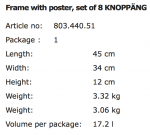
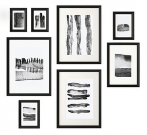
The KNOPPÄNG frame and poster collection offers 8 different frames, each with their own separate textile. The classic colours of black and white mean that this product will look aesthetically pleasing in a variety of locations, and different coloured and styled environments. The variety of sizes in frame give a modern theme of creativity and explores a minimalistic approach. This is a similar theme that I wish to adopt when I am designing the graphics for my picture frame. This price of this collection is in the mid range of our examples, at £25.

Price of KNOPPÄNG: £25
Primary Research – Potential Consumers

Primary Research

As part of my primary research, I conducted a survey made up of 10 questions which will aid me in the production of my media product.

survey-monkey-520x200

I used an online platform called ‘Survey Monkey’ to create my survey. This website enabled me to create 10 questions, then it created me a link in order for me to send out to the appropriate target audience. Survey Monkey allowed me to access results and created charts for me for include in my research, an impressive JDI form of software.

Target audience: The audience will consist of ages 22-55 years, male to female ratio of 40:60, looking at home owners and young to middle age professionals, AB & C1 in the social grade demographics. Start-up entrepreneurs and self-employed/ freelance professionals would benefit from this product, being a home office collection. Therefore, this questionnaire asks people in the target audience, optimising the results.

Questions included:

  • Name
  • Gender
  • Age
  • Occupation
  • Whether they have a home office or not
  • What products they would expect to see in a home office
  • What method of advertising would influence them to buy home office products more
  • What colours/ style/ theme would attract them to these products
  • Whether they would be willing to buy the products or not
  • How much they would pay for a collection of home office products

These questions were asked to people who fit specifically in the target audience:

Ages 22-55 years, male to female ratio of 40:60, looking at home owners and young to middle age professionals, AB & C1 in the social grade demographics. Start-up entrepreneurs and self-employed/ freelance professionals.

Below, is an explanation as to why I asked each question:

  • Name:
    • Just a started question to engage people in the survey.
  • Gender:
    • To see if there is any correlation between gender and the next questions, in terms of whether a specific gender prefers a certain style or theme, or whether  a specific gender would want to buy home office products or not.
  • Age:
    • To see whether there is any difference in ages as to what people expect, or want to see in a home office.
  • Occupation:
    • To see if different occupations expected different products in a home office, relating to their field, an to further see if their occupation affects the style, price, and whether they’d want a home office or not.
  • Whether they have a home office or not:
    • This question will affect the price question, as if people already have a home office, they will know of estimated pricing of competitor products.
  • What products they would expect to see in a home office:
    • This question is to see what consumer expect to find in a home office, and therefore what they would expect to find in a collection. This could determine whether they would want to buy the products or not.
  • What method of advertising would influence them to buy home office products more:
    • This question is essential for my product research as it describes which method reaches the target audience and influences them to purchase the products. The results of the will link directly as to how I will advertise the collection.
  • What colours/ style/ theme would attract them to these products:
    • The answers to this question will influence how the graphics for the different products will be designed, therefore attracting the correct target audience. Furthermore, it enables me to research colours/ style/ and theme that will engage the consumers and be aesthetically pleasing when advertised.
  • Whether they would be willing to buy the products or not:
    • This question was asked to see whether my project was worth producing, and to see whether my estimated target audience would be interested in the purchase of the home office products.
  • How much they would pay for a collection of home office products:
    • The answers to this question will help me determine a price for my collection of home office products. I assume the answers will be in light of existing products the consumers have bought or seen from competitors, therefore, the results will enable me to see market trends, and how much a person would be willing to spend on these types of products.


Results

Question 1‘s results were standard in engaging people with the survey.

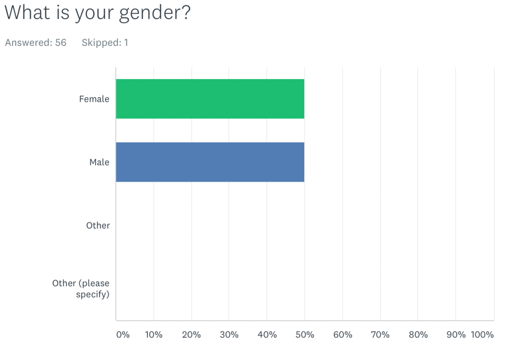
Question 2‘s results gaged from the 57 participants, who were female, and who were male. This would later distinguish whether females or males preferred a different style, colour or theme, and furthermore, see if different genders expected to see different things in a home office, and maybe even reflect on price.

Screen Shot 2017-10-27 at 09.37.38


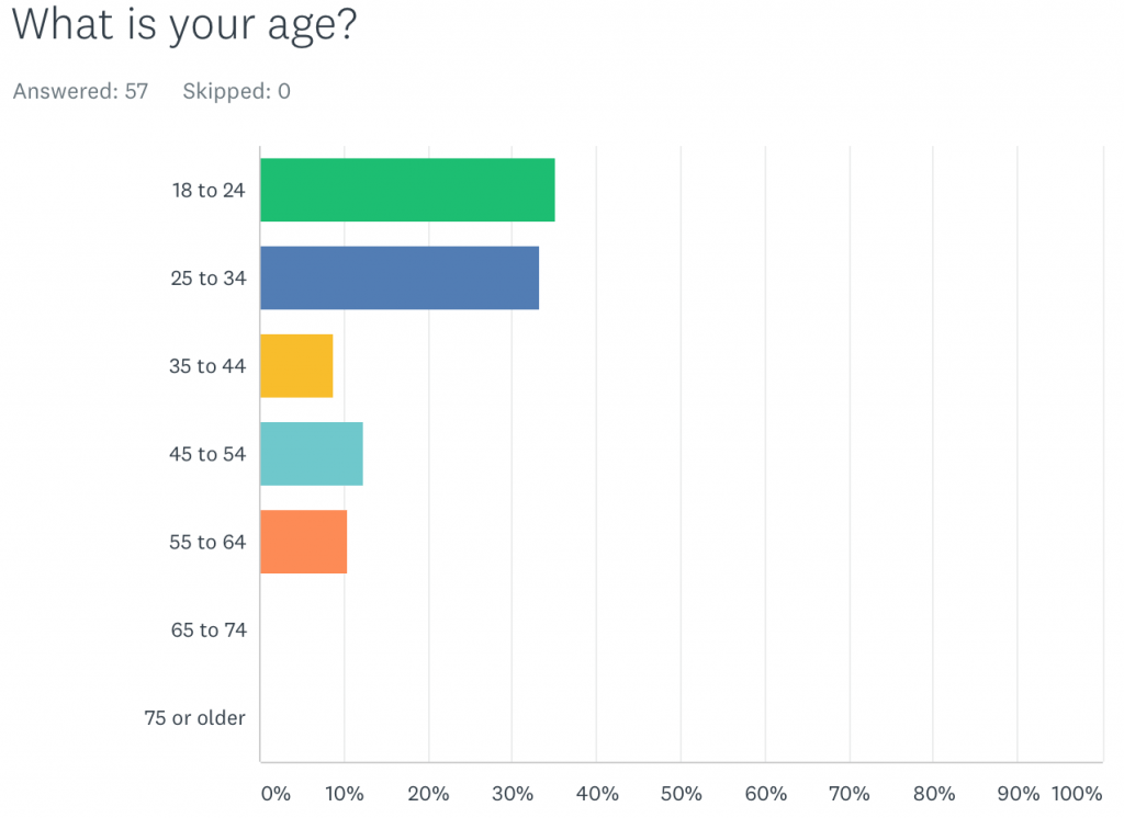
Question 3 was put in there to see what ages responded to my survey, within my target audience.

Screen Shot 2017-10-27 at 09.38.01


The results from the age question showed 35% of my target audience are ages 18-24, the youngest of my target audience. However, this could be due to the fact certain people may have better access to the internet than other, and some, given the option would prefer to fill out a paper survey.

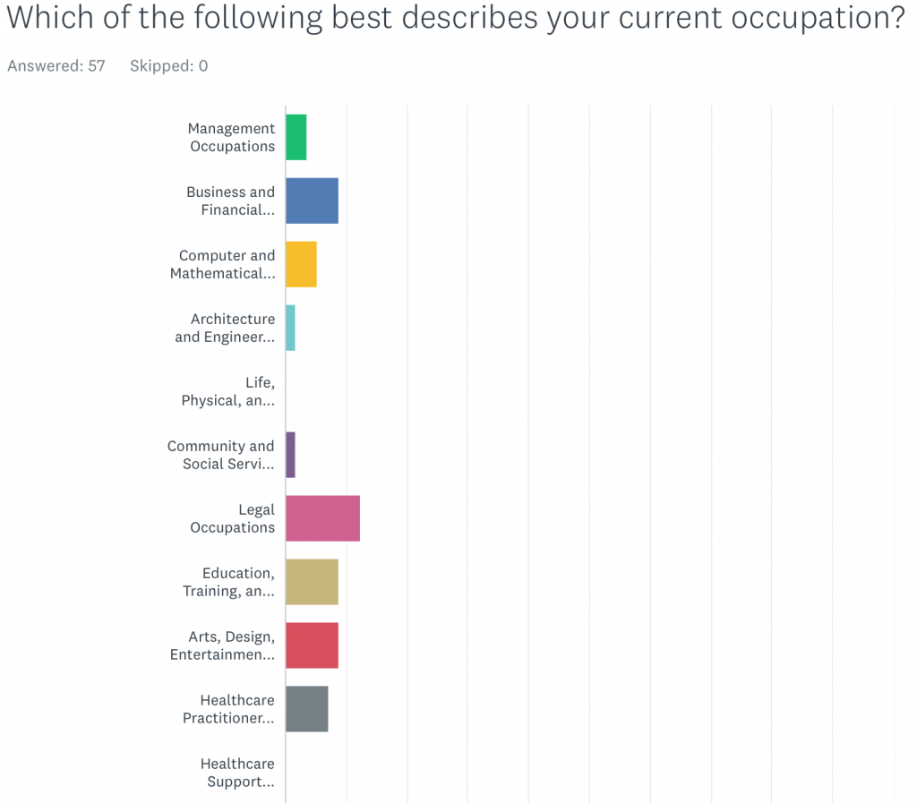
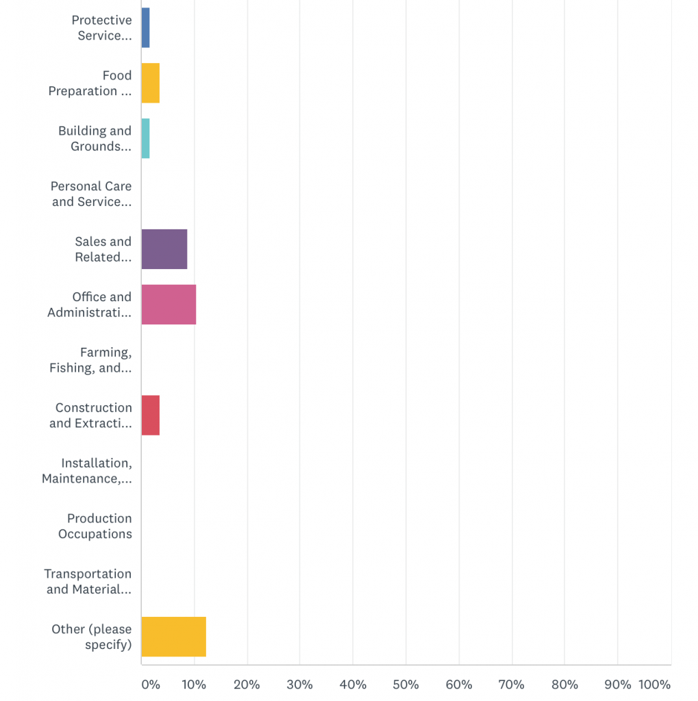
Question 4 was to see whether different occupations had different interest in colours, themes, style. Furthermore, this question was to see whether there was a common factor collaboration with occupation, and whether they had a home office or not.

Screen Shot 2017-10-27 at 09.38.34
Screen Shot 2017-10-27 at 09.38.48

The two most popular answers were legal occupation, and other; answers such as ‘environment’, ‘director’, and ‘hairstylist’ are examples of occupations that didn’t fit in to previous categories.

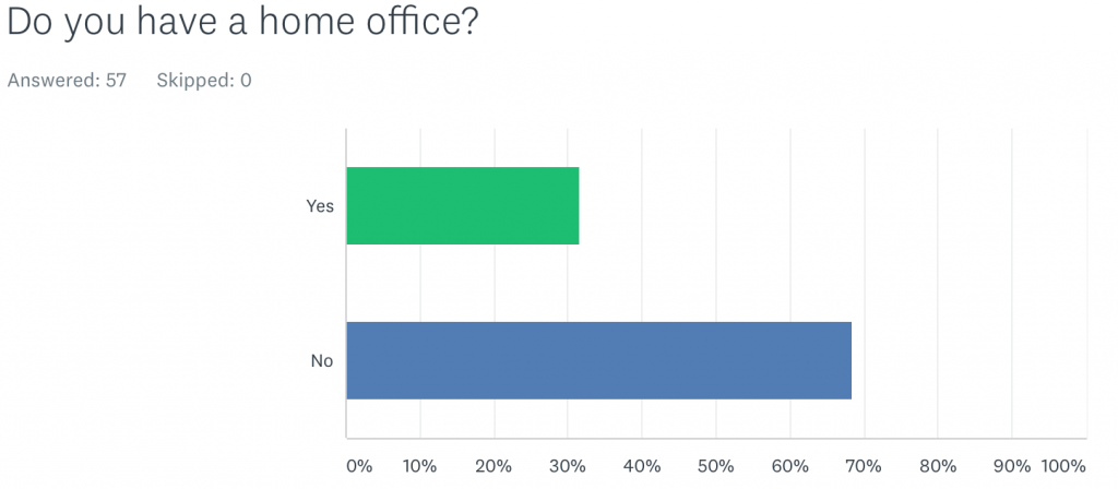
Question 5 distinguished whether the participants had a home office or not.

Screen Shot 2017-10-27 at 09.39.09

The overwhelming fact that majority of participants don’t have a home office illustrates that this is a luxury thing to have. The fact that home offices can be deemed as luxury, then the products within the office may be deemed as luxury as well. This will help me when designing my products and putting a price on them.

Question 6 asked participants what objects they would expect to see in a home office. Answers included: desk, chair, computer, printer, lamp, stationary, plant, draws, pictures, fan, bookcase rug, decorative items, and many more. The answers from this question enable me to look into these products, and see existing examples, as well as trying to understand the target market and industry.

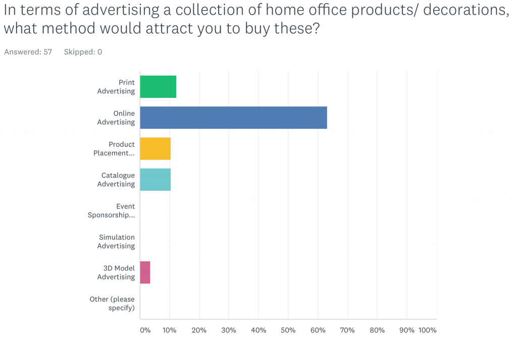
Question 7 asked what is the best form of advertising, that would influence and speak to the consumers directly.

Screen Shot 2017-10-27 at 09.39.20

Online advertising was the most popular followed with just over 60%, followed by print advertising. I will be producing both an online and print advertisement for the collection of products; therefore, consumers has shown that this form communication is important and will influence them to buy my products.

Frequency Festival

Frequency_logo

Frequency Festival of Digital Culture is a biennial festival hosted in the city of Lincoln, providing a platform to celebrate the pioneering spirit of digital innovation and culture through exhibition, creative collision and debate.

I decided to conduct some primary research by attending on the first day of the festival, and see what frequency had to offer, and to see whether there was any information I could used towards my project, for inspiration.


The Festival Trail – Log Book (Assemble)

IMG_4293

IMG_4294

IMG_4295

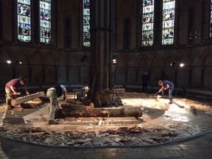
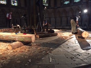
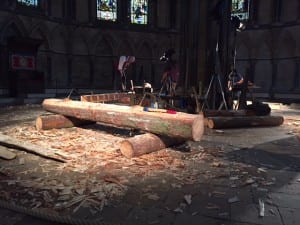
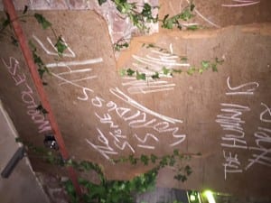
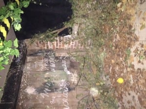
The first instillation I visited was the Log Book. This was a living installation of hewing logs to celebrate the beauty and craft required house raw timber. This piece of work was highly interesting, however, this is a piece that I do not think has any reference to the work I will be doing. I understand the feature of culture throughout this piece, therefore, perhaps I could look into the culture of design, and see what is out there to give me influence and inspiration.


The Festival Trail – Apparatus Florious (Tom Dekyvere)

IMG_4297

IMG_4299

IMG_4300

IMG_4301

IMG_4302


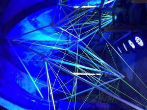
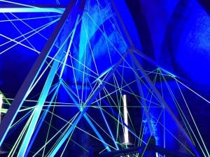
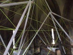
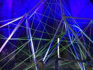
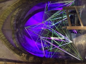
This instillation shows the fusion and obstruction of geometric patterns that grow in and through one another. This was the second instillation I went to go see and was more interesting for me. The use of light in this piece of work is interesting and could be useful for me project. The rope in-between the wooden structure is lit up by lights in several places of the Cobb Hall in Lincoln Castle. This project demonstrates how light bounces and reflects off different sections of the structure, useful for when I’m thinking about lighting my piece of work.


The Festival Trail – Future Body (Jake Moore)

IMG_4303

IMG_4304

IMG_4305

IMG_4306

IMG_4307

IMG_4308

IMG_4309


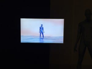
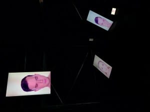
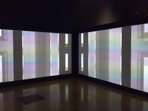
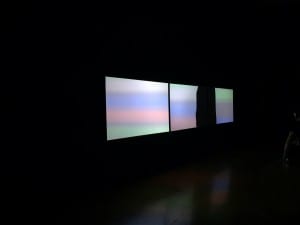
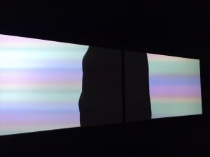
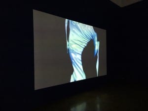
Future Body presents five audio-visual installations, which consider the inadequacy of the human form in the face of our increasingly ever-present technological world. This instillation I visited used projection mapping and LED screens with an audio elements to set the tone. This piece of work could prove useful to me as it incorporates design with visual effects. When I am thinking about advertising my collection, I need to consider aesthetic design in a minimalistic environment to attract consumers.


The Festival Trail – Worldless (Tony Richards, David Mcsherry & Steve Judge)

IMG_4311

IMG_4312

IMG_4313

IMG_4314

IMG_4315

IMG_4316

IMG_4317

IMG_4318


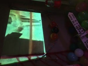
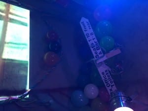
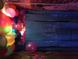
This spooky installation, based around the abandoned Japanese theme park Nara Dreamland, imagines a time when everything has fallen in war and has worn away into the universal ash. This installation was more of a story base with great art direction and sound colour correction. Colour correction is an element in this piece that I can take away, as the outcome was professional and aesthetic, therefore, I can apply this to my work and research what colour grading techniques would be best for my work.


Conclusion

Although these installations seem like they have nothing to do with my project, I can take away some vital information in the form of light, design and colour. These features are important as they make the different between a standard project, and a professional piece of work.

Individual Project Proposal

MED3004M Individual Project Proposal

My concept consists of a collection of home office products, that will have their own unique graphic design, wrapped onto 3D models, then finalised by a print advertisement, a logo for the collection, and a 360-degree product exhibition/ a life like product placement to attract potential consumers.

For my Individual Project Proposal  I chose strand 2; I chose this strand as I will be exploring new software’s, therefore there will be a great amount of development during the process. Furthermore, I am creating a media product with an output of 15 different elements, therefore, there is a large presence of the media product to be marked.

In my proposal, I have included the following sections:

  • Working title
  • Aim
  • Objectives
  • Assessment strand
  • Abstract
  • Audience
  • Final form
  • Creativity and Technical Skills
  • Work relevant to the project
  • Critical texts
  • Primary research
  • Secondary research
  • Types of evident to illustrate your research & development
  • Research objectives

To get these categories, I followed the module guide/ spark page.

This proposal will enable me to get started of my research, followed by creating my product.

Next, I will create a chart to divide my time appropriately to contact research and development in a managed time.